27 February 2022

DON’T KNOW WHAT A SLIDE RULE IS FOR [333]


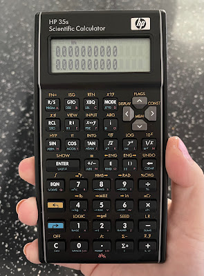
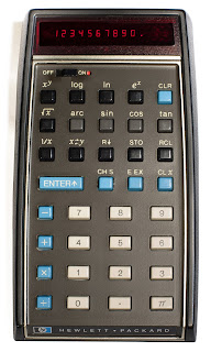
The year 2022 marks fifty years since the introduction of the first pocket scientific calculator, the Hewlett-Packard HP-35. Despite this, I have not seen any evidence that this anniversary is going to be marked in any way, especially as the calculator HP introduced to mark the 35th anniversary in 2007 remains in production to this day, without any changes or updates having been made. The HP 35s could well be the final statement on the matter, as if nothing further can be done.

Having said that, the HP 35s is my favourite calculator to use – I originally said this about the HP-12C financial calculator, in my video about it in 2019 [link], but I hadn’t got my hands on an HP 35s yet. Like the original HP-35, it is ostensibly an engineer’s calculator, including all the expected trigonometric and statistical functions, plus logic and conversions of numerical bases and unit measurements. It is also programmable for any equations you need to need to use frequently, using an intuitive basic language. It is the most you can get a “standard” scientific calculator to do before expecting it to draw a graph and connect to your computer. For me, the HP 35s is solid and dependable, its bowed sides alluding to the original HP design made to fit your pocket more easily, and the keys have a very satisfying click, making it a good stress reliever.

Like the HP-12C, the 35s can use Reverse Polish Notation (RPN) for number entry, which is most easily summarised as entering the number first, then saying what you want to do with it: while you would enter 1 + 2 + 3 = on a standard calculator to get the answer 6, an RPN calculator requires you to type 1 ENTER 2 + 3 +, with no equals button required. More crucially, HP’s RPN calculators use a four-level stack of numbers when calculating, allowing you to combine answers to different calculations more easily using fewer keystrokes – there are also dedicated keys for changing the order of numbers in the stack, depending on what you need. The standard display always shows the first two numbers in the stack, making it much easier to picture everything in order. I found myself becoming so used to this when working from home that I had to buy a second HP 35s for when I returned to the office.


I think this is enough cause for a celebration, but I collect calculators, so of course I would say that. What I think means we may not have this is that HP is not the same company it was in 2007: it had already spun off its analytical instrument arm, including the oscilloscope manufacture on which the company was founded, as Agilent in 1999, and it separated its consumer computer business from its enterprise products and services in 2015. With Hewlett Packard Enterprise also taking the names of the company’s founders with it, the “HP” logo on computers and calculators no longer legally stands for anything, other than the history it used to have. With calculators being HP’s first ever product for the consumer market, it is now listed as “accessories” on the consumer HP’s website, rather than having been hived off with Agilent.
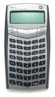


Even then, I am not sure how much involvement HP has with its calculators – their range has been made for them by the Taiwanese company Kinpo Electronics since about 2003, which is also true for Casio and Canon calculators. Up to then, HP’s range had used one standard design, from the cheapest 10B business model to the most advanced 42S scientific calculator, but this was swept aside for an array of bewildering designs for each one: the 35s’s predecessor, the 33s, pushed its keys into a V formation that, to me, is difficult to look at, so a return to the more traditional look based in the 1970s was actually beneficial – another business calculator, the 17bII+ (denoting the second version of an earlier calculator, with more features added), was redesigned to match.


Having heard no announcements or developments so far, it would be a shame not to mark this anniversary in some way. Even if calculator use outside of schools and exams have been replaced by phones and spreadsheets, the initial explosion in their manufacture and use in the 1970s led manufacturers to move to home computers, digital watches and synthesisers. I wouldn’t want this article to be the only acknowledgement of that.

20 February 2022

IT’S NOT THE WAY THAT YOU SAY IT [332]

Mellotron Mark II

Introduced in 1963, the Mellotron is an organ-like musical instrument, its keys instead engaging a tape mechanism to play back ranges of brass, woodwind, string and percussive instruments, making it an analogue forerunner to the sample-based synthesisers that appeared during the 1980s. Instead of its intended sounds being manipulated, recreated or synthesised, they are recordings of the original instruments, and specifically one person’s performance, affected as much by breath and touch – you can hear the air through the flute, and the bows on the violins – as much as the “wow and flutter” of the tape, and the speed of the electric motor. The effect created by that specific combination of factors have made the Mellotron a vital, and slightly eerie-sounding, part of British music for the last sixty years, playing back a sound quality all of its own.

The Mellotron’s sound has become more important than how it works. “Baby Can It Be True”, by The Graham Bond Organization, was the first major song to use one, layering sounds over each other, but Manfred Mann’s 1967 hit “Ha! Ha! Said the Clown” then uses it as the hook, instead of guitar or brass. By this point, The Beatles and The Moody Blues used Mellotrons, including on “Strawberry Fields Forever” and “Nights in White Satin”, later carving a niche in prog rock with King Crimson, Genesis, Pink Floyd and Tangerine Dream. The source of the Mellotron’s sound also means its sounds can be taken too often for the “real” thing, like the cello on Oasis’s “Wonderwall”, and possibly the choir at the end of Coolio’s “Gangsta’s Paradise”, but it sounds too similar to say otherwise. It is also possible to replace the tape, the BBC using an adapted Mellotron to play in sound effects for “Doctor Who” in real time.

Streetly Electronics, the manufacturer of the Mellotron until 1986, was resurrected in 1997 initially to maintain the original version as bands like Radiohead and Oasis continued to use them, even as digital synths by Yamaha, Korg and Roland rendered them obsolete. The sheer number of moving parts in a Mellotron could be affected by humidity, smoke and, least useful for a touring band, movement. However, the possibilities of the Mellotron to a smaller band, and the timbral quality of its sounds, led to more portable versions being introduced into the 1970s.

Mellotron M4000D

The original organ was introduced as an item for the home, with a backing accompaniment available on a second keyboard, and was championed and backed financially by the bandleader Eric Robinson, best known in the UK as presenter of the classical and light music radio show “Melodies for You” on the BBC Light Programme, along with the TV magician David Nixon. Among the first adopters of the Mellotron were people as disparate as Peter Sellers, Scientology founder L. Ron Hubbard, while also providing the only fact I knew off the top of my head about Princess Margaret.

Most notably, the sound of a Mellotron is most often mistaken for that of a Chamberlin, but only because the former is a legally distinguishable version of the latter. Harry Chamberlin designed and perfected his patents from 1949 to 1956, and counted Bobby Darin and Elvis Presley as early customers – but after a legal wrangling caused by a Chamberlin salesman disappearing to the UK and setting up production with a British manufacturer of tape heads, which became Streetly Electronics, Chamberlin and Mellotron continued to sell independently from each other, and not in their home countries. 

Therefore, American acts like The Beach Boys, Edgar Winter, Three Dog Night and Stevie Wonder had access to Chamberlins, and UK acts had Mellotrons. While David Bowie did use a Mellotron on “Space Oddity”, his later “Berlin trilogy” of albums, recorded in Germany, Switzerland and New York, used Chamberlins. Adding to the confusion, the Mellotron’s “3 Violins” sound, used prominently in “Nights in White Satin”, was the one sound licensed for it from Chamberlin.

I want a Mellotron but, due to space and lack of mechanical knowhow, it would have to be one of the modern digital versions currently being manufactured by the original company, although they are expensive: even a rack-mounted version for the studio, where you have to add your own keyboard, costs over a thousand pounds. Fortunately, because Harry Chamberlin sold his company’s rights to them in 1981, all digital Mellotrons effectively come with a free Chamberlin, to layer sounds on top of each other. Arturia sells a downloadable Mellotron sound pack for use via MIDI and a computer, but that is much less special than playing on the real thing.

What would I want to do with a Mellotron? Play on the nostalgia created by the sounds it makes? Layer those sounds together to recreate that eerie quality employed by The Moody Blues? Create something that sounds like nothing else? Yes please.

Mellotron M4000D Micro


13 February 2022

BREAK IT TO ME GENTLY NOW [331]


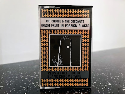
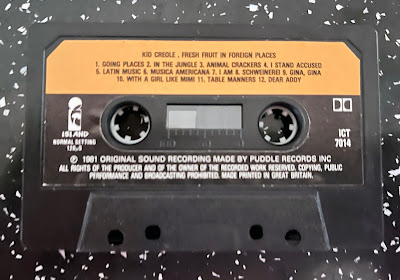
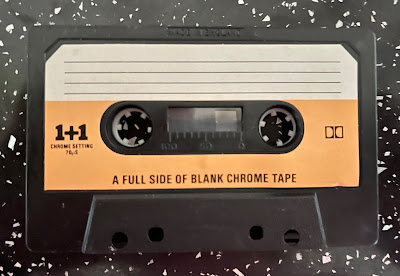
A while ago, I bought a cassette tape in a second-hand shop. It wasn’t for the album on side A, which was “Fresh Fruit in Foreign Places” by Kid Creole & The Coconuts – their most played songs, “Annie I’m Not Your Daddy” and “Stool Pigeon”, are on their following album “Tropical Gangsters” - but more about why side B of the tape was deliberately left blank.

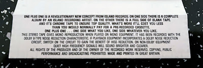
In 1981, Island Records began a series of album releases on cassette titled “1+1”. The inlay card on my album describes it as a “revolutionary new concept… On one side there is a complete album by an Island recording artist. On the other there is a full side of blank tape. And it’s chrome tape to ensure top quality. What’s more it’ll cost you less than you would normally pay for a pre-recorded cassette. One plus one… one side what you like, one side whatever you like.” After a year, the “1+1” pattern on the packaging was minimised to a single logo at the bottom of the front cover of the cassette, which otherwise matched the regular release of the album, and would instead feature the title album in full on each side, giving you the option to record over one side. This series was discontinued in 1983, but continued in the United States by Mango Records, Island’s ska and reggae label.


This would have been particularly attractive at the time to people who made copies of their vinyl albums for home use, or on their recently-acquired Sony Walkman, as the forty-minute duration of the average LP meant two of them could fit onto a C90 cassette. The attraction of buying an album on higher-quality tape stock, and adding another of your own to take advantage of the same tape, will have made “1+1” a sensible option at the record store. 

However, with the marketing blurb mentioning that its cost would be lower than usually expected, I originally thought “1+1” was a novel way of packaging album re-releases. But 1981 was the year “Fresh Fruit in Foreign Places” was first released, and the “1+1” version was simultaneously released alongside the standard cassette format which, in being able to use both sides of the tape, used half the amount of tape. Meanwhile, chrome tape didn’t cost much more to buy than standard ferric tape, but its use as a selling point is more interesting today.


In 2017, I wrote that many of the advances in cassette technology, from types of tape used to Dolby noise reduction, are no longer available to new adopters of the format [link]. Buy a new blank cassette, and it will only be standard ferric tape, otherwise known as IEC Type I, which was established once new formulations of tape were created by manufacturers like BASF, that turned Philips’s original Compact Cassette from a medium for dictation into a higher fidelity format suitable for music. However, Type II chrome, Type III “ferro-chrome” and Type IV “metal” tapes, using different compounds to increase dynamic range and fidelity, haven’t been made for some time, although you now have the option of paying premium prices for the “new old stock” that remains...


...provided your cassette recorder can make use of the different tape formats. With the “Tanishin” China-manufactured cassette mechanism being effectively the last remaining cassette mechanism still being manufactured, and the only new cassette recorder I can find that still currently manufactured to record to chrome tapes, while also accounting for the maximum output levels, bias levels and time constants of different tape types, turns out to be the professional-grade Tascam 202MKVII and its TEAC-branded consumer version, costing from £400 to £600. In short, making serious use of cassettes as a recording medium in the way it used to be requires you to invest in old equipment that can take advantage of the advantages chrome tape could offer, and probably old tapes as well.


Side B of my copy of “Fresh Fruit in Foreign Places” is still blank after forty years and, unless someone buys me the Tascam unit, that is how it will have to stay.


06 February 2022

GREEN IS THE COLOUR OF HER KIND [330]


For all the planning, research and energy I may put into an article or video, I never usually give much thought to how it looks on screen, other than it should be legible. Since 2018, this has taken the form of black text on a mint green background, topped with a pink logo, and I probably did not give these choices more thought than the time it took to whip up the logo using Adobe Photoshop. 

That said, I have no reason to change them. Green and pink are a strong combination that has come to work as a signal or brand for me and my work from the moment they are seen, either on the canvas of a website, or when reduced to a smudge of colour on a YouTube video thumbnail.

My site began in 2016, with a functional white text on a black background – a style that marked the absence of style. By December that year, black had been swapped for what is meant to be International Klein Blue (RGB hex triplet code #002FA7), an ultramarine blue formulated to be more blue than blue, also my favourite colour – a simple choice, but better than nothing.

Apart from blue being the colour of a clear horizon, its being my favourite colour is much like 26 being my favourite number: there is really no reason for such a thing to exist, although it may have arrived as a result of appearing in a number of places at the same time in November 1993 – I think the BBC held their annual Children in Need appeal night on the 26th of that month.

Charlestowne Mall
 

By April 2018, I had arrived at the tagline “nostalgia culture crisis”, and this produced a need to apply branding to support it while looking for something that could be more identified as mine than just the colour blue. The original choice was going to be navy blue text on a peach background, inspired by a carrier bag from the clothes store Next, but what worked on plastic failed on a screen. I changed the peach to a light pink (#f6cac9), and went for mint green (#a3fdd7) based on videos I have seen of dead US shopping malls that were designed in the 1980s and 1990s, particularly the Charlestowne Mall in St. Charles, Illinois, currently due for demolition. I then also realised these were the same colours used on the classic vaporwave album “Floral Shoppe” by Vektroid, using the name Macintosh Plus, so I was on the right track. The pink colour was darkened a bit in May 2021 (#ffb5b2) for legibility, once I decided I should make more use of it as branding in videos.


Does writing about this mean I now have to keep to the scheme of green on pink? It’s more an indication that you can establish something without really thinking about it, and that thinking “if it ain’t broke, don’t fix it”, requires you to properly acknowledge it as a thing first.


30 January 2022

I’M KING OF THE HILL, TOP OF THE HEAP [329]


With the street of Long Acre in London once home to coachbuilders and car showrooms, the similarly industrious Longacre Square in New York City, having taken its name, ironically also hosted horse stables, the American Horse Exchange finally closing in 1910. By then, “The New York Times” newspaper had built and opened its headquarters in the centre of the square, where Broadway intersects with 42nd Street, and convinced the city to rename the square after itself, something the other dozen or so daily papers at the time hadn’t done.

One Times Square, otherwise known as 1475 Broadway, opened in 1904, and remains the focal point of Times Square, hosting the New Year’s Eve ball drop first begun by the “Times” in 1907. The narrow end of the triangular building, which has famously hosted a Sony Jumbotron screen from 1990 to 1996, used by “The Late Show with David Letterman”, and displayed a realistically-steaming pot of Nissin Cup Noodle, now hosts a 350 foot-long advertising video wall projecting into the square, erected in 2019 to replace a number of smaller screens and billboards. However, it also resulted in removing the famous news ticker, or “zipper”, that had operated at various times since 1928. With similar video screens spreading around the building and across the square, its equivalent space in London has now moved to Piccadilly Circus.

For a building with so many eyes on it, I was surprised to hear it is mostly empty. I visited the ground level Walgreens drug store while on holiday in New York in 2011, but with only one floor towards the top used by the current organisers of the New Year’s Eve celebrations, the Times Square Alliance and Countdown Entertainment LLC, the rest of the building is used either as storage, or is completely abandoned. It matters nothing its owners, Jamestown LP and Sherwood Equities, as the tens of millions of dollars they charge in rent is for its exterior: so long as it acts as a frame for the video screens, it remains profitable.

With only a 500m2  trapezoid-shaped footprint, and only twenty-five stories, it may be easier for most businesses looking for space to find one floor in another building, instead of two or three at One Times Square. Even “The New York Times” started moving out of the building as early as 1913, as its corporate headquarters moved to 229 West 43rd Street, itself extended in subsequent years. However, production of the newspaper continued at Times Square until the last section moved out in 1960 - even after the “Times” sold the building in 1961, the printing presses, situated in the four-storey-depth basement, ran until 1997, replaced by a more advanced facility based in Queens.

Allied Chemical, a multi-industrial corporation that, through a continued series of mergers, is the company now known as Honeywell, bought the building in 1963, two years after the “Times” sold it to advertising executive Douglas Leigh, and proceeded to re-skin it for the first time, replacing the original Gothic architecture, which made it look not unlike the Flatiron building, with modernist marble, not that you can see it properly now. The Allied Chemical Tower opened in December 1965, acting as headquarters of its Fibers division, and the Fabricated Products division. The first three floors, however, were more like what you would have found at the New York World’s Fair that closed earlier that year: the ground floor housed a demonstration of the upcoming Apollo space project, and an animated model of a city that could then be built on the moon. Displays of chemical processes took the next floor up, and the third floor fashion show displayed clothes made using Nylon produced by Allied Chemical.

One Times Square was already on sale by October 1972 for a minimum of $7 million, Allied Chemical acknowledging they had too much office space in New York City, that the displays should be dealt with by a group more experienced with dealing directly with the public, and that they were never going to get back the full cost of their renovations. The next buyer, real-estate developer Alex Parker, ultimately paid $6.25 million, and initial talk of exhibition spaces on most floors were replaced by hiring out office space to tenants, although a Song Writers Hall of Fame did open on the eighth floor. Between 1974 and 1997, the building was sold six more times, with unfulfilled proposals to replace the exterior with glass, or stripping it to a bare metal frame to use for floodlights. Demolition of the building had also been proposed in 1979 as part of a plan to create an urban renewal district in 42nd Street.

Having looked through the numerous news articles on the “Times” website about changes in ownership and intent, the lack of consistency is perhaps the major contributor to tenants dwindling away – by 1982, there was reference to leases lasting from month to month, with nothing in the long term. Outside of the “Times”, Walgreens is seemingly the longest-running tenant of the interior of One Times Square. Their lease, signed in 2007, actually covers most of the interior, even though only the first three floors are used. It replaced a Warner Bros. studio shop, operated from 1996-2001 to compete with Disney’s store, but Warner Bros. continued to pay for the lease until Walgreens took over. I have seen evidence that the store closed again on 27thDecember 2021, but with Walgreens’ lease continuing until 2027, and with the ongoing Covid-19 pandemic, I could not confirm if this was temporary or not.

The current value of One Times Square is dictated by its advertising potential: Lehman Brothers bought it in 1995 for $27.5m, with the first electronic billboards being installed in 1996. The following year, it was sold to its current owners for $110m. A four-week placement on the main billboard installed in 2019 costs from $2.5m. Perhaps One Times Square is at the point where any future construction means advertising revenue lost. Ironically, the original scoreboard-like ad screen, installed above the “zipper” in 1975, is more famous as an artwork, being the screen on which Jenny Holzer displayed the message, “PROTECT ME FROM WHAT I WANT”.


23 January 2022

LAUGH ABOUT IT, SHOUT ABOUT IT [328]


Social media has become as much of a bête noire for myself this website as the 45th President of the United States came to be, so I must now also write it out of my system until further notice.

Social media is just another form of traditional media, and should be understood as such. Marshall McLuhan, the philosopher whose work created the field of media studies, was forty-one years old when regular television broadcasts started in his native Canada in 1952, making him well-placed in commenting on television’s impact on communication and our world. The focus of his book “Understanding Media” was how we should study media more than the content it carries, and the impact of a new medium will be more than that of the content. For social media, which became part of everyday life during my twenties, content is fuel for the algorithm of the site, and providing content to the site is both amplification of your message and the price of admission. The “social” side is an impression created by the content.

If everyone uses social media, we are essentially all in the media business and, therefore, we all should receive media training to fully understand the uses and effects of media, so that we can use it most effectively and mindfully. I think this would press home the importance of acting professionally in the public space created by a media that requires us to act intimately in order to receive the content required to run it. Organisations specialising in media training offer communication skills, interview technique, provide experience in dealing with PR and media relations, and provide “key message development” for the messages you want to get across. 

It sounds not far away from preparing for a job interview, as you prepare to create the greatest possible impression of yourself, until I saw that one company, PA Mediapoint, also offers “crisis media training” in how to deal with intense media scrutiny – their website states that “the focus is on equipping comms teams and spokespeople with the essential techniques and strategies to limit reputational damage.” 

For all that you can hate about what Piers Morgan says on Twitter, his account can be viewed as the same collection of safe press release announcements and off-the-cuff pronouncements that define a brand-building social media account that keeps on the right side of the site’s terms of service, because Morgan knows how to play the social media engagement game. Whenever Twitter has been used in a controversial fashion, mostly by people since banned from using the platform, the “social” side of social media is not applicable. 

Something that is slanderous if spoken between two people is counted as libel on social media because it is media, it is recorded, it is written down. Putting yourself on public view carries an element of risk for anyone, celebrity or not, at any point, and whether it is worth putting on that off-hand comment, to be deleted later, or to target someone or something anonymously, carries its own risks.

I therefore use Twitter and Instagram primarily to link to my website, and to share things I like, because that is as much as I want to use it. I could decide to play the game, building social capital through likes and followers, but I think I prefer it more when that happens as a coincidence of one thing I posted about what I write elsewhere.

As everyone now has access to the media, we must not just get used to having a separate private and public face, but the management of that is now a life skill. That essentially makes it impossible to get it out of my system.

16 January 2022

HOW SHALL WE EXTOL THEE? [327]


On Friday 7th January, Britain’s Culture Minister, Chris Philp, said that the national anthem should be played more frequently by the BBC, and by other public service broadcasters: “[the] more we hear the national anthem sung, frankly, the better.” This followed a comment the day before in the House of Commons by Conservative MP Andrew Rosindell that, with 2022 being the year of the Queen’s platinum jubilee, “will the minister take steps to encourage public broadcasters to play the national anthem and ensure the BBC restores it at the end of the day’s programming before it switches to News 24?” The minister in the Commons, Culture Secretary Nadine Dorries, could be heard saying “fantastic” in response.

Far from just being ridiculed in comments online, this reactionary step, in the literal sense that it is trying to return to something people used to do, is completely unenforceable: “God Save the Queen” has only been the official national anthem of the United Kingdom through tradition and use, with no law ever having been put into place, and any attempt to make it law now will, no doubt, inspire similar derision. In terms of TV channels, only BBC One and ITV – except for Thames, Granada, Central, Yorkshire and Border - have ever played the national anthem when they closed down for the night, and stopped doing so when they stopped closing down. BBC Two and Channel 4 have never played it, and Channel 5 launched with a 24-hour schedule from the start. Furthermore, BBC News 24 has been called the BBC News Channel since 2009.

My initial reaction to this non-starter was to think of “An Audience with Billy Connolly”, the 1985 stand-up special that ended by arguing that the parlous state of the country was due to the national anthem being boring, which I agree, and that it should be replaced by the theme from BBC Radio 4’s “The Archers”, with everyone singing “dum-de-da-de-dum-de-dah” instead of writing lyrics for it. The option of Simon May’s “EastEnders” theme since arisen, but far better the maypole dance of Arthur Wood’s “Barwick Green” than Eric Spear’s plodding “Coronation Street” theme. BBC Radio 4 is the one station that still closes the day by playing the national anthem, just before 1.00am each night.

Meanwhile, rearrangements of “God Save the Queen”, like Benjamin Britten’s blockbuster production, and Philip Sheppard’s arrangement for the 2012 Summer Olympics held in London, make me feel there is not much more that can be done with such a simple tune – Sheppard explained that his arrangement was designed to add tension, including an E minor chord that gave the impression the entire piece was in a minor key.

Having no official anthem means we have always had a choice. “Land of Hope and Glory”, “Jerusalem”, “Flower of Scotland”, “Scotland the Brave”, “Land of My Fathers” and “Londonderry Air” have all been used by the nations of the UK in different capacities, and despite the creation of national parliaments outside of England, none of these have become official. Another option could have been “Zadok the Priest”, written by Georg Frideric Handel for the coronation of King George II, and possibly the first national anthem, but its having been used by the UEFA Champions League since 1992 has probably ended any chances of that. The use of “Jerusalem” for England at the Commonwealth Games, however, came from a public vote held by the Commonwealth Games Council for England in 2010, polling just over half of the votes – “God Save the Queen” came third.

Personally, I would choose the second-placed song in the poll, Edward Elgar’s Pomp and Circumstance March No. 1, “Land of Hope and Glory”, with lyrics by Arthur C Benson. The lyrics referencing God mean about as much to me as singing about God saving the Queen, but it doesn’t matter in a song that, even more than “Rule Britannia”, must be played and sung as loud as possible. In an era where the “drop” is as important in pop music as the chorus, the approach and “drop” before the second chorus of “Land of Hope and Glory” makes me feel more patriotic for my country than anything, or anyone, can possibly do. The use of the word “hope” is also good.