Showing posts with label martin parr. Show all posts

03 April 2022

LET ME ENTERTAIN YOU [338]


BBC One launched a new ident package on Friday 1st April and, having covered the launch of the previous “Oneness” set in 2017, devised and filmed by the photographer Martin Parr [link], it only made sense for me to continue considering television idents and branding like it is public art. From the Channel 4 logo and the “2” used by BBC Two from 1991 to 2018, to the “ITV Creates” initiative employing artists to rebrand ITV channel every week since 2019, few get the chance to create in a space seen so often by so many people, even multiple times in the same evening.

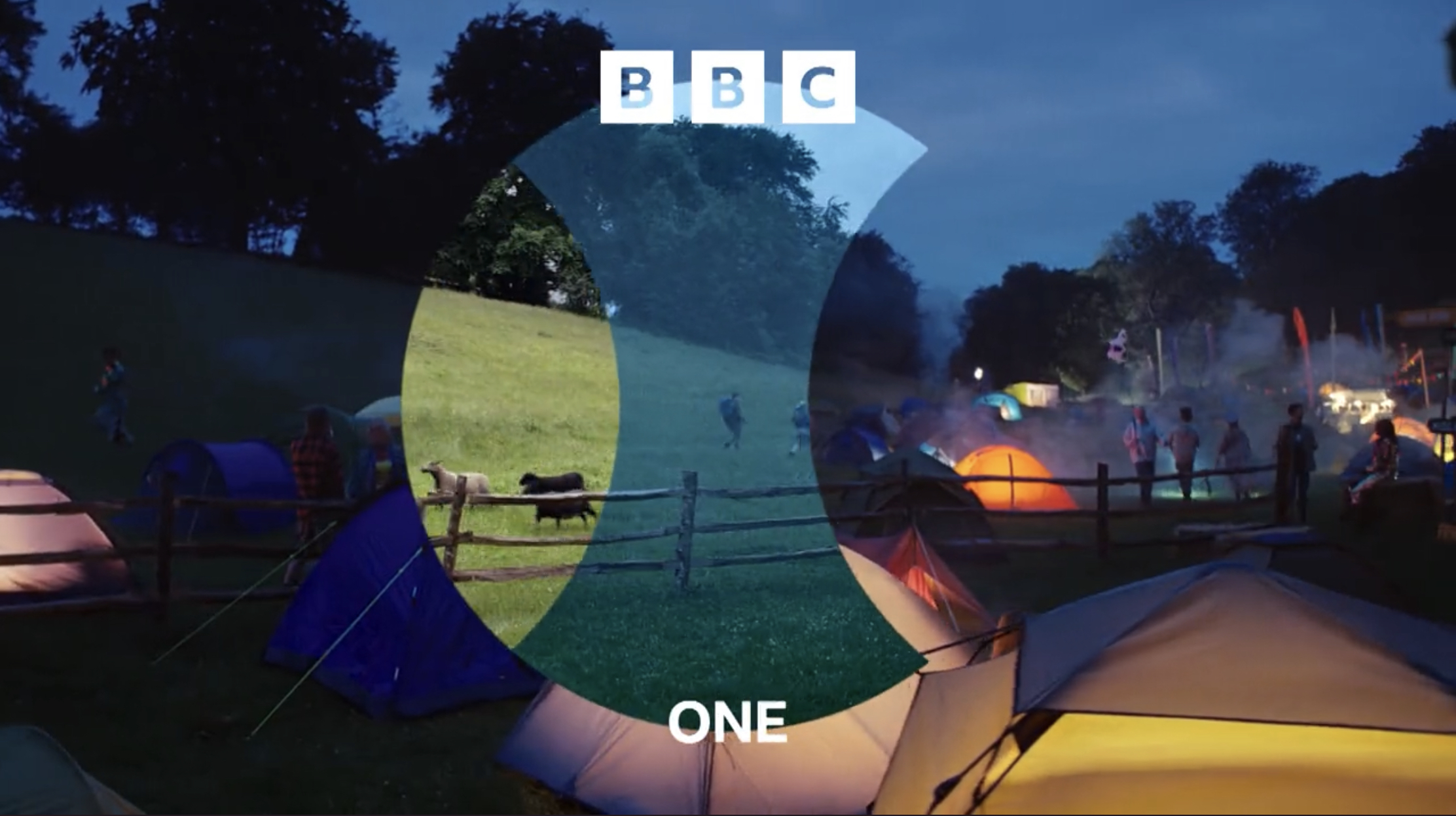
A production of BBC Creative and Man vs. Machine, a visual arts group that has created idents for More4, Film4 and 4seven, in addition to advertisements for KFC, Nike and Apple, the new BBC One idents pan the camera around spaces, seen through a lens to different times of day: a hall hosts children trampolining in one moment, but we see glimpses of a meeting, and preparations for a disco; a field hosts a festival at night, then ramblers, and later sheep herding; a street corner hosts a market stall, then a garage worker’s tea break, followed by a street sweeper; and a brickwork basement hosts skateboarding, with glimpses of a later photo shoot and a rave. 

These are great ideas by themselves, depicting spaces that bring people together, instead of Parr’s “Oneness” idents that just showed people appearing in a space, but each glimpse of a space also has a full ident that will show glimpses of the others within the lens, creating a moment of recognition in the viewer as the idents are repeated, while being a conceit that keeps the idents fresh as new ones are added into the mix.


The ”lens” idents were meant to have been introduced in October 2021, alongside the kinetic BBC blocks logo [link], which left the red circle motif placed between programme trailers as the only clue to their eventual form. BBC One’s idents have used the motif of a circle through the years to symbolise an all-encompassing inclusivity, most literally when a globe of the Earth was the channel’s ident for forty years to 2002, rendered through mechanical models, computer graphics, and as a hot air balloon. 


When your symbol has been that all-encompassing, “picture postcard” films of people in spaces doing things, such as the “Oneness” set, and ITV’s idents during before 2019, are merely holding a mirror to its audience. Fortunately, the focus is back on the channels themselves: BBC One, as Britain’s most popular channel, is reflecting how it is a space where people gather for its programmes, and the “ITV Creates” initiative is intended to emphasise the creative heart of the broadcasting business.


It will be interesting to see how much of an impact BBC One’s glimpses of life through a lens will be, for branding remains key: when BBC Two introduced its “2” logo in 1991, a symbol made into a blade, a rubber duck, a toy car, a garden display, a Dalek and so on, ratings for the channel improved. The programmes had not changed.


24 October 2021

YOU’RE STILL THE ONE [316]

Back in 2017, I wrote about BBC One replacing its channel idents with the “Oneness” series of group portraits, photographed by the artist Martin Parr [link]. I ended that article by saying: “…getting audiences to programmes do not rely on individual channels so much, unless you count the BBC iPlayer or Netflix as a ‘channel.’ For the BBC, Martin Parr’s new idents may be more important for the ’BBC’ on screen, rather than for the ‘One’.”

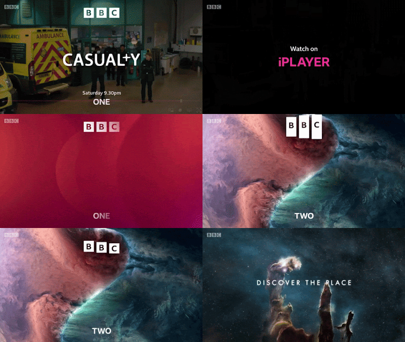
On Wednesday 20th October, the BBC unveiled new branding that placed their restyled logo at the top of screens, programme trailers and poster advertising, and their channel names in smaller letters at the bottom, underlining the inevitability of the move – all programme trailers end with “available on iPlayer,” placed prominently in the middle of the screen, just as “iPlayer” and “Sounds” replaced the “TV” and “Radio” categories on BBC Online. Long gone are the days of simple radio-like announcements over slides of upcoming shows. Moreover, the way the new logo is used highlights, at a fundamental level, the change in how we watch television over the last twenty-four years.

I have always changed my website’s logo and branding when it was needed, as proved by my 300th article showing five logos over five years [link], as I zeroed in on the most effective way of presenting myself and my work. Likewise, the BBC’s logo, a variation of three letters in three boxes since it was first introduced in 1958, has been modified as its uses have changed, from identifying a broadcaster to supporting the quality of British programmes sold worldwide, to being a mark of reputation to sell tie-in merchandise, to being a sigil for a British national identity portrayed through cultural soft power. 

As much as some people search for the opportunity to complain about taxpayers’ money being perceived to have been wasted on a logo change that is still superficially similar to the previous version, you have make changes when your current branding is found to have stopped working effectively. As stated by the BBC’s Chief Customer Officer, Kerris Bright [link], “Our research tells us that audiences think some of our services look old fashioned and out of date. They want a modern BBC that is easier to use and navigate to find the content they love and enjoy.” 

If people in its own country are saying that, then perhaps it was being said elsewhere. The latest BBC logo was introduced in April 2021 on an online streaming service aimed at North America, BBC Select, and on the Australian TV channel BBC Kids, six months before the UK saw it on screen. Because these are subscription services, their audiences are also, indirectly, paying for the new logo. Meanwhile, the latest Cadbury logo, using thinner lines and closer to the company founder’s original signature, was first seen on chocolate bars sold in Australia. 

A big feature of the BBC’s new branding, and one that has been introduced gradually for a couple of years, before reaching the logo, is the font. “Reith,” in its sans serif form, may not immediately be too different from the previous use of Gill Sans to the casual user, but the one-off cost of the BBC buying its own font, to use it as much as it wants, contrasts with the yearly fees to use Gill Sans, Helvetica, Futura and other fonts over the years. I could not find how much the BBC pays to use fonts, but I could also not find out how much Ikea saved in 2009 by switching their shops and catalogues from using Futura to Microsoft’s cheaper font Verdana.


The previous BBC logo was introduced in 1997. The logo that version replaced was deemed not to work when made smaller on screen – the lines under the blocks, and the spaces in the letter B, began to disappear. Its replacement was simplified, easier to reproduce and was more legible on screen.


What has changed since then is the screen. In 1997, people were still watching cathode-ray tube (CRT) televisions, beaming a raster pattern of electrons onto a fluorescent screen. LCD and LED televisions did become commonplace until 2006, when regular HD television broadcasts began in the UK. In 1997, the BBC still played their idents for their channels from laserdisc, with servers not being used until widescreen broadcasts began in 1998. They still only had two channels to worry about – the BBC News Channel began in November 1997, followed by BBC Choice in 1998. Aside from all this, watching television from a non-television screen only properly began when the BBC iPlayer download service began in 2005, only becoming a streaming platform in 2007, the same year Netflix began their own service – the flood of mobile, tablet and other connected devices began from there.


What made me realise this was using the BBC News app in beta mode. I knew about the new logo from the reports of BBC Select introducing it, finding that an upcoming update to the News app will use it. In using it, I found that the logo, placed at the top of my phone’s screen, placed its blocks further apart so they can animate more clearly: swiping down to refresh the page would stretch the blocks before reverting to their correct shape, and they would shrink to lines as I moved down the page, maintaining their presence as a constant reminder. 


I thought this animation was something cute at the time, because it is something you could do on your phone, but I didn’t think it would happen on television. With the blocks making the Channel 4 logo having been broken up and thrown about since it began in 1982, and with a new ident on ITV seemingly every week as part of an artist initiative, it is now time for the BBC to stop being defined by three static, immovable blocks. 


Now, they rarely ever sit: they move in, they fall into place, they move up, down, in and out. Perhaps this could have been done fifty years ago, but when BBC One and Two had idents that were live feeds of clockwork models, it wouldn’t have been practical. It certainly does not feel like the logo of a corporation that is approaching its hundredth anniversary in 2022, but that is entirely the point: this will be the last BBC logo made for a regular television screen, if not for a linear television channel. Next time: holograms, probably.


There is a lot to be said for the triviality of a broadcaster changing its logo, as I have proved, but because of the unique way it is funded, the BBC belongs to everyone, and it represents us all to the rest of the world. I want it to look its best.

07 January 2017

IF YOU’RE NOT THE ONE [36]


The first act of 2017 appears to be replacing circling hippos with an aerobics class. After ten years, BBC One has replaced its channel idents, themed around “circles,” evocating the globe logos it used for many years, in favour of snapshots of groups of people, directed by photographer Martin Parr, themed around the idea of “oneness.”
So far, we have just four idents, out of a promised twenty-four – the aerobics class, a group of sea swimmers, and a slightly different version of each one. They are a bit sparse, with no music or sound apart from what is in the scene, and too mundane when compared with what they replaced. There are also too few idents available right now, risking outstaying their welcome by the time the next ones appear.
I thought that enthusiasm for TV idents was just an online pursuit, where you can go into as much detail as you want, but I am no longer sure. I really should know, as this happened before.
The first time I appeared on the radio, said in anticipation of a next time, was on Monday 29th March 2002, when I called Nicky Campbell’s morning show on BBC Radio 5 Live. Earlier that morning, BBC One switched its globe-shaped hot air balloon for “Rhythm and Movement” - groups of people dancing.
One of the idents, filmed at the Minack Theatre in Porthcurno, Cornwall, featured ten ballerinas performing a graceful dance, to the sounds of a string quartet that was led by a cello. This particular ident was described as being “too middle class,” and I called up to point out the sole point is to tell you what channel you are watching. It did sound a bit naïve at the time, but I was let onto Nicky Campbell’s show to say that – I think Nick Knowles was there too.
After making the point that, when I was born, BBC One’s single ident was a turning lime green globe on a blue background, I was thanked for my comments, and the show moved on. They did not discuss the ballet any further, my appearance having killed that conversation stone dead.
TV idents were borne of a time when you physically had to tune your TV to the correct channel, and even then, you were just as likely to have programmes introduced by someone appearing on screen to talk to you. BBC Two continues to show why logos and branding is important, as people are still enjoying watching their older “2” idents, made as early as 1991. Radio jingles fall into the same nostalgia, hoping you remember their frequency – all in the south of Hampshire sing with me now: “One-oh-three-point-two, Power-F-M!”
However, on digital TV, radio and online, where you can simply scan your receiver, and select your viewing from a list, idents are no longer needed – you are already where you need to be. You see more picture postcard-style idents, like those on ITV, and now BBC One, because they reflect their audience, and are easier, and cheaper, to produce.  In addition, getting audiences to programmes do not rely on individual channels so much, unless you count the BBC iPlayer or Netflix as a “channel.” For the BBC, Martin Parr’s new idents may be more important for the “BBC” on screen, rather than for the “One.”