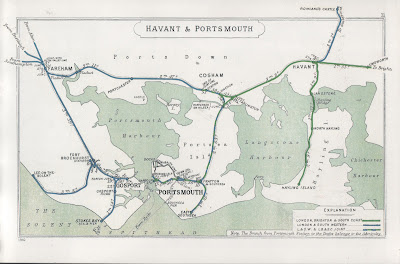
Here are the facts: my home town of Gosport, Hampshire, has an estimated population of eighty-five thousand people. It is a dormitory town, so most of its inhabitants work outside of it, making the main A32 Fareham Road and the B3334 Rowner Road gridlocked at least twice a day. The last passenger train left Gosport on 8thJune 1953, a whole decade before the Beeching cuts that severely reduced the UK’s rail network, but the first motorway in the UK, the Preston bypass, now forming part of the M6, opened on 5thDecember 1958. Rowner and Bridgemary, two major areas of Gosport, were built into suburbs in the 1960s without any further major roads being built in and out of the town.
The train line continued to be used for freight until 1969, and while the southern half continued to be used to move naval ordnance until 1991, the rest was converted to a cycle track. Eventually, public transport returned to the northern half in 2012, the tracks replaced by a busway removing one type of vehicle from gridlock – an extension to this busway opened in December 2021, using up part of the converted cycle track, reducing the length of the average bus journey by two minutes. Gosport Train Station was redeveloped into housing in 2010, having been left derelict for fifty years.
The reason any of this has been on my mind is because, having rolled around local history in my mind for so long, the fact there was a gap between the end of passenger trains in Gosport and the opening of the first motorway meant that no-one would have thought to plan for when reliance on roads would continue to increase: the nearby M27 motorway between Southampton and Portsmouth did not begin to be constructed until 1972.
It doesn’t necessarily mean I think a motorway needs to be cleaved into the town to reduce the time taken to get in and out, because the upheaval caused by attempting something like that now would carry its own cost over that of the concrete, tarmac and labour. While there is a bypass nearing completion in nearby Stubbington, where the land is available to build one, it serves to highlight the reliance on cars in Gosport, as I have mentioned previously on how a number of industries have left the town in the last thirty years [link].
I am not certain if trains should be reintroduced to Gosport, especially now that buses have taken over the track, but this is only because I am not sure trains were the answer to begin with. Gosport Train Station was opened in 1841, outside the town walls when they were still there, because it was less of a security risk to build there than in the home of the Royal Navy at Portsmouth Harbour, a situation which had changed by 1876. Branch lines to Stokes Bay and Lee-on-the-Solent had died out by 1914 and 1930 respectively – the former is now also a cycle track, while Lee-on-the-Solent station has been used an amusement arcade for so long that any indication of its previous use is almost accidental. If it wasn’t used so much for naval ordnance, the track probably would have closed to passengers before World War II.
You might be surprised that people continue to use Microsoft Internet Explorer but, these days, there are people that will never have used it. Since I registered www.leighspence.net, Internet Explorer accounts for only 1.3% of all access to this site so far – two thirds of access was made by Safari for iOS and iPadOS, distantly followed by Google Chrome, Mozilla’s Firefox and the desktop version of Safari. Hardly anyone used Opera to access this site, despite it now being used on more desktop computers than Internet Explorer, which held a 95% share of all desktop computer web browsing in 2003.
I have only just found out that Microsoft is finally withdrawing Internet Explorer on 15th June 2022 – people who upgraded to Windows 11 have already found it has disappeared, and it will not work if a re-download is attempted, but considering the last major update to the browser was made in 2013, you are only looking to continue using it if you need it. Microsoft’s other browser, Edge, retains an “Internet Explorer” mode so people can continue to access older systems, in some cases the server access sites they need to continue working from home. My moving from PC to Mac means that compatibility issues are both expected, and accounted for – if I work from home, signing into one web page starts a program that will bridge any gaps between my computer and the server at work – but forcing progress on PCs has been slow.
The “Internet Explorer” mode on Edge was meant to have been provided from 2015, when Windows 10 and Edge first appeared, before it was decided to push the browser as the new one that people should be using, despite the untidy situation created of supplying an operating system with two web browsers. What causes the difference is the browser engine used, which renders the HTML code used by the browser into a viewable page: Internet Explorer used its own proprietary engine, MSHTML, while Edge, which originally also used its own engine, now uses an open-source engine also used by Google Chrome, Opera, Amazon and Samsung. Decisions on which engine to use determine how the internet develops, as proved when Apple announced they would not support the Flash plug-in on its browsers in 2011, forcing developers to use alternatives for web graphics.
I know I can download any browser I want, but I use Safari on my phone and computer because it was simply the browser those devices came with, and I have not had a specific reason to need a different one. In bundling Internet Explorer with later updates to Windows 95, then Windows 98 onwards, and insisting new computers using Windows came with the software, Microsoft created the impression that a web browser is part of your device’s operating system, before it became the most used part of it. Even if Windows is not the only operating system anymore, and a PC is not the only computer, this perception persists, as viewers to my site have perhaps proven.
Please see below for the script I used in completing this video:
Coming up, I take a fond look back on how I wrote a song about nostalgia, how it won a song contest, and why this is not case of “this is how _I_ did it” more than “is _that_ how I did it?”
[OPENING TITLES]
[TITLE: “How to Win a Song Contest, apparently” or “Don’t Take a Stand ‘til You Reach for That Landfill”]
Hello there. In May 2021, the “CheapShow” comedy podcast ran the second Urinevision Song Contest, following the success of the previous year’s event in substituting for the pandemic-hit Eurovision Song Contest. This time around, I had an idea for a song, and decided to enter, despite never having properly written, recorded and sung a song before. I effectively sent my entry to answer the question, “is this anything? Does this sound like something I should be doing?” I faithfully watched the ceremony live on Twitch, to see if I had made the shortlist, and I yelled “yes!” when “Nostalgia’s Gonna Get You” appeared as the ninth song out of thirteen, meaning my work would now be judged by a panel of thirteen comedians, actors and singers, and I would find out if I had embarrassed myself or not. But… that wasn’t the end of it.
[“RECONSTRUCTION” caption on screen, waveform in background, as Eli Silverman announces: “The winner of Urinevision 2021 is Nostalgia’s Gonna Get You by Leigh Spence.” I am as open mouthed as I can be.]
I was devastated. I genuinely was not prepared for this outcome, especially after hearing the other entries, songs like “Down at the Spoff & Pickle” by Ukulele Jon, and “Piss Crystals” by L.J. Goody, thinking how much more they fit the themes and energy of “CheapShow” as a podcast, and how much more professionally recorded the other songs sounded, at least to me. I do remember feeling incredibly confident for a while after submitting my song, but that was me thinking, “wow, I made a thing,” not “I’m gonna win this thing.” So, thank you to “CheapShow” for putting on a great show, and for the lovely shirt I won, featuring art by their in-house artist Tony Vorrath, and thank you to everyone for all the nice things they said both during the contest and online afterwards.
Before I go any further, I implore you to listen to “CheapShow” as it is a great podcast, and one I have written about at length. Hosted by Real Ghostbuster Paul Gannon, and pickle of destiny Eli Silverman, “CheapShow” rummages through the charity shops, the bargain bins, the thrift stores, the flea markets, the pound shops and record bins of the known world, to give you the treasure amongst the trash. It also has its own tie-in magazine and merchandise, which may itself be the subject of future discussion in another geneeration’s podcast. It is an absurdist comedy machine with an enjoyably filthy mouth on it, like Derek & Clive meets Blue Peter on the bus home from a night at the Cabaret Voltaire. It is a magazine show: you may have board games and charity shop finds one week, novelty records and weird soft drinks another week, celebrity guests or an audio drama with mad characters the week after – it’s great that there is a podcast I can download each week and not know what form it is going to take, other than in minutes and seconds, and you need to cherish something like that if you find it.
And so, in order to explain “Nostalgia’s Gonna Get You”, I must play it to you first, using the lyric video I created previously. I will be back in a moment.
[PLAY VIDEO]
I should say the reason I am playing the recording instead of singing it live is because…
Singing at my limit is a mountain to climb,
So I broke the lyrics up and sang two lines at a time.
…and edited it together. On the night of the contest, I did like how the presenters visualised the songs by using puppets. [Clip of ostrich.] Here is some of the reactions from the judges…
[Play selection of some, ending with response to Imran Yusuf: if you can pay for it, you can be my guest.]
I will say the response that made me happy immediately was from co-host on the night, Ash Frith: [“Who performed that, that was amazing!”] …I’m going to play that again. [“Who performed that, that was amazing!”]
There was only one rule for the Urinevision Song Contest: your song had to be between one and two minutes long. How I interpreted this was that I would need to fit as much song as I possibly could into two minutes, working out how many bars of 4/4 time I can get when using a hundred and twenty beats per minute, divided by two bars per line. Rather than entirely sounding like a maths exercise, my favourite Eurovision song, “Ding-a-Dong” by Teach-In, which won for the Netherlands in 1975, clatters along at such a pace that it doesn’t need all of the three minutes it was allowed. At the same time, Tony Christie’s song “Avenues and Alleyways,” the theme to the TV drama “The Protectors,” doesn’t have a chorus as such – Christie sings “in the avenues and alleyways” a second time, followed by an entirely new set of lyrics. Therefore, aside from a short intro and outro, I have three whole verses, a vast middle section to list nostalgic things, and exclaim “Nostalgia’s Gonna Get You” – I’ve only since realised I unintendedly wrote “nah-nah-nah-nah-naah-naah, nostalgia’s gonna get you!”
The music itself is kept very simple, performed in C sharp major to stretch to what should be out of reach, and to sing just slightly out of my range, but I deliberately chose instruments that evoked the 1980s: a drum machine, synth chords and a synth bass that jumped up and down by one octave to fill the sound. Far cheaper than spending a few thousand pounds on the real thing, Apple’s BandCamp lets you pick a LinnDrum, one of the first sample-based drum machines, and the machine most associated with Prince, from “1999” to “Purple Rain”, with “When Doves Cry” essentially being a LinnDrum featuring Prince. What also helps is that, if you choose the right drums, you can make a pattern that sounds like a clock.
The chords were played on my Yamaha Reface DX, a proper FM synthesiser like the original DX7, replicating the original Electric Piano 1 setting with the same glassy sound that characterises the era, as Yamaha sold thousands of DX7s to musicians who, apart from Brian Eno, used the same thirty-two built-in patches from piano to bass, to brass to marimba, because it was too hard to program.
I am absolutely happy to be compared to them, but I must admit I was initially perplexed by the comparison to Squeeze made by co-host and TV writer Paul Rose, aka Mr Biffo [“Cool for Cats” quote, followed by Depeche Mode.] My only reason for this was my having been so focussed and influenced during this process by the Eighties-est artist of them all, and a recurring name on “CheapShow”: Phil Collins. Yes, I own the sheet music to the “No Jacket Required” album. What happened was I was listening to a local radio station, Wave 105, on a Sunday morning, and after they played a jingle, there was silence, almost like they fell off air. When a song eventually started, it was the dum-da-da-dum-clap of “Take Me Home”, followed by, yes, chords played on a Yamaha DX7. Having since bought the album on CD, I think “Only You Know and I Know” may be one of the catchiest songs ever devised, even more than “Sussudio,” but what I did find were the demos that Phil Collins made of his songs – they are simply a drum machine, a DX7, and his singing almost in tongues to get the melody and the energy down before writing the lyrics. The simplicity of these demos was what I decided to go with in my finished song, but while I wrote the lyrics, I did have the sound of the Phil Collins demos in my head… [Imitate them using “Nostalgia’s Gonna Get You” tune.]
In terms of the lyrics, I intended to use my three verses to build up into a preposterous situation: start with giving into nostalgia, followed by something weird, then complete all-consuming hysteria – instead of “the greatest hits of yesteryear will do for you now,” it was originally “because there’s no hope for you now.” However, I had the final line “don’t take a stand ‘til you reach for that landfill” from the start as a line that sounds utterly bizarre by itself, but entirely in context by the time you get to it – that is why I was happy for how one of the judges, Tom Mayhew, reacted to it: [Tom Mayhew clip].
I felt it was easy to refer to liminal spaces, hauntology and Jacques Derrida in the song, as they have all been discussed on “CheapShow”, although I didn’t yet know there was a song by Scritti Politti titled “Jacques Derrida”. Dead shopping malls are almost a genre of video on YouTube as people film walkthroughs of places that were once safe and busy, rendered eerie and empty by changing times – while they can be perfect examples of places you have to pass through, but you don’t think that you should be there, I think watching them might be my version of ASMR. Having said that, “That vape shop once sold games on tape for my Spectrum Plus” was the hardest line to condense, and then sing – I only realised later that Sinclair made a computer branded as a Spectrum+, because I was originally working down from Spectrum Plus 2. I also originally wrote “once sold cassette games for my Spectrum Plus,” proving you need to be as clear as you possibly can – this was why I had to change “Birds Eye Potato Waffles, still alive”, which I like, to “Findus Crispy Pancakes, still alive” which I hate – it has to be dah-dum, dah-dum, dah-dum, not dum-dah...
The middle section was always meant to be a list, but I then had to find items that were a stretch to be nostalgic about, like Polaris, which was Britain’s nuclear deterrent at the time, maintaining a base in my home town, but then also had to rhyme with each other, like The Naked Gun and “Pebble Mill at One,” thanks to my pronunciation of “wun” instead of “won.” I loved how the BBC’s daytime TV show, a forerunner of “The One Show”, also made it into another song in the contest, “Watching Shit Old Daytime TV” by the Electric Chair Orchestra. By the way, I was meant to sing “didn’t die” instead of “still alive”, until I had to sacrifice the alliteration when I realised I was singing “die, die, die” all the way through.
My favourite verse is obviously the last one – once I worked out how to talk about the monotonous “rhythm” of the nightly news, the alternate 1985 of “Back to the Future Part II” came to mind very quickly, an easy way to say “what went wrong?” and retreat into the past. “Tomorrow’s World Is Cancelled” both means exactly that, and the fact that the BBC’s science show of that title ended in 2003, the same year that Concorde flew for the last time, as if our idea of what the “future” was, and where you would find it, had ended.
If I had one regret with the song, it was not following Stephen Sondheim’s rule of no half-rhymes all the way through, having left “sounds” rhyming with “around” in the first verse. I think, by that point, I had to stop writing, and put my pen down.
So, what happened next? The Urinevision Song Contest 2021 album is available to listen to and download on Bandcamp – I never expected to be found on the home of vaporwave, so that is mind-blowing in itself. Entering the contest was the best thing I could have done, it has been the highlight of 2021 for me, and if I ever do anything as successful or as popular again, I will remember that it started with “Nostalgia’s Gonna Get You” - it’s as simple as that.
What this experience also confirmed for me is that, within strict legal definitions, I can apparently sing, and I have music confirmed as one more outlet, one I intend on making much more of, after writing a new opening and closing theme for this show. [Closing theme starts.] All I know for sure is this: if you enter your song into a contest, and it moves someone to say [Ash Frith clip] “who performed that, that was amazing,” you must be doing something right.
Thank you for watching. Comment, like and subscribe to let me know what you think, and until next time, the nostalgia culture crisis continues at www.leighspence.net, the new home for dancing with the gatekeepers.
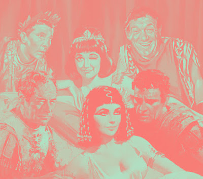
It is well known that the line “infamy, infamy, they’ve all got it in for me,” from the 1964 film “Carry On Cleo”, was not written by its scriptwriter Talbot Rothwell, but was borrowed, with permission, from Frank Muir & Denis Norden and their radio series “Take It From Here” (1948-60), which included the prototypical dysfunctional family sitcom The Glums.
Of course, “Carry On Cleo” borrowed rather more than that, namely the leftover sets and costumes from the blockbuster historical picture “Cleopatra”, for which 20th Century-Fox had moved production from Pinewood Studios in Buckinghamshire, to Cinecitta in Rome, in 1961.
“Cleopatra” would be released in June 1963, having first signed Elizabeth Taylor to the starring role in September 1959. Meanwhile, “Carry On Cleo” was shot in July and August 1964 for a release in cinemas in December of the same year. Ironically, “Carry On Cleo,” in both its thrift and haste, is actually closer to what “Cleopatra” was meant to have been.
The “Cleopatra” crew had left behind an opulent and elaborate group of interior sets, and a standing outdoor set that was overwhelming in scale, but were constantly deteriorating in the dire British weather, requiring daily touch-ups on paint and masonry, and tropical vegetation to be replaced for each day of shooting. When Taylor developed a cold, later a fever and meningitis, a better climate was required for all aspects of production, and with the 1960 Summer Olympics now over, Rome became a more favourable option once more. With the decision made to start afresh, the $600,000 set and other items were left behind.
"Carry On Cleo”, starring Amanda Barrie as Cleopatra, Sid James as Mark Anthony and Kenneth Williams as Julius Caesar, was concocted as a way of using what was left behind, injecting British bawdiness into more luxuriously appointed surroundings than normal. However, producer Peter Rogers and director Gerald Thomas approached the shooting of the film in the same manner as their other productions, using mostly medium and close-up shots that work for the comedic acting and dialogue, but making no use of their sets’ scale. Mind you, this was only the second “Carry On” film to this point to be shot in colour, and its poster had to be made less similar to that of “Cleopatra” to avoid legal action, so expectations perhaps have to be set accordingly.
However, "Carry On Cleo" was what "Cleopatra" was originally intended to be: a quick, $2 million, 90-minute romp starring Joan Collins, who had been tested extensively for the role, while also intending to get 20th Century-Fox out of a sticky position with their finances by remaking the script for the almost-entirely lost 1917 “Cleopatra”, starring Theda Bara. The ambition of producer Walter Wanger, following the success of “Invasion of the Body Snatchers”, and the subsequent signing of Elizabeth Taylor, caused the production to spiral into a $44 million behemoth that nearly sank the entire company, having been seduced by how much more they could have if they had bigger production values and bigger stars. The contractual obligation to use a widescreen film process owned by Taylor, Todd-AO, developed by her late husband Mike Todd, is one of the less likely sequences of words in the history of filmmaking.
A later film shot at Cinecitta, the notorious adult film “Caligula”, also had its set reused for a parody, “Messalina, Messalina!”, made by “Caligula” co-producer Franco Rossellini. The film was released in 1977, two years ahead of its target - like "Cleopatra", "Caligula", a film of similar opulence and reputation, had its own set of problems.
In 2020, I bought a new television. My previous LCD TV, bought in 2011, was becoming clunky and slow in comparison for what I can now get for two-thirds the cost, in addition to a higher-quality LED screen. Connected to it is an Apple TV box, a Blu-ray player, and a secondary DVD player that allows me, living in Europe, to watch region 1 DVDs from the United States, a cheaper option than buying a Blu-ray player that covered this requirement.
However, I still expected to connect the DVD player via SCART, the only option available on it. What I had not banked on was the almost wholesale dropping of SCART connections from audio-visual (AV) equipment since I last had to buy a television.
Known as Péritel in its originating country of France, and first appearing in 1977, SCART is the acronym of an organisation of manufacturers that created a shared AV connector standard, and the name of the connector itself. The intention of creating a shared standard was to simplify the connecting of different AV devices, whether they were analogue or digital, and to avoid incorrect connections. To that end, twenty-one pins were supplied to carry composite, RGB, S-Video and YPbPr component video signals, and analogue, optical or digital audio signals – your devices would then choose the best connection to make. SCART connectors also carry the control signals that allow, for example, a DVD player to be “woken up” from standby mode when your TV switches to its connection, and you could daisy-chain devices together.
This is something I did not realise until much later, because I did not know: for a long time, SCART leads were often the only connectors available to televisions in the UK apart from that needed for an aerial, and while we may be used to HDMI offering similar ease of use, HDMI is for transmitting digital audio and visual data, and not the analogue signals from older devices – there have been HD televisions and laser-disc players that used an analogue component signal of 720 or 1080 lines, but this was used mainly in Japan, where a version of SCART also gained traction, and was extremely expensive.
Where did this leave me, with my region 1 DVD player? There is a spare HDMI connector available on my TV, but the requirement to turn the analogue signal from the DVD player into a digital one that can be accepted by HDMI means that the cost of a converter was higher than I wanted to spend, while also requiring a power source to assist in processing the signal from analogue to digital. You can use the VGA connector that is now often included to turn your TV into a computer monitor, but while that will carry a component visual signal to the TV, it won’t carry the sound.
In the end, I had to buy an adaptor to break out the composite signals from the scart lead to use the red, white and yellow AV connectors at the back of the TV. For the record, while SCART has not been a requirement on French TVs since 2015, which is perhaps what led to it being dropped elsewhere, the inferior composite signal and connectors created by RCA in the 1950s have apparently proved too ubiquitous on TVs worldwide to kill off.
Sometimes, you only notice a trend when it has already fully established itself, leaving you to trail back to where it might have begun. My latest such realisation came in, well, the alcoholic drinks section of a local supermarket, one which still separates out the non-alcoholic versions of well-known brands into their own, comparatively tiny section.
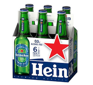
I had been looking for Guinness 0.0, which is basically the standard draught Guinness with the alcohol filtrated out at the end of the production process, which has recently been reintroduced after a contamination issue led to its withdrawal in October 2020 after only its first two weeks on sale. I remember it tasted pretty much exactly like normal Guinness, if a little lighter, with notes of coffee – here’s hoping that wasn’t what was wrong with it.
The design of Guinness 0.0 cans is pretty close to those of the standard brand, except for stating “0.0” in large blue lettering, and blue bands on the top and bottom of the cans. The supermarket did not have it, but with the other non-alcoholic brands grouped together, I realised that similar design choices had been made on the packaging of other beer brands like Heineken, Beck’s (named "Beck's Blue"), Moretti and San Miguel, but also on Kopparberg cider, Freixenet sparkling wine, and Gordon’s and Tanqueray gin.
The shelves that inspired this article
While not a hard and fast rule – Budweiser Zero removes the red from the standard design to leave it in monochrome, and Carlsberg 0.0% outright replaces its green colour with blue – the use of blue highlights on existing branding, to emphasise the taste identified with the brand over the removal of a major element and selling point of that brand, is something that must have slowly sprouted over the last year, as brands latch on to a growing taste and trend.
I rarely drink alcohol as both a preference and a rule, so the opportunity to avoid it altogether will make having a Guinness even more enjoyable, while I wait for Pimm’s to follow suit. Therefore, another interpretation of this use of blue is to indicate safety, that this drink you would only have in certain acceptable circumstances is safe to drink anywhere, at any time, without having to think about it. My reason for thinking this is intentional is having seen Heineken 0.0 on sale in a shop that otherwise did not sell alcohol, which was a high street branch of the newsagent-stationers-bookshop WH Smith – thinking about it further, the blue accents on the Heineken can made it fit in with the soft drinks stocked next to it.
Having said all this, I live in a country where the colour blue on food and drink packaging is more associated with a conspiracy theory that Walkers Crisps changed the bags for their cheese and onion flavour from green to blue, never acknowledging they changed it, when in fact they have always used blue, despite the majority of other brands use green.
It is a fact of 1990s family life that some VHS cassettes were repeatedly watched until the tape wore out. My family had many: “Who Framed Roger Rabbit?”, “Back to the Future”, and “Fantasia”. All would be replaced as time and home video formats progressed, but one tape, which became lost within the family home, could not be replaced until the film’s eventual DVD release in 2006.
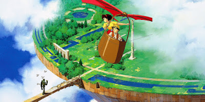
It turned out our lost copy of what was being called “Laputa the Flying Castle,” recorded from a TV airing on 31st December 1988, was from the first occasion that a Japanese animated feature film had been shown on British television. That this was shown at 9.25am on the populist ITV network, more known for cramming their Christmas schedules with Star Wars, Harry Potter and James Bond, is even more remarkable. If they ever did it again, I am not aware of it.
A story of mystical cities, escaping kidnap and airborne pirates, “Castle in the Sky” was directed by Hayao Miyazaki and released, in 1986, as the official first film from Studio Ghibli, founded on the success of “Nausicaä of the Valley of the Wind” two years earlier. Like much of Miyazaki’s work involving planes, airships and other flying devices, “Castle in the Sky” has become widely influential as a classic of the steampunk genre.
The flying island itself is lifted in name and concept from Jonathan Swift's novel "Gulliver's Travels," while also influencing the plot of wanting to harness the castle for political, nefarious ends, before ultimately crashing to the ground. Unlike Swift's satire, Miyazaki's Laputa was old technology and reason, overgrown and reclaimed by nature, to be left alone - it is allowed to escape at the end, but irreversibly marked by human hands.
The setting of a small mining town was familiar to British audiences. Miyazaki visited Wales in 1984 as part of the film’s research, and his witnessing of the aftermath of the Miner's Strike influenced characters as well as architecture. A later noted steampunk work, 2004’s “Steamboy”, Katushiro Otomo's eventual follow-up to "Akira," was explicitly set in Victorian industrial Manchester. “Castle in the Sky” would later be shown in Aberystwyth in 2011, a charity screening to support relief efforts following the Tōhoku earthquake and tsunami, using its original Japanese soundtrack.
Despite The Walt Disney Company’s release of Studio Ghibli’s films on DVD, our lost copy of the ITV airing of “Castle in the Sky” would not truly be replaced until around 2018, my sister having sourced a copy of the Japanese DVD version originally released in 2002 – I immediately asked her to order another one for me. This was the only place we could find the English dubbed soundtrack prepared by Magnum Video Tape and Dubbing, for use in Japan Airways trans-Pacific flights, and later in American art-house screenings – it is a straight translation of the original Japanese, with music and sound effects left intact. Pazu, the boy who rescues central figure Sheeta from kidnap, is voiced by Barbara Goodson, now best known as Rita Repulsa from “Power Rangers”, while Sheeta, who possesses a magical crystal of the sort that allowed the city of Laputa to fly, is voiced by Lara Cody, who later dubbed voices for English-language versions of “My Neighbour Totoro” and “Kiki’s Delivery Service”. This was the version I remembered from my childhood, even if it is not the film’s own original soundtrack, but I knew I had the correct version the moment I heard Pazu deliver a lunch at work: “meatballs for the boss.” As Proustian as a madeleine biscuit, I’m sure you will agree.
It was important for me to have the version of “Castle in the Sky” that I remember, because that version was the reason one of my formative experiences of watching a film – I was five years old when ITV broadcast it – has led me to be spoiled when it comes to the expectation of what an animated feature film can accomplish in scope of story, technical detail and emotion. Arguably, only Studio Ghibli have matched it since, and only Pixar have come close.
It is already noted that the English-language dub of “Castle in the Sky” now most widely available, recorded by Disney in 1998, took liberties with the soundtrack that were later revised and scaled back on further home video releases. The original sixty minutes of synthesised musical score, reworked by the original composer Joe Hisaishi into a lavish, and overwhelming, ninety-minute orchestral performance, was restored, as were periods of silence that were filled in with background noise. However, the increase in Pazu and Sheeta’s ages, from pre-teen to mid-teen, and lines that made Sheeta a potential romantic interest to the airborne pirates instead of a mother figure, were retained, perhaps because James Van Der Beek and Anna Paquin would have had to be recast. The original changes were authorised by Studio Ghibli, but with this now also being the English-language track on Japanese DVDs, following a re-release in 2014, it leaves only the original Japanese soundtrack as being the “correct” version available. Perhaps this is how it always should have been, but accessibility doesn’t usually require a rewrite.
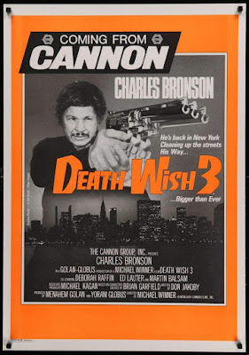
“Death Wish 3” is a 1985 action thriller film starring Charles Bronson as grieving husband turned Rambo-like vigilante Paul Kersey. I’ve had a DVD copy of it on my chair to watch for some time now. In fact, there are two copies – it was so cheap second-hand that I didn’t realise I ordered two copies by accident.
I am used to dissecting films both here and in my education, and the act of looking for something to learn, or to redeem, from any film I watch, means I must have developed a higher tolerance for what the casual viewer would otherwise call crap. I am not going to say that of “Death Wish 3”: it’s competent, it’s serviceable, it’s under an hour and a half, and I watched it until the end. It’s a Cannon Group film from the 1980s, and that was all that was expected of it at the time – it was, at least, better than their film “America 3000” from the following year, which I have reviewed previously [link].
The reason I bought this film was hearing that, to make savings in the budget, a derelict hospital in the Lambeth area of London substituted for the New York projects. It works well enough, but only if you remember to look past that fact afterwards, just like seeing the respected actor and director Alex Winter – Bill, of Bill & Ted – playing a thug. Other than that, Cannon films were very much of their time: its ownership under producers Menahem Golan and Yoram Globus spanned the 1980s, and the lower-budgeted action-led films they are most identified by exist purely to thrill their audience. Their business model was to sell the film to distributors first, then use that money to make the film – delivering maximum bang for their buck was where the profit arrived.
Having said that, thinking about “Death Wish 3” is probably not what Cannon wanted me to do. The violence is glorified, and Paul Kersey is celebrated for his kills, and it is all sanctioned by the plot, Kersey having been given free rein by the police commissioner in the first act. The film is very fast, its story having been set up within the first fifteen minutes, and every scene feels like it was once longer, but then pared down to the bone by editor Arnold Crust, a pseudonym for director Michael Winner. The gang of thugs in this film feel like the most cartoonish pack of rats that could have been written – they only look like people, and having no motivation to write them like people makes Kersey blowing them away that much easier to cheer, if you find yourself doing that. Don Jakoby objected to the rewrites of his script, his name in the credit replaced by “Michael Edmonds”.
The final ten minutes is one explosion after another, until the gang finally retreats after they see what we assume to be the burning corpse of their leader. The police commander tells Kersey he should go, buying him a few minutes – the credits roll fifteen seconds later, the music starting like the theme from “Seinfeld” later sounded. Wasn’t that show also about “no hugs, no learning”?
Perhaps the easiest gauge of “Death Wish 3” is to look up the sequel from 1987, “Death Wish 4: The Crackdown”. Without watching it, I imagine the same action formula would have been followed, but because Cannon had overspent on prestige productions that did poorly at the box office, like Franco Zeffirelli’s “Otello” (1986), so future productions would be limited to budgets of $5 million, half the budget of “Death Wish 3”. Cannon could afford Led Zeppelin’s Jimmy Page to write and perform the music for “Death Wish II”, then have Mike Moran re-record it with synthesisers for the next one, but the fourth film is down to mostly reusing recordings from previous Cannon productions. Remember, Cannon also slashed the budget for “Superman IV: The Quest for Peace” around this time, which I have also talked about [link].
I was about to write if there was anything I should take away from “Death Wish 3”, but its objective was solely to entertain me. I was diverted, so we’ll call it a score draw.
Back in 2017, I wrote about BBC One replacing its channel idents with the “Oneness” series of group portraits, photographed by the artist Martin Parr [link]. I ended that article by saying: “…getting audiences to programmes do not rely on individual channels so much, unless you count the BBC iPlayer or Netflix as a ‘channel.’ For the BBC, Martin Parr’s new idents may be more important for the ’BBC’ on screen, rather than for the ‘One’.”
On Wednesday 20th October, the BBC unveiled new branding that placed their restyled logo at the top of screens, programme trailers and poster advertising, and their channel names in smaller letters at the bottom, underlining the inevitability of the move – all programme trailers end with “available on iPlayer,” placed prominently in the middle of the screen, just as “iPlayer” and “Sounds” replaced the “TV” and “Radio” categories on BBC Online. Long gone are the days of simple radio-like announcements over slides of upcoming shows. Moreover, the way the new logo is used highlights, at a fundamental level, the change in how we watch television over the last twenty-four years.
I have always changed my website’s logo and branding when it was needed, as proved by my 300tharticle showing five logos over five years [link], as I zeroed in on the most effective way of presenting myself and my work. Likewise, the BBC’s logo, a variation of three letters in three boxes since it was first introduced in 1958, has been modified as its uses have changed, from identifying a broadcaster to supporting the quality of British programmes sold worldwide, to being a mark of reputation to sell tie-in merchandise, to being a sigil for a British national identity portrayed through cultural soft power.
As much as some people search for the opportunity to complain about taxpayers’ money being perceived to have been wasted on a logo change that is still superficially similar to the previous version, you have make changes when your current branding is found to have stopped working effectively. As stated by the BBC’s Chief Customer Officer, Kerris Bright [link], “Our research tells us that audiences think some of our services look old fashioned and out of date. They want a modern BBC that is easier to use and navigate to find the content they love and enjoy.”
If people in its own country are saying that, then perhaps it was being said elsewhere. The latest BBC logo was introduced in April 2021 on an online streaming service aimed at North America, BBC Select, and on the Australian TV channel BBC Kids, six months before the UK saw it on screen. Because these are subscription services, their audiences are also, indirectly, paying for the new logo. Meanwhile, the latest Cadbury logo, using thinner lines and closer to the company founder’s original signature, was first seen on chocolate bars sold in Australia.
A big feature of the BBC’s new branding, and one that has been introduced gradually for a couple of years, before reaching the logo, is the font. “Reith,” in its sans serif form, may not immediately be too different from the previous use of Gill Sans to the casual user, but the one-off cost of the BBC buying its own font, to use it as much as it wants, contrasts with the yearly fees to use Gill Sans, Helvetica, Futura and other fonts over the years. I could not find how much the BBC pays to use fonts, but I could also not find out how much Ikea saved in 2009 by switching their shops and catalogues from using Futura to Microsoft’s cheaper font Verdana.
The previous BBC logo was introduced in 1997. The logo that version replaced was deemed not to work when made smaller on screen – the lines under the blocks, and the spaces in the letter B, began to disappear. Its replacement was simplified, easier to reproduce and was more legible on screen.
What has changed since then is the screen. In 1997, people were still watching cathode-ray tube (CRT) televisions, beaming a raster pattern of electrons onto a fluorescent screen. LCD and LED televisions did become commonplace until 2006, when regular HD television broadcasts began in the UK. In 1997, the BBC still played their idents for their channels from laserdisc, with servers not being used until widescreen broadcasts began in 1998. They still only had two channels to worry about – the BBC News Channel began in November 1997, followed by BBC Choice in 1998. Aside from all this, watching television from a non-television screen only properly began when the BBC iPlayer download service began in 2005, only becoming a streaming platform in 2007, the same year Netflix began their own service – the flood of mobile, tablet and other connected devices began from there.
What made me realise this was using the BBC News app in beta mode. I knew about the new logo from the reports of BBC Select introducing it, finding that an upcoming update to the News app will use it. In using it, I found that the logo, placed at the top of my phone’s screen, placed its blocks further apart so they can animate more clearly: swiping down to refresh the page would stretch the blocks before reverting to their correct shape, and they would shrink to lines as I moved down the page, maintaining their presence as a constant reminder.
I thought this animation was something cute at the time, because it is something you could do on your phone, but I didn’t think it would happen on television. With the blocks making the Channel 4 logo having been broken up and thrown about since it began in 1982, and with a new ident on ITV seemingly every week as part of an artist initiative, it is now time for the BBC to stop being defined by three static, immovable blocks.
Now, they rarely ever sit: they move in, they fall into place, they move up, down, in and out. Perhaps this could have been done fifty years ago, but when BBC One and Two had idents that were live feeds of clockwork models, it wouldn’t have been practical. It certainly does not feel like the logo of a corporation that is approaching its hundredth anniversary in 2022, but that is entirely the point: this will be the last BBC logo made for a regular television screen, if not for a linear television channel. Next time: holograms, probably.
There is a lot to be said for the triviality of a broadcaster changing its logo, as I have proved, but because of the unique way it is funded, the BBC belongs to everyone, and it represents us all to the rest of the world. I want it to look its best.
I think I am writing this one more for my benefit than for anyone else.
The term “culture war” was coined by the German physicist, biologist and politician Rudolf Virchow to describe the campaign of the pre-German kingdom of Prussia, under Otto von Bismarck to reduce the influence of the Roman Catholic Church in educational matter. Translated from the German “Kulturkampf,” the term was repeated in American newspapers, later applied to opposing values, whether they be conservative or liberal, progressive or traditionalist, or urban or rural. The increasing polarisation in American politics along these lines was described in sociologist James Davison Hunter’s book “Culture Wars: The Struggle to Define America” (1991), which returned the term to widespread use.
When “kampf” means “struggle”, a less charged word than “war”, the choice of one word over the other implies an intent to win outright. Concord is never an option, let alone an objective. If one side is described as a deranged, totalitarian illiberal mob, then the other side must be too. Does it ultimately matter? Not if either side think they are having a good war.
I don’t believe “culture war” was a term ever needed in the UK until its own politics and culture experienced polarisation through the Brexit referendum - “cancel culture” and “woke” have similarly only entered common use in the media in the last five years since then. However, all the terms are snappy, emotionally charged and easy to apply to a headline, alongside “feud”, “blast”, “hits out at”, “shame”, “mob”, “cult”, “shock”, “ban”, “axe” and “row”. Any issue can be heated like a microwave dinner if the right words are chosen.
My preoccupation on “culture war” as a term comes from being, as a transgender person, the subject of a culture war. I am not on either side of the argument, I am what is being fought over – my rights are under question. This culture war appears to have begun in the summer of 2017, when the UK government announced a consultation on whether people can self-identify as their correct gender, instead of going through the court-based system to obtain a Gender Recognition Certificate.
It does not matter that this issue has apparently been resolved: the existing system is to remain in place, but applying will become online-based and substantially cheaper. It does not matter what my opinion of the issue is: if living your life authentically means you need to use whatever system exists, rather than waiting for enough minds to be changed so it can be replaced with one more dignified, you would do it – I know I did.
However, the opening of a government consultation on one specific issue became a wider argument on how a group of people should continue to fit into society – again, the Equality Act 2004 was not in question. The culture war that now exists seems to be more predicated on the use of words, from those that each side have for each other like “TERF”, “transphobe” and “gender critical”, to the checklist of what allows someone to be called a “woman” or a “man”, and whether you can change your sex at all. Framing this as a “culture war” implies that both sides are as strong as each other, but when the much of the reporting on the issue is on protecting the rights of celebrities like J.K. Rowling, Dave Chapelle and Piers Morgan to speak, it feels like the objective is to protect the most powerful people in the room - people who appear to be having a good war. Meanwhile, I need to be careful about how I speak in case it jeopardises any part of my life, from my job to friendships.
The target of legislation is no longer the Equality Act, which already had regulations on access to single-sex spaces, to freedom of expression in academic institutions. My theory is this is more a symptom of tuition fees in universities, now over £9,000 a year, making students more into customers and stakeholders that demand more of their academic journey than I would have done when I started my degree twenty years ago.
I am not willing to engage in an argument over my own rights. There are enough books being published on the subject right now, such as “The Transgender Issue” by Shon Faye, and “Trans: When Ideology Meets Reality” by Helen Joyce. Both books were reviewed in the Culture magazine of “The Sunday Times” in August 2021 under the headline “Which side are you on?” With that headline, not mine.
Once again, I am writing here more for my benefit this time around.
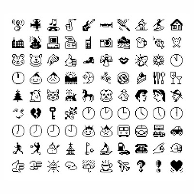
As silly as it sounds, I decided I was not going to use emoji when I realised I didn’t know what any of them were supposed to mean. Their implementation as a keyboard on my phone, one that required me to select it over the regular English keyboard, made me think they act principally as pictograms, to use as word replacements – like a lexicon, but not like a rebus. Unable to find any kind of glossary, mainly because meanings applied to particular emoji are reached over time by consensus, rather than being prescribed, I decided I was better off not using anything that could cause confusion or misunderstanding – it is hard enough doing that using English words.
Mind you, I never used emoticons or Wingdings, both intended to add simple pictures to messages like adding a sticker, so I didn’t see the line that led to emoji. Wingdings was hampered by relying on both the sender and receiver having access to the same font, and emoticons were made less clear by having to be read on their side >:/ 8-> >:-( Analgoues to both systems are found in Japan, through kaomoji (“face character”, read in the same direction as text (ˊ•͈◡•͈ˋ)૮⸝⸝> ̫ <⸝⸝ა), and in emoji (“picture character”, with no ties to emotion or emoticons).
With the latest Apple mobile system upgrade to iOS 15, I am now seeing emoji suggestions in their predictive text feature, and I cannot disable this feature, let alone the entire emoji keyboard. I know my mother only uses emoji other than a smiley face in text messages to me if they are suggested to her, like the fish that accompanied a mention of the McDonald’s Fillet-O-Fish. My biggest exposure to emoji has been on social media, where they are used to point, promote, and to clap between words to emphasise points being made. If I have ever used one at all, it may have been for effect, but it was too long ago for me to remember, and I can’t see any reason to start now.
Essentially, emoji began like Wingdings, as a proprietary font available only to users of a particular phone in 1997, the SkyWalker DP-211SW from JPhone, now SoftBank. A competitor, NTT DoCoMo, implemented their own emoji across their i-mode platform, beginning the mass usage that culminated in companies like Apple and Google supporting emoji in Japan first, and the need to attach emoji to Unicode, the international text standard, in order for the same images to be seen between different devices. This led to many pictures that existed in Unicode becoming emoji, including those previously added to the standard from Wingdings, Webdings and Zapf Dingbats.
New emoji are added yearly, and Unicode’s emoji proposal guidelines [https://unicode.org/emoji/proposals.html] are specific in what must be excluded, like logos, exact images, or having meanings that are transient or very specific – openness to interpretation and usage is built into the process. Therefore, when the “Melting Face” emoji was included in Unicode 14.0 and Emoji 14.0 from September 2021, people jumped on it as a symbol for our current times, a kind of sarcasm as things fall apart. Indeed, Jennifer Daniel and Neil Cohn, who conceived it two years before, intended it as a kind of embarrassment, a Western version of when Japanese manga characters turn into paper and float away. It sums up my inability to use such an established communication system perfectly.
Hello there. This is a video about my not having made a video in a while. I’m sorry about that, and while I continue to plan the next video, I thought I should reflect on how this happened.
The short answer is that life gets in the way, work gets in the way, and pandemics, when they happen, get in the way. Everyone has had some sort of upheaval recently, and while we wait for things to settle back down again, especially at work, you want to take more time to relax.
Another problem for me personally is finding the perfect formula for making videos for YouTube. You can’t expect everyone to be interested in the same subjects as yourself, and you shouldn’t be disappointed if not everyone engages with what you have made. At the same time, when something does hit, it will be without explanation: my video about why BBC radio had no news bulletin on Good Friday 1930 only had four views in its first two weeks, but has had over seventeen thousand since. It may be because that fact has been repeated enough times that people need to check it, but there aren’t many facts left that haven’t been endlessly explained in a video. What else is there to say when everyone has already said what you we going to say
Where does that leave me? I have concluded thatstyle is what will make for a good video on YouTube. Having good content is an objective, but presentation is more important in getting that content seen. Finding the best way to achieve that takes time, but I think I have a plan now. If engagement is what drives business on YouTube, regardless of whatever the content actually is, then you should keep refining your style until something clicks, or someone clicks. By the way, like, comment and subscribe, as they say around these parts.
There will be a new video – give it a month or so – and it will be titled “How to win a song contest, apparently”. I won a song contest, you see.
Thank you for watching. As ever, find more nostalgia culture crisis at www.leighspence.net.
My parents still listen to BBC Radio 1. They always have done – they have been listening to it since they were children, in fact since the station began in 1967. They still listen because they have never had a reason to change the channel - they want to hear new music, they don’t want to hear the same songs played all the time, and it’s one way to keep up with the grandchildren.
However, for a radio station formatted to play the most modern pop music, and current pop hits, their target listener age of between 15 and 29 means my parents should have moved elsewhere even before its dramatic realignment towards a younger audience not fully served by BBC radio, from 1993, away from catering to practically everyone. But just because a station needs to move with the times, it doesn’t necessarily mean its listeners’ habits change.
There was a time in British music history when the top 40 chart was king, and its main outlets were “Top of the Pops” and Radio 1, which had been introduced as a legitimate outlet for all-day pop music, after the closing of a legal loophole outlawed offshore pirate stations. Before then, pop music was only heard in snatches on the BBC Light Programme, for which any music only formed part of its schedule, while Radio Luxembourg was only heard in the evening. Commercial radio of any type only began in the UK in 1973 and, even then, obligations to provide non-music programmes were only dropped in the 1980s.
For a very long time, Radio 1 was the only game in town, from playing the most popular songs by day, to breaking new artists through live and recorded tracks in the evening and at the weekend. But the shows that were attracting audiences of up to 20 million into the 1990s were those playing music that now could be found elsewhere, including on MTV. Furthermore, through old Radio 1 DJs remaining with the station like Alan Freeman, Simon Bates, and Dave Lee Travis, people listening to the station as teenagers continued through their thirties.
The station’s current focus on current music is what has helped to distinguish it from commercial radio, for which most stations have no commercial impetus to play anything over than proven hits, often classic tracks first championed in previous decades by Radio 1. The BBC committed in its most recent Annual Report to measuring the overlap in its hundred most played tracks with commercial radio stations, and the breadth and depth of artists and genres it plays.
The moment at which it was proved that pop music had essentially moved on was when the band Status Quo issued two writs against the BBC – one was for damages, following their decision not to play their latest song on Radio 1, and the other was to instigate a judicial review over the song not being played on a radio station that still claimed to play songs in the top 40. The song was a cover of the Beach Boys’ “Fun Fun Fun,” performed with the Beach Boys, a song that wouldn’t have been played by Dave Pearce even if his job depended on it.
This happened in February 1996, following the Britpop boom, and one year after the chart battle between Blur’s “Country House” and Oasis’s “Roll With It” – I swore it happened in about 1993 or so. “Fun Fun Fun” entered the chart at number 24, when another Oasis song, “Don’t Look Back In Anger,” entered at number 1 – the rest of the top 10 included “Children” by Robert Miles, “I Got 5 On It” by Luniz, “Spaceman” by Babylon Zoo, and the Lighthouse Family’s “Lifted”. “Fun Fun Fun” left the Top 40 chart the following week, meaning it no longer qualified for “Top of the Pops” either. The writs were settled privately and confidentially, but I don’t think it was in Status Quo’s favour.
I stopped listening to Radio 1 in 2012, when Chris Moyles left the breakfast show – my musical tastes had developed away from the pop chart, which even the BBC played elsewhere, on Radios 2, 3 and 6 Music, the latter of which began in 2002 to provide a space for rebroadcasting the archive sessions recorded for Radio 1. Usually, if I do hear Radio 1, it is because my parents have the radio tuned to it.
It takes inspiration and vision to turn an error into a moment of serendipity, but instances of an error supplanting that which didn’t need replacing are rarer still. It was harder than I expected to compile a list of cases where a fix occurred where there wasn’t a problem, but I found more examples than I expected.
The following is a list of items, and people, that received their names by accident. In all cases, they were already known under a different name when the accident occurred. A decision will have been made to keep the mistake made, or no subsequent attempt was made to correct the mistake.
1) Cilla Black: Best known as presenter of ITV entertainment shows “Blind Date” and “Surprise Surprise,” and for her initial career as a singer – the best-selling song by a female artist in the 1960s in the UK was her version of “Anyone Who Had a Heart” – Cilla Black was born Priscilla White, first performing under the name “Swinging Cilla” at the Zodiac Club in Liverpool, following a few unplanned performances at the Cavern Club, where she worked in the cloakroom. Her surname was flipped into negative in 1961 by the local music newspaper “Mersey Beat,” a name that turned a scene into a genre. Its publisher, Bill Harry, made the mistake. Cilla Black signed with manager Brian Epstein in 1963, having seen her perform with The Beatles, and then on her own.
2) Ovaltine: To my knowledge, I have never drunk Ovaltine, but only because it sounds like I would still prefer hot chocolate. A flavouring product made of malt extract, whey and sugar, with cocoa for taste, Ovaltine is added to milk to make what is traditionally a bedtime drink in the UK, alongside the similar Horlicks. The drink originally also contained eggs, and is still known in its birthplace of Switzerland and elsewhere under the name Ovomaltine. However, the name change for the UK was made long before eggs were removed from the recipe – it was a spelling mistake on the trademark application, contracting the name down.
3) Lew Grade: A talent agent and TV executive whose companies, ATV and ITC, were associated with everything from “Crossroads” and “Thunderbirds” to “The Muppet Show” and “Jesus of Nazareth”, Lew, Baron Grade of Elstree entered showbusiness as a professional dancer. Born in Russia as Lev Winogradsky in 1906, moving with his family to the UK at the age of five, “Louis Grad” was the name he danced under, until a typing error in a Paris newspaper report added a vowel. The name “Grade” was also used by his brother Leslie, also a talent agent, and passed to his nephew Michael, who later ran BBC One and Channel 4. However, Lew’s other brother, Bernard Delfont, originally also a dancer, continued to use his own stage name to distinguish himself from his brothers.
4) “Ye Olde…”: This is a case of a term being used for effect, when everyone knows it is wrong. The English language as written in the years until the post-Tudor period continued to use the letter “thorn” where we would use the two letters “th”, making “the” into “þe”. The first printing presses often substituted the thorn for “y”, which more closely resembled how most people wrote it, especially when Gothic type made it resemble a closed þ. Now, the y sound of “ye” is deliberately, and incorrectly, used and pronounced retroactively to evoke an old-time period where it was never used.
5) The Hindu-Arabic Number System: The Persian mathematician Muḥammad ibn Mūsā al-Khwārizmī wrote a treatise in around 825 AD titled, in modern English, “On the Calculation with Hindu Numerals”. Three centuries later, it was translated into Latin as “Algoritmi de numero Indorum” – “Algorismus on the Indian Numbers” – giving the author a Latinised name. Alongside the work of the Italian mathematician Fibonacci, the treatise served as the introduction of “Arabic numerals” to the West, e.g. 0 and 1-9, but it became known as “algorism” or “algorithm”, using the “originator’s” name to describe a type of arithmetic, instead of just using a word like “arithmetic.” As this number system became dominant, to the point of no longer needing a distinguishing name, the word “algorithm” would later be applied to definitions relating to computer instructions.
Watching Warner Bros’ latest film “Space Jam: A New Legacy” at the cinema was an interesting experience. With a story based within the company’s computer servers, I needed the cinema-sized screen to catch all the references to the company’s characters from their films and “properties” in the crowd watching the climactic basketball match between LeBron James and the program running the show, “Al-G Rhythm”.
The film has received negative reviews for the general product placement of, well, Warner Bros. itself: it is strange to see a family film sprayed with characters and locations from far more adult productions, like “Mad Max: Fury Road”, “A Clockwork Orange,” “Game of Thrones,” Pennywise from “It”, and Vanessa Redgrave’s Sister Jeanne des Anges from Ken Russell’s “The Devils” – I sincerely doubt the latter would get as worked up over basketball than what goes on in their own film (really, look it up).
As a film fan and student, I believe Warner Bros. is the Hollywood studio, shaping the art form, staying on top of it for a hundred years, and preserving its past, even if through mergers and acquisitions: the new “Space Jam” film features MGM’s “The Wizard of Oz” and Tom & Jerry alongside Hanna-Barbera characters, including The Flintstones, and RKO Radio Pictures’ original King Kong. The breadth and scale of Warner Bros. today is belied by only just mentioning Looney Tunes now, followed by DC Comics, HBO, CNN, and “Friends”.
It is meant to be distasteful to bring business into art, but the history of Warner Bros. is the exception that proves the rule: “The Jazz Singer” is not known as “Warner Bros’ Supreme Triumph” for nothing, not least because the studio proclaimed the film as such upon its release in 1927. Far more than making “talking pictures” viable commercially, through Al Jolson’s effortless use of his established catchphrase “you ain’t heard nothin’ yet,” the notion of what a ALL FILMS made before or since “The Jazz Singer”, and the idea of film itself as a medium, will feature a soundtrack of some kind, whether one is added to a “silent” film, or even when a conscious decision is made to be “silent” for any length of time, for Warner Bros. and Western Electric developed the Vitaphone sound-on-disc system to provide musical accompaniment and sound effects in all cinemas, even those that could not afford its own band or orchestra.
For a company only properly incorporated in 1923, and having only built their studios in Sunset Boulevard in 1918, Warner Bros. had enough cash from the box office of “The Jazz Singer” to buy up a brace of music publishers, suddenly a necessary part of film production, and the Stanley theatre chain, which came with a one-third ownership of a far bigger film producer and distributor: the current Warner Bros. studio in Burbank, California was built by First National, whose name continued to be used for some time. These investments helped to pioneer both the musical film genre and the initial use of Technicolor, and to allow a switch to comedy, horror and gangster films when audiences’ tastes changed.
However, the content-rich current state of Warner Bros. is precisely down to the corporate upheavals in Hollywood that took place following the anti-trust lawsuits that separated cinema chains from film producers, the rise of television, and sheer bad luck. Its massive purchase of the Turner Broadcasting System in 1996 reunited Warner Bros. with the pre-1950 films and cartoons it sold in 1956 to support itself at an uncertain time, but this also came with the pre-1986 MGM film library, RKO’s library from “King Jong” to “Citizen Kane”, and all of Hanna-Barbera’s cartoon series too. Ted Turner built up this collection to provide content to his TV networks, from Cartoon Network to TBS and TNT, but he sold on the MGM film company because he overextended himself, despite keeping the rights to their films. Similar divestments by Warner Bros. in previous years included Nickelodeon, MTV and VH1, along with their cable TV network that built these channels, and the computer game company Atari.
Watching “Space Jam: A New Legacy” made me think I was watching a film studio writing a love letter to itself, albeit one I’ll happily act as a co-signatory. What I think the scriptwriters could have done, considering the film is mainly set in a virtual reality run by a computer algorithm, is they could have made more of the connection with “The Matrix”, especially with Warner Bros. releasing the fourth film in the series this Christmas.