Showing posts with label Guinness. Show all posts

07 September 2024

FROM A WHISPER TO A SCREAM [465]

(2016)

I know the room in which I write these articles is messy, but at least I can still see the floor. For me, the archetypal definition of a messy room was the one I caught a plane to see. 

Francis Bacon was the Dublin-born British painter of visceral, violent intensity and twisted limbs, often in series of diptychs and triptychs, which remain unsettling and captivating. For me, the knowledge they were created in a studio setting of chaos and debris could not be separated from the finished works. Pictures of Bacon in his studio show him amongst various piles of paint pots and boxes, ripped-up books and newspapers lining the floor, paint mixed into the door and walls, but oddly nothing that could be mistaken as trash.

I am sure Bacon would have approved of my itinerary on 1st March 2016: the Guinness factory; St Patrick’s Cathedral, the Anglican cathedral where Jonathan Swift was once Dean; Trinity College library and the Book of Kells; and the Hugh Lane Gallery in Parnell Square, where Bacon’s studio was reconstructed and opened for public view in 2001. 

Virtually untouched since Bacon’s death in 1992, the studio was bought in its entirety by the gallery in 1998, shipping its entire contents from London, from the walls, windows and doors to even the remaining dust, with around seven thousand individual items digitised and recorded before being slotted back, like a jigsaw puzzle, into its original strewn form. You can look through the windows, then review the database on screens surrounded by the last six canvasses that remained unfinished after Bacon died.

(2016)

During the week I was in Dublin, I visited the studio twice, and overwhelmed both times. Framed by its windows, I could only take in the tableau as a whole – I never thought to look through the database, because I had no idea where to start. Only now looking back through the pictures I took through the window, using an iPhone 6 with a good-for-the-time 8-megapixel camera, I was immediately drawn to the numerous tins of white Dulux Trade Vinyl Matt Emulsion paint – it was mentioned that Bacon used acrylic paint in addition to oils, and these appeared to be it. I tried to find what use it would have in an artistic context, but I was being pointed back to its suitability for “low traffic rooms” like hallways.

Boxes that previously contained VAT 69, a blended scotch whisky, and Krug champagne litter the floor, but like the door and walls, may have been used to blend colours. I read later that pairs of corduroy trousers were also kept in the room, which I couldn’t quite see, that had paint applied to them and used to add texture. Bottle caps are as often used to apply paint to canvas as much as the numerous paintbrushes. Reference books, prints and photographs are scattered – I can only assume that Bacon’s filing system was just knowing where everything this, but seeing a book on Velázquez being near the surface was appropriate, his portrait of Pope Innocent X informing many Bacon studies and portraits.

I am not sure about needing to retain the many cans of varnish and fixative, but in looking at the positioning of the main H-frame easel in the room, with a skylight looking down on it, and in front of a window, Bacon had his back to most of the room, with everything having the potential to be some sort of a tool at any point. That can be the only reason there was no need to clean up the room: everything was where it needed to be.

(2016)

11 December 2022

THE HIT OF THE WHOLE FRUIT [374]


As much as I like Coca-Cola, I am increasingly turning to British soft drinks. Dinner usually includes a glass of Vimto, while I may choose Tango or Tizer when I am out somewhere. If I find a pub serving Pepsi instead of Coke – I really don’t like Pepsi - that means their supplier should have also stocked them with R. White’s lemonade, so I will choose that instead.

I don’t think this is because my tastes have changed, more than my consciously trying other flavours because my tastes do not include alcohol, let alone tea or coffee. I am happy Guinness 0.0 now exists, while I consider Vimto, a cordial of blackcurrants, grapes and raspberries, to be a non-alcoholic version of Pimm’s No. 1, until they join the bandwagon. A good non-alcoholic drink should taste similar to the fuelled-up version anyway, as Budweiser Prohibition Brew (now Budweiser Zero) also proved.

And then there’s Tizer. Introduced in 1924, Tizer is like a mid-point between Vimto and the strange, sherbet-like (to me) taste of Irn-Bru, the official drink of the Cop26 climate summit when it was held in Glasgow, and a drink I have since found contains quinine to taste, and whose colour I keep calling “Agent Orange” instead of “sunset yellow”. With Tizer having a strong citrus flavour comprised of whatever has been put into it, including what gives it its particularly red colour – it’s not just Coca-Cola that employs the idea of “secret recipe” in their mystique, I mean advertising - I usually say that Tizer “tastes of red”. The flavour is of itself, making comparisons difficult. Tizer’s original name was “Pickup’s Appetizer”, named for its inventors Fred and Tom Pickup, making it an aperitif in the same way that Jägermeister is meant to be a digestif.

Tizer has been owned and made since 1972 by A.G. Barr plc of Cumbernauld, originators of Irn-Bru in 1899, moving the drink there from its native Manchester, from where Vimto also appeared. Drinks sold under the “Barr” name include their own cola, cherryade, lemonade, orangeade, limeade, bubblegum flavour, ice cream soda, ginger beer and “shandyade”. Reading through this list made me realise that supermarket own brand drinks have also supplanted the old brands, being sold just as widely, taking up as much space on shelves at a lower cost, and probably not too dissimilar in taste.

From what I can see, or from what the shelves of my nearest corner shop can attest, Barr is the last of the regional soft drink makers that were the main suppliers of soft drinks for its local area, much like channel 3 on British televisions was for Granada, Meridian or Tyne Tees, before “ITV” became the main name. Other such brands with history reaching back to the 19th century like Corona, Alpine and R. White’s, of which only the lemonade now remains on sale, wouldn’t be sold nationwide until the 1960s and 70s.

As it stands, British soft drinks are dominated by three companies: alongside A.G. Barr is Britvic, which owns Tango, Robinsons fruit drinks and R. White’s in addition to producing Pepsi, 7Up, Gatorade and Lipton’s Ice Tea under licence; and Coca-Cola which, despite being an outpost of the US giant, originated the pineapple and grapefruit drink Lilt in the UK in 1975. In other words, they compete on brands rather than flavours. It isn’t a surprise that Corona, bought by Beechams in 1958 and sold to Britvic in 1987, has failed to survive while its orange soda brand Tango, which was introduced in 1950 and produced alongside a separate Corona orangeade, that must have tasted different in some way to be worth the effort, has thrived since the 1990s through its use of surreal and absurdist advertising – “You know when you've been Tango'd” was a slogan used in everyday life at one point, whereas “I’se Got the Ize”, from a 1986 Tizer ad that showed the drink changing the drinker’s speech, didn’t take so well. 

The temperance movements of the late nineteenth and twentieth centuries have, while losing out to liberation and moderation, have left their mark in what I get to drink instead. With Coca-Cola gaining popularity quickly due to its being introduced in 1886, the same year alcohol was banned in its home city of Atlanta, “Vim Tonic”, later Vimto, was introduced in Manchester in 1908 just as a new Licensing Act sought to increase alcohol duty and reduce the number of pubs. This history gives the impression that soft drinks are what you have “instead”, which for me is preferable from umpteen types of beer and wine.

That said, I can’t think of an alcoholic equivalent of Tizer. Aperol? Ruby Grapefruit Bacardi Breezer?

14 November 2021

BLUE, BLUE, MY WORLD IS BLUE [319]


Sometimes, you only notice a trend when it has already fully established itself, leaving you to trail back to where it might have begun. My latest such realisation came in, well, the alcoholic drinks section of a local supermarket, one which still separates out the non-alcoholic versions of well-known brands into their own, comparatively tiny section.

I had been looking for Guinness 0.0, which is basically the standard draught Guinness with the alcohol filtrated out at the end of the production process, which has recently been reintroduced after a contamination issue led to its withdrawal in October 2020 after only its first two weeks on sale. I remember it tasted pretty much exactly like normal Guinness, if a little lighter, with notes of coffee – here’s hoping that wasn’t what was wrong with it.

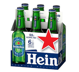
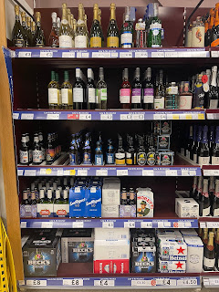
The design of Guinness 0.0 cans is pretty close to those of the standard brand, except for stating “0.0” in large blue lettering, and blue bands on the top and bottom of the cans. The supermarket did not have it, but with the other non-alcoholic brands grouped together, I realised that similar design choices had been made on the packaging of other beer brands like Heineken, Beck’s (named "Beck's Blue"), Moretti and San Miguel, but also on Kopparberg cider, Freixenet sparkling wine, and Gordon’s and Tanqueray gin.

The shelves that inspired this article


While not a hard and fast rule – Budweiser Zero removes the red from the standard design to leave it in monochrome, and Carlsberg 0.0% outright replaces its green colour with blue – the use of blue highlights on existing branding, to emphasise the taste identified with the brand over the removal of a major element and selling point of that brand, is something that must have slowly sprouted over the last year, as brands latch on to a growing taste and trend. 


I rarely drink alcohol as both a preference and a rule, so the opportunity to avoid it altogether will make having a Guinness even more enjoyable, while I wait for Pimm’s to follow suit. Therefore, another interpretation of this use of blue is to indicate safety, that this drink you would only have in certain acceptable circumstances is safe to drink anywhere, at any time, without having to think about it. My reason for thinking this is intentional is having seen Heineken 0.0 on sale in a shop that otherwise did not sell alcohol, which was a high street branch of the newsagent-stationers-bookshop WH Smith – thinking about it further, the blue accents on the Heineken can made it fit in with the soft drinks stocked next to it.


Having said all this, I live in a country where the colour blue on food and drink packaging is more associated with a conspiracy theory that Walkers Crisps changed the bags for their cheese and onion flavour from green to blue, never acknowledging they changed it, when in fact they have always used blue, despite the majority of other brands use green.


Always read the label.

18 February 2018

WHAT THE WORLD WANTS TODAY IS THE REAL THING [96]


As one of the most popular and ubiquitous products on Earth, Coca-Cola only needs to advertise its brand either to keep itself in the front of people’s minds, or when they need to tell us how many of their drinks have no sugar in them. The Coke brand is solid: its logo has barely changed since the drink was introduced in 1886, the bold colour red is used across all variations, and the silhouette of the “hobbleskirt” bottle is immediately synonymous. To that end, Coca-Cola advertising can be brilliantly straightforward: apart from American taglines like, “Coke Is It!” and “Red, White and You,” I remember a British poster ad, from a few years ago, of a Coke bottle against a red background, with the line, “And what would you like to eat?”
Haddon Sundblom

Then there is the “Yes” girl – the Coca-Cola Company’s website points out it would never say “girl” these days. The most famous “Yes” girl ad was from 1946, in a billboard ad painted by Haddon Sundblom, who had also been painting the Coca-Cola Santa Claus, the character’s face inspired by his own, since 1931. The ad features a woman in a bikini, sat on a beach, perhaps propping herself up after sunbathing, being handed a bottle of Coke by someone outside of the frame. Other than the Coca-Cola logo displayed on a red disc like an enormous button, the only other element is the word “Yes” - the woman is sitting on sand, but the background is white, as in blank.

I first came across this ad in the definitive history of the drink and the company, Mark Pendergrast’s “For God, Country and Coca-Cola” – this book also happens to print, towards the back, what is believed to be the secret recipe for Coke which, apparently, includes coriander, cinnamon and nutmeg. It just didn’t make sense to me: who is saying “yes” to what? Is it from the woman to the drink, or from the hand to the woman? Am I, looking at the tableau, supposed to be saying “yes” to the drink, or the woman, or both?

It should be noted that the Freudian, psychological approaches to advertising and consumer behaviour would only become commonplace in the next ten years, and Coca-Cola had its own rules on how people would be used in advertising, seeing as it is drunk by everyone: both women would be seen in roles as varied as men in Coke ads, especially in uniform during the Second World War, and even after a switch in advertising agency in 1950 meant painted ads were swapped for photo shoots. Perhaps, at that point just after the end of the war, a focus on being seen to enjoy life was paramount.

With 2018 eyes, the 1946 “Yes” ad does not look innocent, but it is only because we are wiser to practices used in advertising since then, surrounding the use of women as a glamourous garnish, that would be interpreted as sexist. Along with Sundblom’s other painted ads for Coke, the “Yes” girl occupies the same area of popular art as John Gilroy’s work for Guinness, including the famous toucan, but we know straplines like, “Lovely day for a Guinness,” and “Guinness is good for you,” are not claims Guinness would, or could, make nowadays. Having the single word “yes” is too oblique for an ad, and too open to interpretation one way or the other – perhaps Coca-Cola should have put the “yes” in quotation marks, like they did elsewhere.

26 May 2017

THAT SOUR GIN AND TONIC ONLY MAKES YOU CRY [57]


In my ongoing quest to look and sound more witty and urbane, I felt that I should, at least, try a gin and tonic - again. I had once bought a can of pre-mixed gin and tonic, took one sip of it, and spat it straight out again, pouring the rest down the kitchen sink. Willing to admit that may have been my fault, never having been one for anything that tastes remotely bitter, I have tried again but, as I write this, I am taking the smallest sips possible – why did anyone, apart from me, think this was a good idea?
Almost the most British of cocktails, gin and tonic was borne out of necessity. When India was under British rule, it was necessary to down large quantities of quinine, at least eight times more than you now find in regular tonic water, in order to fend off malaria, although you are now more likely to use it to restless leg syndrome. Therefore, to take away the taste of something that, to me, tries to remove all the moisture from the inside of your mouth, gin was added, from the ration already given to British officers in India, to make the concoction more palatable, or bearable.
However, that does not explain why we drink it now – like so many things, like tea, silks, minerals, curry and chintz, the British took it home with them. Accidentally keeping in with this, had a chicken tikka masala for dinner before trying my G&T, although this is a British variant on an Indian tradition, and its being a microwave meal means it counts for nothing at all.

Pressing on through more sips of the G&T, I realised I should try to drink it in the same manner I was advised to drink Guinness, having been on a tour of their factory in Dublin last year: apparently, you should draw a decent amount into your mouth, and then gulp it, before the more bitter notes of the hops (or, in this case, the quinine) act on your throat.
This all sounds like I am trying to learn how to be an adult, expected to “hold” their drink, to be able to drink with friends, to do this and that. However, when you don’t like the idea of being drunk, passing from the “witty” phase to the “boring, or out of control” phase, or when you don’t like the idea of being in a pub, much preferring a good restaurant, there is much less of a need to have a drink. Sure, I will have a drink now and then, but “now” and “then” are usually separated by quite a few days. In short, I don’t not drink to be anti-social, which is about as awkward as telling some people you don’t like going to the pub.
Will I try gin and tonic again? The flavour of the juniper berries in the gin are somewhat overtaken by the bitterness of the quinine so, for me, the next time might be a gin and… anything else.

14 October 2016

GET HIGH, GET TALL, YEAH WE’RE LIGHTER THAN AIR [22]


I am not really qualified to talk about alcoholic drinks, as I only drink them every so often, and usually just to get the point of what the drink maker was intending – a half-pint of Guinness, a Pimm’s and Lemonade, and that’s about it. I certainly don’t understand the desire of some to get intentionally drunk, let alone those who think thrusting a condition of being less inhibited upon yourself makes you more able to be creative – one drink usually leaves me prepared for a good night’s sleep.
However, I can still talk about the history of Special Brew, both venerated and berated as the stereotypical British “tramp fuel,” without drinking it. It is a strong pilsner beer, usually found only in cans, and was first brewed in tribute to Sir Winston Churchill – appropriately enough, a new Five Pound note will survive being dunked in a can of Special Brew, and presumably also a glass of it, but the image of the drink in the UK means Special Brew is not often pictured as being drunk from a glass.
The Churchill connection comes from a visit he made to Copenhagen in 1950 while in between stints as Prime Minister, which Carlsberg commemorated with a special drink that was infused with the flavour of cognac, to match his taste for brandy. He would later name it “Commemoration Lager,” when Carlsberg delivered two crates to him later, but it became “Special Brew” on when it went on general sale – it was originally “Easter Brew” in its native Denmark, but that name is now on another, weaker beer.
Despite the pedigree the drink hoped to create, the social impact of alcohol as a whole led Carlsberg, in 2015, to make it weaker, or less efficient in getting you drunk. Any drink over 7.5% ABV is taxed more highly in the UK, and Special Brew, at 9%, was made to fit. To fit a pledge to provide no more than four units of alcohol in one can, signed between beer companies and the UK government, the original 500 ml can was reduced to 440 ml – so, so long as you have one, it is now fine. (At the other end of the scale, drinks under 2.8% have less duty applied to it, as anyone that insisted on choosing “Guinness Mid-Strength” will know – there is no “Low-Strength”, so where’s the “Mid”?)
I am sure Special Brew tastes fine for those choosing to drink it, and its poor image in the UK is balanced by more than two thirds of sales apparently being made to “older professionals in management positions,” but its image could be overturned by selling it in large, ornate bottles, with one of those old-fashioned stoppers attached to it, and it was marketed like a craft beer. If it is to be thought of as highly as Churchill, Special Brew shouldn’t be sold in a can.