Showing posts with label coke. Show all posts

29 April 2023

TASTE OF A NEW GENERATION [394]


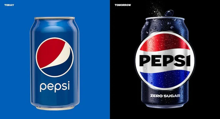
Marking its 125th anniversary in 2023, despite having first gone on sale as “Brad’s Drink” in 1893, Pepsi unveiled its latest rebrand in North America on 28th March, rolling out to the rest of the world in 2024. Currently a red and blue circle bisected by a white line with “pepsi” placed under it, the new logo returns the name in bold capitals to the newly wavy line, termed by them as a “pulse”, in what is essentially a refresh of the branding used from the 1960s to the 1990s.

Pepsi’s Chief Marketing Officer, Todd Kaplan, said in PepsiCo’s press release that “This new visual system brings out the best of the Pepsi brand's rich heritage, while taking a giant leap forward to set it up for success in an increasingly digital world.” Not unlike the BBC’s brand refresh from 2021 [which I discussed here], the press release accepts their brand needs to work beyond the static logo featured on the products themselves: “the revitalized and distinct design introduces movement and animation into the visual system, unlocking more flexibility for Pepsi to move between physical and digital spaces, from retail shelves to the metaverse.”


However, the sentence that made me react irrationally was: “The logo and visual identity thoughtfully borrows equity from its 125-year history and incorporates modern elements to create a look that is unapologetically current and undeniably Pepsi.” My initial thought was, “Borrows equity”? Surely it would have been easier to admit “our older logo is more recognisable, and our customers are more nostalgic for it, so we are introducing a new version of it”? And doesn’t “equity” mean the value of something minus its liabilities, so Pepsi are removing elements of their branding that aren’t working? Does this explain why the Pepsi brand isn’t as timeless as that of Coca-Cola, despite how many “Coke” wordmarks they have used over time?

I now know that “brand equity” is a more specific term, relating to the social value of a brand-name, measuring its worth as a financial asset, as a product among other similar items, and public awareness. Reinforcing brand awareness not only involves removing elements that no longer work, but questioning whether what does still works as effectively as it did upon introduction, introducing new elements while maintaining consistency. The BBC logo was changed because it was required to be more flexible on screen; the cultural goodwill towards Volkswagen engendered by their Type 2 camper van helped it pass the “Dieselgate” scandal with the new, nostalgic ID. Buzz electric vehicle; the Co-Op Group reintroducing the original version of their “cloverleaf” logo in 2016, a much stronger brand than had been used in the previous twenty years [which I also talked about here].

In the knowledge of the “cola wars” of the 1980s, the chief objective is to delay changing the product for as long as possible. Coca-Cola famously blinked in 1985, using the “New Coke” controversy to reintroduce the original recipe under the new brand “Coca-Cola Classic”. Likewise, Pepsi was reformulated in the 1920s, after it had been bought out of bankruptcy. For me, Pepsi will remain the cola sold when the restaurant doesn’t serve Coke, but I am well aware of it. 

24 April 2022

LISTEN TO ME, DON’T LISTEN TO ME [341]


Hearing the term “fear of missing out” or “FOMO” gives me no reason to fear. It sounds like a term invented to encourage you to “keep up with the Joneses” by tying that impulse to your quality of life, turning it into something too dangerous to get involved with. “FOMO” was first observed as a phenomenon by a marketing strategist, Dr Dan Herman, in 1996, reinforcing this thought for me.


I may have also dealt so often in nostalgia that I believe it is possible to return to everything. There is no fear of missing out on something because there is no way you can miss out, unless you limit its availability. This may be the result of the “Disney vault”, where The Walt Disney Company limited VHS releases of their classic films to keep them special and scarce, until DVD, Blu-ray and streaming video made this practice obsolete.


I thought the limited-edition Coca-Cola Intergalactic flavour, the first in a series of “Coca-Cola Creations”, was only to have been available in North America, but coming across it in my local supermarket was enough for me to try it. The Coke website stated that “we will collaborate to create new flavours, designs and experiences with Coca‑Cola, reimagining our iconic product in time-limited edition flavours which take inspiration from relevant moments across culture, music and gaming”. In this case, Coca-Cola was the first soft drink launched into space, on the Space Shuttle Challenger on 12th July 1985, the day after the Coca-Cola Company announced they were returning from New Coke to the classic formula.


Starting with Coca-Cola Zero Sugar, Intergalactic turned its dark caramel colour to red, its ingredients including carrot and blackcurrant from concentrates, while the taste is much like the existing vanilla Coke, with a slightly chocolate aftertaste, at least to me. It tasted fine, but not to dissimilar to a Coke flavour I can continue to drink after Intergalactic is withdrawn.


Meanwhile, I have only just started playing Wordle, a daily online word game so successful upon its launch in 2021 that it was bought by “The New York Times” for a substantial sum. Up to now, I had only seen the yellow and green grids posted on Twitter by other players, showing how well they did in guessing what letters made up that day’s five-letter word, and where that letter was placed, although the abstract nature of just seeing the letter-less grid meant it took until an idle moment on approximately day 290 of the game’s history for me to even think of trying the game. I have since concluded the first of my six attempts to guess the word should always be “quiet”, covering two vowels and the first row of my keyboard.


Wordle is a “special edition” word game in the sense that everyone is given the same word to guess in each twenty-four hour period. With no ability to go back to previous games, and with “The New York Times” issuing cease-and-desist orders on copycat websites where you can play previous days’ games, or multiple games a day, you must make a daily appointment to play, or risk missing a game on which you can never catch up. This becomes particularly frustrating if you failed to guess the word that day, or continuously failing to get the rest of a word when you got the second half fairly easily. All word games lead me to think my vocabulary is too small, so that might just be my problem.

The abbreviation “FOMO” was coined by Patrick J McGinnis in 2004, in the Harvard Business School magazine “The Harbus”, but alongside it was “FOBO”, for “fear of a better option”, the act of not making a choice because you are waiting for a better opportunity.

To me, Coca-Cola Intergalactic and Wordle are impacted by “FOBO”. One is a further dilution of the original Coke formula that had no variations until the launch of Diet Coke, but while soft drink manufacturers are fighting to hold attention, the Coca-Cola Company itself took a bolder decision by acquiring Costa Coffee in 2019 to catch where some consumers were going. While “The New York Times” may have avoided its own fear of missing out on the next big thing by buying Wordle, closing down unauthorised copies, without offering what made them so popular as an alternative to their own product, makes me think that eliminating other options for diversifying the game was needed over providing those options themselves, especially to keep the “FOMO” factor of the standard Wordle format. 

02 August 2020

A WHOLE LOT OF FUN, PRIZES TO BE WON [253]


Coke Zone was the name of a loyalty points scheme operated by Coca-Cola from 2008 to 2013 across its range of soft drinks. By collecting codes printed on bottles, boxes and can ring pulls, the points you accumulate could buy money-off vouchers to use in stores, magazine subscriptions, cinema tickets and, if you were lucky, expensive electrical items like games consoles and cameras.

I have great memories of Coke Zone. Diet Coke is still my favourite drink, and because I rarely ever drink anything alcoholic, Diet Coke is often all I ever drink, apart from water. Introducing a loyalty scheme to a product for which I was already a loyal customer was very welcome indeed.

To be honest, I practically fleeced Coca-Cola when they ran Coke Zone. I diligently collected the codes to enter on their website to collect the points, and friends and work colleagues that knew I was collecting the codes gave me their bottles and cans to throw away, after I wrote the codes down. You were only allowed to collect fifty points per week, and while a 330ml can gave you one point, a 500ml bottle gave you two, and a multipack scored five points, I often reached their weekly limit due to the codes I was given.

In return, I received many things: 100 points could be exchanged for £5 vouchers to use at HMV to buy CDs and DVDs – before 2011, when HMV also owned the bookshop chain Waterstones, I could redeem them for books as well. I received quite a few tickets to watch films at my local cinema, also at 100 points each. I had a year’s free subscription to the film magazine “Empire.” I also had a money-off voucher for a clothes shop, which I remembered using on a pair of shorts.

The high point was when I actually caught a big-ticket item on the Coke Zone website, which often disappeared as quickly as they appeared: on a day off from work, having collected enough points to participate, I spent 600 points to buy a Sony Cyber-Shot DSC-T90 camera, which cost about £250 in 2009 – it was either one of them, or an Xbox 360 console. I still own and use this camera.


When Coca-Cola started to wind down Coke Zone in 2013, the offers had become less enticing – increased participation from people in the points scheme had caused inflation, with vouchers costing 100 points having increased to 150, then 200 points, while larger items, previously costing over a thousand points, were replaced with prize draws, spending fewer points to enter. Coca-Cola provided a final round of larger products to burn up the piles of points that some, like me, had amassed – I bought a nineteen-inch Sony Bravia television which, like the camera four years earlier, would have costed around £250, but costed 1,500 points. Once Coke Zone finally closed, I had received prizes and vouchers worth a total of over £650.

I have never been that lucky since, although I rarely enter any competitions. However, I have benefitted from other points reward schemes: HMV started their own, Pure HMV, whose money-off vouchers came in good use when I realised I needed David Bowie’s complete discography after he died. Like Tesco Clubcard and the Boots Advantage card, my loyalty to buying products from them that I could have bought elsewhere is being rewarded, rather than buying one brand instead of another – I guess the 1980s “cola wars” between Coke and Pepsi never really ended. Meanwhile, my bank introduced a current account in 2014 that offered its own yearly choice of rewards, one of which was six free cinema tickets per year. I have paid to watch a film in a cinema only a few times in the last ten years, and one of those times was for “Cats.”

My Coke Zone online login apparently still works, but Coca-Cola’s website now only offers product news and the occasional competition, which is perhaps all it should ever have done. Coca-Cola is a brand that does not need to advertise as much as other products, such is its place in popular culture – I wish I could find a copy of the poster I once saw that shows a Coke bottle with the slogan, “And what would you like to eat?” They only need to advertise to remind people they are there, which is why you see Coca-Cola ads most often at Christmas, Easter and during the summer.

Fortunately for Coca-Cola, I would have continued drinking Diet Coke regardless of whether Coke Zone existed, but I took advantage of it while it was there. My continual loyalty to them has since been measured in pounds Sterling, rather than points.

29 October 2018

JUST FOR THE TASTE OF IT [133]


Every so often, I will look in a shop that purports to sell American candy and drinks, or look online, to see if they have cans of Tab, the original Diet Coke, for sale. It has been over two years since I last tasted Tab, and over two years since the shop I bought it from had closed. A seller on Amazon is apparently selling two cases of twelve cans, imported to the UK, for nearly £60 – this is approaching wine prices, but unless I can find something for less, it may be my last resort. Is it the taste, or the thrill of the chase, that keeps me looking?
It’s not just me – even in its country of origin, people are getting desperate. Stories have been running about the largest independent distributor of Coca-Cola drinks in the US, covering fourteen states, deciding to discontinue Tab. With what remains on store shelves, supplies are drying up, and the search for its delightfully bitter aftertaste – a result of sweetening with saccharine, instead of the smoother taste of aspartame – continues into neighbouring states, and further afield.
Really, it’s not that surprising that Tab is easier to find – its original success threatened its company’s brand. Coca-Cola introduced Tab in 1963 as a zero-calorie alternative to, well, itself. It’s pink-coloured can was marketed to women, and its name, originally chosen from a computer printout of random letter combinations, because the name “Diet Coke” was considered heresy to the original drink at the time, was marketed to everyone with their weight on their mind. All of Coca-Cola’s zero-calorie drinks used the Tab name in the 1970s, including what became the diet versions of Sprite and orange Fanta.
However, diet Coke (originally with a small “d,” with the strapline “just for the taste of it”) was launched in 1982 at the point where the original Coke was losing out to the growing market of diet drinks – there was a diet Pepsi by then too. The taste was enough, making Diet Coke the fourth-biggest drink in the US by the end of 1983, and just to show the power of the Coca-Cola brand, taste tests showed people favoured Diet Coke from vending machines even when the cans actually contained Tab – no wonder present Tab cans take pains to tell you where they came from.

However, taste tests can lead you down a blind alley. The Tab formula was changed in 1984 to use the smoother-tasting aspartame, as used in Diet Coke, and an outcry reversed it – saccharine is just part of the taste. The New Coke debacle of 1985 repeated it, because more people said, in tests, they preferred a sugary version of Diet Coke. In both cases, habits were changed, and taste buds went mad. Now, in the face of replacing Tab with Diet Coke because you cannot get Tab anymore, the same thing will happen.
I would like to see where this goes. In the UK, there has been a conspiracy on social media that Coca-Cola Cherry has been withdrawn, when this is not the case – that doesn’t bother me, I have only ever bought it by accident. However, should something only receive a resurgence when there is a threat to take it away? I would rather not spend £60 on soft drinks, I know that much.

18 February 2018

WHAT THE WORLD WANTS TODAY IS THE REAL THING [96]


As one of the most popular and ubiquitous products on Earth, Coca-Cola only needs to advertise its brand either to keep itself in the front of people’s minds, or when they need to tell us how many of their drinks have no sugar in them. The Coke brand is solid: its logo has barely changed since the drink was introduced in 1886, the bold colour red is used across all variations, and the silhouette of the “hobbleskirt” bottle is immediately synonymous. To that end, Coca-Cola advertising can be brilliantly straightforward: apart from American taglines like, “Coke Is It!” and “Red, White and You,” I remember a British poster ad, from a few years ago, of a Coke bottle against a red background, with the line, “And what would you like to eat?”
Haddon Sundblom

Then there is the “Yes” girl – the Coca-Cola Company’s website points out it would never say “girl” these days. The most famous “Yes” girl ad was from 1946, in a billboard ad painted by Haddon Sundblom, who had also been painting the Coca-Cola Santa Claus, the character’s face inspired by his own, since 1931. The ad features a woman in a bikini, sat on a beach, perhaps propping herself up after sunbathing, being handed a bottle of Coke by someone outside of the frame. Other than the Coca-Cola logo displayed on a red disc like an enormous button, the only other element is the word “Yes” - the woman is sitting on sand, but the background is white, as in blank.

I first came across this ad in the definitive history of the drink and the company, Mark Pendergrast’s “For God, Country and Coca-Cola” – this book also happens to print, towards the back, what is believed to be the secret recipe for Coke which, apparently, includes coriander, cinnamon and nutmeg. It just didn’t make sense to me: who is saying “yes” to what? Is it from the woman to the drink, or from the hand to the woman? Am I, looking at the tableau, supposed to be saying “yes” to the drink, or the woman, or both?

It should be noted that the Freudian, psychological approaches to advertising and consumer behaviour would only become commonplace in the next ten years, and Coca-Cola had its own rules on how people would be used in advertising, seeing as it is drunk by everyone: both women would be seen in roles as varied as men in Coke ads, especially in uniform during the Second World War, and even after a switch in advertising agency in 1950 meant painted ads were swapped for photo shoots. Perhaps, at that point just after the end of the war, a focus on being seen to enjoy life was paramount.

With 2018 eyes, the 1946 “Yes” ad does not look innocent, but it is only because we are wiser to practices used in advertising since then, surrounding the use of women as a glamourous garnish, that would be interpreted as sexist. Along with Sundblom’s other painted ads for Coke, the “Yes” girl occupies the same area of popular art as John Gilroy’s work for Guinness, including the famous toucan, but we know straplines like, “Lovely day for a Guinness,” and “Guinness is good for you,” are not claims Guinness would, or could, make nowadays. Having the single word “yes” is too oblique for an ad, and too open to interpretation one way or the other – perhaps Coca-Cola should have put the “yes” in quotation marks, like they did elsewhere.

03 September 2016

I'LL BE YOUR MIRROR [16]


I cannot comprehend how the Pop Art-ist Andy Warhol ate the same lunch for twenty years – like Albert Einstein, or Alfred Hitchcock, who always wore the same clothes, I can only guess a standard lunch of condensed soup (usually tomato) and Coca-Cola means you save precious seconds that can be spent thinking how to produce the perfect screen print of Marilyn Monroe, or of an electric chair, or something.
Having just eaten this lunch before writing – I had cream of mushroom – I feel that fewer than three hundred calories does not feel like enough to sustain you until dinner, and the soup really needs to be eaten with something. It might fill a hole in your stomach, but not much more.
However, this was not why Warhol, whose career as a commercial illustrator for newspaper and magazine advertisements led him into fine art, chose to make his name by painting the cans and bottles that he saw every day. With a chance to submit works to a gallery, and a need for to distinguish his work from more polished artists, like the comic book-style canvasses of Roy Lichtenstein, or British artists like Peter Blake (he of the “Sergeant Pepper” album cover), a friend suggested Warhol should paint a subject already familiar to people.
The final work, literally named “Campbell’s Soup Cans” (1962), consisting of thirty-two paintings of every flavour available at the time, including Manhattan clam chowder, caused a sensation, mostly from people not sure what to make of it, or outrage over seemingly too much effort used to paint a picture of such an easily available, manufactured object.

Pop Art is based around taking images from popular culture, often changing their context and meaning as a result. The more ironic the use of a banal or kitschy item, the more success the artist may have - the reason a five-year-old can’t do it is because they wouldn’t know why they should. It was a journey not many people had taken, or would want to take, but in our era of unmade beds and sharks in formaldehyde, gallery audiences nowadays are much more receptive. 

While I see the elevation of mass production into fine art, what I also see how we can rightly take mass production for granted. Without various factories, processes and conveyor belts, consider how much effort it would take to produce a can of condensed soup, and a bottle of cola, from cooking the soup and mixing the drink, through to forming a metal can, blowing a glass bottle, and illustrating the labels.

In the book “The Philosophy of Andy Warhol,” whether he wrote it or not, Warhol, an immigrant from what is now Slovakia, stated what made the United States great was how it “started the tradition where the richest consumers buy essentially the same things as the poorest… the more equal something is, the more equal it is.” Whether you spent tens of millions of dollars on his paintings of soup tins and Coke bottles or, in my case, £1.68, the meaning of what you see is the same. Democracy, especially in art, means no special treatment for anyone, and levelling the playing field, however that is done, means someone had to take a big step first.

Originally intended to be sold off as individual canvasses, the gallery owner bought all of “Campbell’s Soup Cans,” and they are now kept together by the Museum of Modern Art in New York. For Andy Warhol, having had his first successful art show, he could concentrate on pictures of what he enjoyed the most – soup, Coca-Cola, money and celebrity.