Sunday, October 31, 2021

AND THE FORESTS WILL ECHO WITH LAUGHTER [317]


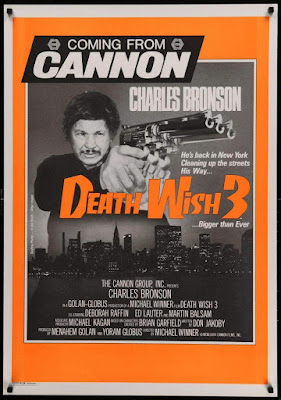
“Death Wish 3” is a 1985 action thriller film starring Charles Bronson as grieving husband turned Rambo-like vigilante Paul Kersey. I’ve had a DVD copy of it on my chair to watch for some time now. In fact, there are two copies – it was so cheap second-hand that I didn’t realise I ordered two copies by accident.

I am used to dissecting films both here and in my education, and the act of looking for something to learn, or to redeem, from any film I watch, means I must have developed a higher tolerance for what the casual viewer would otherwise call crap. I am not going to say that of “Death Wish 3”: it’s competent, it’s serviceable, it’s under an hour and a half, and I watched it until the end. It’s a Cannon Group film from the 1980s, and that was all that was expected of it at the time – it was, at least, better than their film “America 3000” from the following year, which I have reviewed previously [link].

The reason I bought this film was hearing that, to make savings in the budget, a derelict hospital in the Lambeth area of London substituted for the New York projects. It works well enough, but only if you remember to look past that fact afterwards, just like seeing the respected actor and director Alex Winter – Bill, of Bill & Ted – playing a thug. Other than that, Cannon films were very much of their time: its ownership under producers Menahem Golan and Yoram Globus spanned the 1980s, and the lower-budgeted action-led films they are most identified by exist purely to thrill their audience. Their business model was to sell the film to distributors first, then use that money to make the film – delivering maximum bang for their buck was where the profit arrived.

Having said that, thinking about “Death Wish 3” is probably not what Cannon wanted me to do. The violence is glorified, and Paul Kersey is celebrated for his kills, and it is all sanctioned by the plot, Kersey having been given free rein by the police commissioner in the first act. The film is very fast, its story having been set up within the first fifteen minutes, and every scene feels like it was once longer, but then pared down to the bone by editor Arnold Crust, a pseudonym for director Michael Winner. The gang of thugs in this film feel like the most cartoonish pack of rats that could have been written – they only look like people, and having no motivation to write them like people makes Kersey blowing them away that much easier to cheer, if you find yourself doing that. Don Jakoby objected to the rewrites of his script, his name in the credit replaced by “Michael Edmonds”. 

The final ten minutes is one explosion after another, until the gang finally retreats after they see what we assume to be the burning corpse of their leader. The police commander tells Kersey he should go, buying him a few minutes – the credits roll fifteen seconds later, the music starting like the theme from “Seinfeld” later sounded. Wasn’t that show also about “no hugs, no learning”?

Perhaps the easiest gauge of “Death Wish 3” is to look up the sequel from 1987, “Death Wish 4: The Crackdown”. Without watching it, I imagine the same action formula would have been followed, but because Cannon had overspent on prestige productions that did poorly at the box office, like Franco Zeffirelli’s “Otello” (1986), so future productions would be limited to budgets of $5 million, half the budget of “Death Wish 3”. Cannon could afford Led Zeppelin’s Jimmy Page to write and perform the music for “Death Wish II”, then have Mike Moran re-record it with synthesisers for the next one, but the fourth film is down to mostly reusing recordings from previous Cannon productions. Remember, Cannon also slashed the budget for “Superman IV: The Quest for Peace” around this time, which I have also talked about [link].

I was about to write if there was anything I should take away from “Death Wish 3”, but its objective was solely to entertain me. I was diverted, so we’ll call it a score draw.

Sunday, October 24, 2021

YOU’RE STILL THE ONE [316]

Back in 2017, I wrote about BBC One replacing its channel idents with the “Oneness” series of group portraits, photographed by the artist Martin Parr [link]. I ended that article by saying: “…getting audiences to programmes do not rely on individual channels so much, unless you count the BBC iPlayer or Netflix as a ‘channel.’ For the BBC, Martin Parr’s new idents may be more important for the ’BBC’ on screen, rather than for the ‘One’.”

On Wednesday 20th October, the BBC unveiled new branding that placed their restyled logo at the top of screens, programme trailers and poster advertising, and their channel names in smaller letters at the bottom, underlining the inevitability of the move – all programme trailers end with “available on iPlayer,” placed prominently in the middle of the screen, just as “iPlayer” and “Sounds” replaced the “TV” and “Radio” categories on BBC Online. Long gone are the days of simple radio-like announcements over slides of upcoming shows. Moreover, the way the new logo is used highlights, at a fundamental level, the change in how we watch television over the last twenty-four years.

I have always changed my website’s logo and branding when it was needed, as proved by my 300th article showing five logos over five years [link], as I zeroed in on the most effective way of presenting myself and my work. Likewise, the BBC’s logo, a variation of three letters in three boxes since it was first introduced in 1958, has been modified as its uses have changed, from identifying a broadcaster to supporting the quality of British programmes sold worldwide, to being a mark of reputation to sell tie-in merchandise, to being a sigil for a British national identity portrayed through cultural soft power. 

As much as some people search for the opportunity to complain about taxpayers’ money being perceived to have been wasted on a logo change that is still superficially similar to the previous version, you have make changes when your current branding is found to have stopped working effectively. As stated by the BBC’s Chief Customer Officer, Kerris Bright [link], “Our research tells us that audiences think some of our services look old fashioned and out of date. They want a modern BBC that is easier to use and navigate to find the content they love and enjoy.” 

If people in its own country are saying that, then perhaps it was being said elsewhere. The latest BBC logo was introduced in April 2021 on an online streaming service aimed at North America, BBC Select, and on the Australian TV channel BBC Kids, six months before the UK saw it on screen. Because these are subscription services, their audiences are also, indirectly, paying for the new logo. Meanwhile, the latest Cadbury logo, using thinner lines and closer to the company founder’s original signature, was first seen on chocolate bars sold in Australia. 

A big feature of the BBC’s new branding, and one that has been introduced gradually for a couple of years, before reaching the logo, is the font. “Reith,” in its sans serif form, may not immediately be too different from the previous use of Gill Sans to the casual user, but the one-off cost of the BBC buying its own font, to use it as much as it wants, contrasts with the yearly fees to use Gill Sans, Helvetica, Futura and other fonts over the years. I could not find how much the BBC pays to use fonts, but I could also not find out how much Ikea saved in 2009 by switching their shops and catalogues from using Futura to Microsoft’s cheaper font Verdana.


The previous BBC logo was introduced in 1997. The logo that version replaced was deemed not to work when made smaller on screen – the lines under the blocks, and the spaces in the letter B, began to disappear. Its replacement was simplified, easier to reproduce and was more legible on screen.


What has changed since then is the screen. In 1997, people were still watching cathode-ray tube (CRT) televisions, beaming a raster pattern of electrons onto a fluorescent screen. LCD and LED televisions did become commonplace until 2006, when regular HD television broadcasts began in the UK. In 1997, the BBC still played their idents for their channels from laserdisc, with servers not being used until widescreen broadcasts began in 1998. They still only had two channels to worry about – the BBC News Channel began in November 1997, followed by BBC Choice in 1998. Aside from all this, watching television from a non-television screen only properly began when the BBC iPlayer download service began in 2005, only becoming a streaming platform in 2007, the same year Netflix began their own service – the flood of mobile, tablet and other connected devices began from there.


What made me realise this was using the BBC News app in beta mode. I knew about the new logo from the reports of BBC Select introducing it, finding that an upcoming update to the News app will use it. In using it, I found that the logo, placed at the top of my phone’s screen, placed its blocks further apart so they can animate more clearly: swiping down to refresh the page would stretch the blocks before reverting to their correct shape, and they would shrink to lines as I moved down the page, maintaining their presence as a constant reminder. 


I thought this animation was something cute at the time, because it is something you could do on your phone, but I didn’t think it would happen on television. With the blocks making the Channel 4 logo having been broken up and thrown about since it began in 1982, and with a new ident on ITV seemingly every week as part of an artist initiative, it is now time for the BBC to stop being defined by three static, immovable blocks. 


Now, they rarely ever sit: they move in, they fall into place, they move up, down, in and out. Perhaps this could have been done fifty years ago, but when BBC One and Two had idents that were live feeds of clockwork models, it wouldn’t have been practical. It certainly does not feel like the logo of a corporation that is approaching its hundredth anniversary in 2022, but that is entirely the point: this will be the last BBC logo made for a regular television screen, if not for a linear television channel. Next time: holograms, probably.


There is a lot to be said for the triviality of a broadcaster changing its logo, as I have proved, but because of the unique way it is funded, the BBC belongs to everyone, and it represents us all to the rest of the world. I want it to look its best.

Sunday, October 17, 2021

IT AIN’T NOTHING BUT A HEART-BREAKER [315]


I think I am writing this one more for my benefit than for anyone else.


The term “culture war” was coined by the German physicist, biologist and politician Rudolf Virchow to describe the campaign of the pre-German kingdom of Prussia, under Otto von Bismarck to reduce the influence of the Roman Catholic Church in educational matter. Translated from the German “Kulturkampf,” the term was repeated in American newspapers, later applied to opposing values, whether they be conservative or liberal, progressive or traditionalist, or urban or rural. The increasing polarisation in American politics along these lines was described in sociologist James Davison Hunter’s book “Culture Wars: The Struggle to Define America” (1991), which returned the term to widespread use.


When “kampf” means “struggle”, a less charged word than “war”, the choice of one word over the other implies an intent to win outright. Concord is never an option, let alone an objective. If one side is described as a deranged, totalitarian illiberal mob, then the other side must be too. Does it ultimately matter? Not if either side think they are having a good war.


I don’t believe “culture war” was a term ever needed in the UK until its own politics and culture experienced polarisation through the Brexit referendum - “cancel culture” and “woke” have similarly only entered common use in the media in the last five years since then. However, all the terms are snappy, emotionally charged and easy to apply to a headline, alongside “feud”, “blast”, “hits out at”, “shame”, “mob”, “cult”, “shock”, “ban”, “axe” and “row”. Any issue can be heated like a microwave dinner if the right words are chosen.


My preoccupation on “culture war” as a term comes from being, as a transgender person, the subject of a culture war. I am not on either side of the argument, I am what is being fought over – my rights are under question. This culture war appears to have begun in the summer of 2017, when the UK government announced a consultation on whether people can self-identify as their correct gender, instead of going through the court-based system to obtain a Gender Recognition Certificate. 


It does not matter that this issue has apparently been resolved: the existing system is to remain in place, but applying will become online-based and substantially cheaper. It does not matter what my opinion of the issue is: if living your life authentically means you need to use whatever system exists, rather than waiting for enough minds to be changed so it can be replaced with one more dignified, you would do it – I know I did.


However, the opening of a government consultation on one specific issue became a wider argument on how a group of people should continue to fit into society – again, the Equality Act 2004 was not in question. The culture war that now exists seems to be more predicated on the use of words, from those that each side have for each other like “TERF”, “transphobe” and “gender critical”, to the checklist of what allows someone to be called a “woman” or a “man”, and whether you can change your sex at all. Framing this as a “culture war” implies that both sides are as strong as each other, but when the much of the reporting on the issue is on protecting the rights of celebrities like J.K. Rowling, Dave Chapelle and Piers Morgan to speak, it feels like the objective is to protect the most powerful people in the room - people who appear to be having a good war. Meanwhile, I need to be careful about how I speak in case it jeopardises any part of my life, from my job to friendships. 


The target of legislation is no longer the Equality Act, which already had regulations on access to single-sex spaces, to freedom of expression in academic institutions. My theory is this is more a symptom of tuition fees in universities, now over £9,000 a year, making students more into customers and stakeholders that demand more of their academic journey than I would have done when I started my degree twenty years ago.


I am not willing to engage in an argument over my own rights. There are enough books being published on the subject right now, such as “The Transgender Issue” by Shon Faye, and “Trans: When Ideology Meets Reality” by Helen Joyce. Both books were reviewed in the Culture magazine of “The Sunday Times” in August 2021 under the headline “Which side are you on?” With that headline, not mine.


Once again, I am writing here more for my benefit this time around.

Sunday, October 10, 2021

IT’S GOT NOTHING TO DO WITH YOU [314]

The original JPhone emoji set (1997)

As silly as it sounds, I decided I was not going to use emoji when I realised I didn’t know what any of them were supposed to mean. Their implementation as a keyboard on my phone, one that required me to select it over the regular English keyboard, made me think they act principally as pictograms, to use as word replacements – like a lexicon, but not like a rebus. Unable to find any kind of glossary, mainly because meanings applied to particular emoji are reached over time by consensus, rather than being prescribed, I decided I was better off not using anything that could cause confusion or misunderstanding – it is hard enough doing that using English words.

Mind you, I never used emoticons or Wingdings, both intended to add simple pictures to messages like adding a sticker, so I didn’t see the line that led to emoji. Wingdings was hampered by relying on both the sender and receiver having access to the same font, and emoticons were made less clear by having to be read on their side >:/ 8-> >:-( Analgoues to both systems are found in Japan, through kaomoji (“face character”, read in the same direction as text (ˊ•͈  •͈ˋ) ⸝⸝> ̫ <⸝⸝ ა), and in emoji (“picture character”, with no ties to emotion or emoticons).

With the latest Apple mobile system upgrade to iOS 15, I am now seeing emoji suggestions in their predictive text feature, and I cannot disable this feature, let alone the entire emoji keyboard. I know my mother only uses emoji other than a smiley face in text messages to me if they are suggested to her, like the fish that accompanied a mention of the McDonald’s Fillet-O-Fish. My biggest exposure to emoji has been on social media, where they are used to point, promote, and to clap between words to emphasise points being made. If I have ever used one at all, it may have been for effect, but it was too long ago for me to remember, and I can’t see any reason to start now.


Essentially, emoji began like Wingdings, as a proprietary font available only to users of a particular phone in 1997, the SkyWalker DP-211SW from JPhone, now SoftBank. A competitor, NTT DoCoMo, implemented their own emoji across their i-mode platform, beginning the mass usage that culminated in companies like Apple and Google supporting emoji in Japan first, and the need to attach emoji to Unicode, the international text standard, in order for the same images to be seen between different devices. This led to many pictures that existed in Unicode becoming emoji, including those previously added to the standard from Wingdings, Webdings and Zapf Dingbats.

New emoji are added yearly, and Unicode’s emoji proposal guidelines [https://unicode.org/emoji/proposals.html] are specific in what must be excluded, like logos, exact images, or having meanings that are transient or very specific – openness to interpretation and usage is built into the process. Therefore, when the “Melting Face” emoji was included in Unicode 14.0 and Emoji 14.0 from September 2021, people jumped on it as a symbol for our current times, a kind of sarcasm as things fall apart. Indeed, Jennifer Daniel and Neil Cohn, who conceived it two years before, intended it as a kind of embarrassment, a Western version of when Japanese manga characters turn into paper and float away. It sums up my inability to use such an established communication system perfectly.

Sunday, October 3, 2021

BUT IF YOU’RE WILLING TO PLAY THE GAME [313]


Hello there. This is a video about my not having made a video in a while. I’m sorry about that, and while I continue to plan the next video, I thought I should reflect on how this happened.

The short answer is that life gets in the way, work gets in the way, and pandemics, when they happen, get in the way. Everyone has had some sort of upheaval recently, and while we wait for things to settle back down again, especially at work, you want to take more time to relax.

Another problem for me personally is finding the perfect formula for making videos for YouTube. You can’t expect everyone to be interested in the same subjects as yourself, and you shouldn’t be disappointed if not everyone engages with what you have made. At the same time, when something does hit, it will be without explanation: my video about why BBC radio had no news bulletin on Good Friday 1930 only had four views in its first two weeks, but has had over seventeen thousand since. It may be because that fact has been repeated enough times that people need to check it, but there aren’t many facts left that haven’t been endlessly explained in a video. What else is there to say when everyone has already said what you we going to say

Where does that leave me? I have concluded that style is what will make for a good video on YouTube. Having good content is an objective, but presentation is more important in getting that content seen. Finding the best way to achieve that takes time, but I think I have a plan now. If engagement is what drives business on YouTube, regardless of whatever the content actually is, then you should keep refining your style until something clicks, or someone clicks. By the way, like, comment and subscribe, as they say around these parts.

There will be a new video – give it a month or so – and it will be titled “How to win a song contest, apparently”. I won a song contest, you see.

Thank you for watching. As ever, find more nostalgia culture crisis at www.leighspence.net.