Showing posts with label logo. Show all posts

13 October 2024

YOU SAW THE WHOLE OF THE MOON [470]


[Update: A big thank you to the digital artist Dave Jeffery [https://www.kecskebak.hu/], whose work in creating and recreating channel idents has been used on screen by the BBC and Big Centre TV, for contacting me via Mastodon to confirm that Meridian’s logo was designed by Ian Carley, the company’s head of design. The original article is below.]

The half-sun, half-moon face used as a logo by Meridian Broadcasting has remained lodged in my mind long after it disappeared from TV screens, but I have never considered why it was used to represent independent television in the south and south-east of England – my hunch is that it doesn’t matter at all.

Back when ITV was the name of a network of regional TV channels, mostly named for the area on which they were broadcast – Thames, Tyne Tees, Anglia, Scottish, London Weekend Television and so on – Meridian replaced TVS (Television South), providing programmes in its area of the UK from 1993. It is still broadcasting, but in the procession of takeovers and mergers of ITV companies that began when Meridian bought Anglia in 1994, Meridian’s distinctive logo and name were usurped by a national “ITV” identity from 2002, the name living on as “ITV News Meridian”, the name of their regional bulletins.

This does not explain the choosing of its symbol, from a designer whose name I could not find, here picked out in high-contrast red, yellow and purple, initially in idents on a halved yellow and blue background. The sun-moon face is centuries old, borne of opposing forces, of duality, and of accepting this as a nature of being, from good and bad, to life and death, and femininity and masculinity. It was seen as decoration on old naval navigational tools, like compasses and sextants, fitting in with the brief of serving an area of the UK steeped in maritime and naval tradition like Portsmouth, Southampton, Cowes and Chatham, but means precisely nothing if you are also broadcasting inland to the likes of Salisbury, Reading and Oxford.

The name “Meridian” is more confusing than expected: it comes from the Latin “meridionalis”, meaning “of the south”, but it makes me think of London, and the Greenwich Meridian - this use came from the Latin “meridies”, for “midday”. When the consortium that owned Meridian bid, in 1991, to represent the ITV network in the south and south-east of England, they also bid for the London area, most likely using the same name and logo. Perhaps the intention was, just “Granada” came to symbolise Manchester and the north-west of England as much as that region of Spain, Meridian will do the same for the south, once it appears often enough. This expectation did not happen so much for Carlton, like Granada a pre-existing company with a pre-existing name, which eventually won the London licence.

The website TVArk has a quote from a J Dallas, creative director at Meridian, talking in 1999 about the replacement of their original bombastic and orchestral idents with something a lot calmer and more purple: “The idea was they thought the Company had become established and the computer graphics for the original ident looked old fashioned. The problem with the logo is it looks stuck on to something whatever you do with it.” Meanwhile, the wonderful book “Branding for Television With Knobs On” by Martin Lambie-Nairn, designer of the Channel 4 logo, noted that Meridian executives took offense at being told their production and marketing wasn’t connected by a unifying strategy and brief, its “marketing tree” being disparate twigs growing from the ground, unable to take advantage of the fact the TV channel itself, branding and all, is as much a product as the programmes by themselves.

The Meridian logo appeared everywhere: before every programme, at the end of programmes made or commissioned by them, in flashes before each advertisement break began, and in a bizarre tie-in with Southern Ford Dealers, where you could buy the Ford Fiesta Meridian special edition car – I really saw a TV broadcaster’s logo plastered on cars that private citizens chose to buy with their own money.

Meridian’s legacy was in children’s programmes like “Wizadora”, “ZZZap!” and “It’s a Mystery”, alongside dramas “The Ruth Rendell Mysteries” and “Hornblower”, and the documentary series “Monkey Business”. However, its logo was used so prominently between 1993 and 2002 that its legacy is what remains for me - it is visually striking, but it only represents itself, not what Meridian was, or continues to be.
24 October 2021

YOU’RE STILL THE ONE [316]

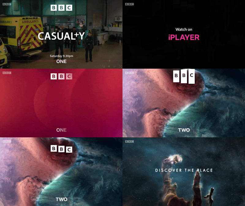
Back in 2017, I wrote about BBC One replacing its channel idents with the “Oneness” series of group portraits, photographed by the artist Martin Parr [link]. I ended that article by saying: “…getting audiences to programmes do not rely on individual channels so much, unless you count the BBC iPlayer or Netflix as a ‘channel.’ For the BBC, Martin Parr’s new idents may be more important for the ’BBC’ on screen, rather than for the ‘One’.”

On Wednesday 20th October, the BBC unveiled new branding that placed their restyled logo at the top of screens, programme trailers and poster advertising, and their channel names in smaller letters at the bottom, underlining the inevitability of the move – all programme trailers end with “available on iPlayer,” placed prominently in the middle of the screen, just as “iPlayer” and “Sounds” replaced the “TV” and “Radio” categories on BBC Online. Long gone are the days of simple radio-like announcements over slides of upcoming shows. Moreover, the way the new logo is used highlights, at a fundamental level, the change in how we watch television over the last twenty-four years.

I have always changed my website’s logo and branding when it was needed, as proved by my 300th article showing five logos over five years [link], as I zeroed in on the most effective way of presenting myself and my work. Likewise, the BBC’s logo, a variation of three letters in three boxes since it was first introduced in 1958, has been modified as its uses have changed, from identifying a broadcaster to supporting the quality of British programmes sold worldwide, to being a mark of reputation to sell tie-in merchandise, to being a sigil for a British national identity portrayed through cultural soft power. 

As much as some people search for the opportunity to complain about taxpayers’ money being perceived to have been wasted on a logo change that is still superficially similar to the previous version, you have make changes when your current branding is found to have stopped working effectively. As stated by the BBC’s Chief Customer Officer, Kerris Bright [link], “Our research tells us that audiences think some of our services look old fashioned and out of date. They want a modern BBC that is easier to use and navigate to find the content they love and enjoy.” 

If people in its own country are saying that, then perhaps it was being said elsewhere. The latest BBC logo was introduced in April 2021 on an online streaming service aimed at North America, BBC Select, and on the Australian TV channel BBC Kids, six months before the UK saw it on screen. Because these are subscription services, their audiences are also, indirectly, paying for the new logo. Meanwhile, the latest Cadbury logo, using thinner lines and closer to the company founder’s original signature, was first seen on chocolate bars sold in Australia. 

A big feature of the BBC’s new branding, and one that has been introduced gradually for a couple of years, before reaching the logo, is the font. “Reith,” in its sans serif form, may not immediately be too different from the previous use of Gill Sans to the casual user, but the one-off cost of the BBC buying its own font, to use it as much as it wants, contrasts with the yearly fees to use Gill Sans, Helvetica, Futura and other fonts over the years. I could not find how much the BBC pays to use fonts, but I could also not find out how much Ikea saved in 2009 by switching their shops and catalogues from using Futura to Microsoft’s cheaper font Verdana.


The previous BBC logo was introduced in 1997. The logo that version replaced was deemed not to work when made smaller on screen – the lines under the blocks, and the spaces in the letter B, began to disappear. Its replacement was simplified, easier to reproduce and was more legible on screen.


What has changed since then is the screen. In 1997, people were still watching cathode-ray tube (CRT) televisions, beaming a raster pattern of electrons onto a fluorescent screen. LCD and LED televisions did become commonplace until 2006, when regular HD television broadcasts began in the UK. In 1997, the BBC still played their idents for their channels from laserdisc, with servers not being used until widescreen broadcasts began in 1998. They still only had two channels to worry about – the BBC News Channel began in November 1997, followed by BBC Choice in 1998. Aside from all this, watching television from a non-television screen only properly began when the BBC iPlayer download service began in 2005, only becoming a streaming platform in 2007, the same year Netflix began their own service – the flood of mobile, tablet and other connected devices began from there.


What made me realise this was using the BBC News app in beta mode. I knew about the new logo from the reports of BBC Select introducing it, finding that an upcoming update to the News app will use it. In using it, I found that the logo, placed at the top of my phone’s screen, placed its blocks further apart so they can animate more clearly: swiping down to refresh the page would stretch the blocks before reverting to their correct shape, and they would shrink to lines as I moved down the page, maintaining their presence as a constant reminder. 


I thought this animation was something cute at the time, because it is something you could do on your phone, but I didn’t think it would happen on television. With the blocks making the Channel 4 logo having been broken up and thrown about since it began in 1982, and with a new ident on ITV seemingly every week as part of an artist initiative, it is now time for the BBC to stop being defined by three static, immovable blocks. 


Now, they rarely ever sit: they move in, they fall into place, they move up, down, in and out. Perhaps this could have been done fifty years ago, but when BBC One and Two had idents that were live feeds of clockwork models, it wouldn’t have been practical. It certainly does not feel like the logo of a corporation that is approaching its hundredth anniversary in 2022, but that is entirely the point: this will be the last BBC logo made for a regular television screen, if not for a linear television channel. Next time: holograms, probably.


There is a lot to be said for the triviality of a broadcaster changing its logo, as I have proved, but because of the unique way it is funded, the BBC belongs to everyone, and it represents us all to the rest of the world. I want it to look its best.

04 June 2016

WE GOTTA MOVE THESE REFRIGERATORS [2]


Last month, the Co-Op, as no-one ever called it “The Co-Operative,” began returning to its original 1968-93 “cloverleaf” logo, and I approve of this very much.
The reason for the new-old look is to recapture the image of a strong, ethically-minded group of services owned by its customers, moving on from the issues that plagued its bank, and providing focus at a time when Co-Op innovations, such as the traffic light food labelling system, and the selling of Fairtrade products, are now expected from all retailers. When the John Lewis Partnership is doing as well as ever, selling the benefits of your business to your customer, and hope in an ideal form of business, is more important than ever.
The Co-Op logo is a stout stamp of confidence that, in these times, fits within the space of an app icon on a phone, looks unlike anything else out there and, most usefully, can be spotted from a mile away. It is inextricably linked with what the business stands for that nothing else can possibly work. The design agency North, responsible for the revamp, were sensible in using an identity that they already knew works. Here’s hoping it works for them.
This has all caused me to be nostalgic for the Co-Op fridge freezer we used to have at home, with the bold logo fixed to a corner. It lasted for at least twenty years, meaning I also get to be nostalgic for the times when everything had to be made to last. With the increasing rate of technological advancement, nothing can ever be around long enough to break down completely – it rendered my last desktop computer as useless after six years, and my current one may be thwarted earlier than that.
However, what has struck me the most is that the original shade of blue is being used around the logo. It is the sort of blue you see on an old poster fixed to a shop window, long enough for the yellow ink to have faded, followed by magenta, leaving a cyan that cannot be erased. If the design can be interpreted as retro, as it is too symbolic and functional in nature to be kitsch or camp, the colour makes it timeless.
I am wary of nostalgia as a matter of course, preferring to use the lessons of the past in preference to wallowing in it. Why use remembrance of the good times to paper over cracks in the present, when it can be used to talk about the future? It’s a good way of making you think about where to buy teabags.