
BBC One launched a new ident package on Friday 1st April and, having covered the launch of the previous “Oneness” set in 2017, devised and filmed by the photographer Martin Parr [link], it only made sense for me to continue considering television idents and branding like it is public art. From the Channel 4 logo and the “2” used by BBC Two from 1991 to 2018, to the “ITV Creates” initiative employing artists to rebrand ITV channel every week since 2019, few get the chance to create in a space seen so often by so many people, even multiple times in the same evening.
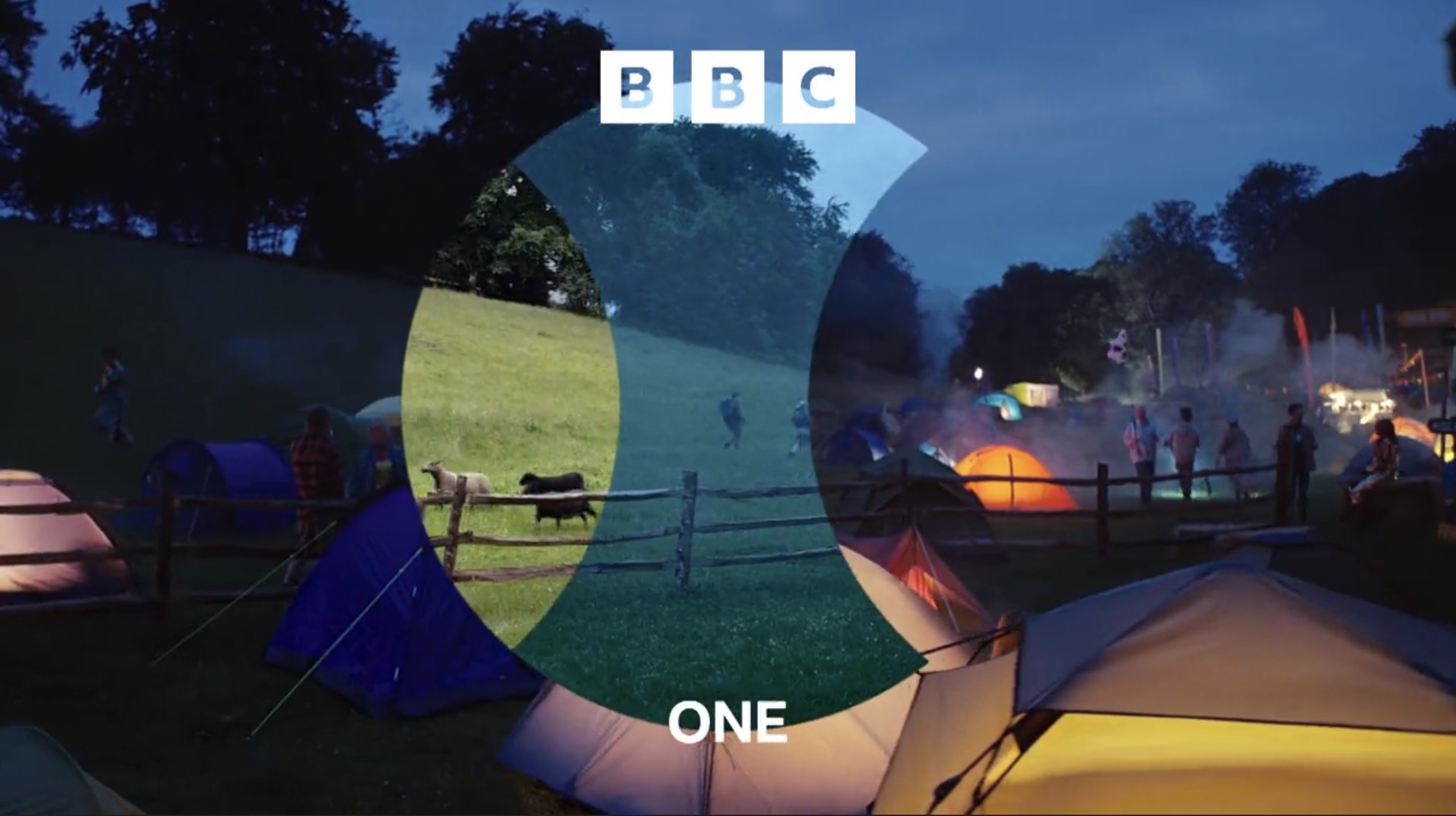
A production of BBC Creative and Man vs. Machine, a visual arts group that has created idents for More4, Film4 and 4seven, in addition to advertisements for KFC, Nike and Apple, the new BBC One idents pan the camera around spaces, seen through a lens to different times of day: a hall hosts children trampolining in one moment, but we see glimpses of a meeting, and preparations for a disco; a field hosts a festival at night, then ramblers, and later sheep herding; a street corner hosts a market stall, then a garage worker’s tea break, followed by a street sweeper; and a brickwork basement hosts skateboarding, with glimpses of a later photo shoot and a rave.
These are great ideas by themselves, depicting spaces that bring people together, instead of Parr’s “Oneness” idents that just showed people appearing in a space, but each glimpse of a space also has a full ident that will show glimpses of the others within the lens, creating a moment of recognition in the viewer as the idents are repeated, while being a conceit that keeps the idents fresh as new ones are added into the mix.

The ”lens” idents were meant to have been introduced in October 2021, alongside the kinetic BBC blocks logo [link], which left the red circle motif placed between programme trailers as the only clue to their eventual form. BBC One’s idents have used the motif of a circle through the years to symbolise an all-encompassing inclusivity, most literally when a globe of the Earth was the channel’s ident for forty years to 2002, rendered through mechanical models, computer graphics, and as a hot air balloon.
When your symbol has been that all-encompassing, “picture postcard” films of people in spaces doing things, such as the “Oneness” set, and ITV’s idents during before 2019, are merely holding a mirror to its audience. Fortunately, the focus is back on the channels themselves: BBC One, as Britain’s most popular channel, is reflecting how it is a space where people gather for its programmes, and the “ITV Creates” initiative is intended to emphasise the creative heart of the broadcasting business.
It will be interesting to see how much of an impact BBC One’s glimpses of life through a lens will be, for branding remains key: when BBC Two introduced its “2” logo in 1991, a symbol made into a blade, a rubber duck, a toy car, a garden display, a Dalek and so on, ratings for the channel improved. The programmes had not changed.

No comments:
Post a Comment