I distinctly remember the hope that, when the Covid-19 pandemic eventually drew to a close, the ensuing momentum that would follow such a seismic event could have been the beginning of a new “Roaring Twenties”, last seen following the First World War and the flu pandemic of 1918.
Of course, it does not feel like this has happened, replaced more by a need to return things to normal, just as the proposals to redraw the map of London following the Great Fire of 1666 was replaced by a need to rebuild as soon as possible.
This has left me feeling like the 2020s haven’t really started yet culturally, much like when the 1960s were said to have started with The Beatles in 1963, or when the 1990s were ushered in by Nirvana’s “Smells Like Teen Spirit” in 1991. The pandemic acted more like a stress test than a creative inspiration, before counting the threat it made to live music venues, in places like Liverpool and Seattle, that help foment the scenes that changed popular music.
The reason I have started thinking about this now was its having been prompted by reading many articles about the prospects of a “post-Elizabethan age” – following the death of the Queen, having been a symbol of stability and consensus for so long, what country is the UK going to become, and how will things progress under King Charles III and Prime Minister Liz Truss?
It feels like fundamental changes are expected, but it is not known what they could be, or what for they should take, because elements of that expectation were themselves not expected. Who are we counting on to enact the change? Someone creative? A ground swell?
I don’t think it is possible to expect a paradigm shift, unless this a result of anxiety. Beatlemania and Nirvana may have ushered in the “Sixties” and the “Nineties”, but the ironic detachment and post-Cold War relief that characterised the “Nineties” was definitively ended by the terrorist attack on the World Trade Center in 2001, just as the end of the “Elizabethan age” was not an event to prepare for. If the lockdown caused by Covid-19 is considered a paradigm shift, it is only in the sense that the standard procedure for progress to take was interrupted or stopped, while happening to coincide with the beginning of the decade.
I think this is one of those times where I don’t know what to expect. The UK has seen uncertainty in one form or another caused by Brexit, Covid, and by changes in Prime Minister and Monarch, unless this proves to be the character of the 2020s – we are already nearly three years in, so it might be time to either call it now, or start preparing to make the 2030s as great as possible.
With the UK still in a period of national mourning as I write this, I decided that discussing the prospects for the country and monarchy can wait for now.
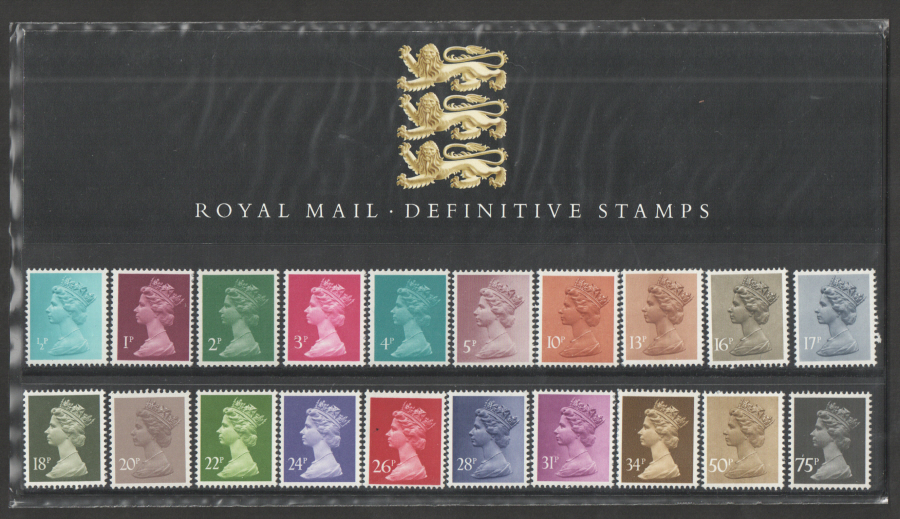
What I do know is that the passing of Queen Elizabeth II will be noted most visibly when the face on the UK’s money and postage stamps begin to change. I have already been witness to this, when the smaller 5 and 10 pence coins introduced in 1990 and 1992 respectively removed one and two shilling coins featuring King George VI, and possibly still George V, from circulation, but that was a change due to progress. Any change this time will be felt more keenly, especially when for the last fifty-five years, the UK has had perhaps the best postage stamps in the world.
The Royal Philatelic Collection is one of the largest and most valuable stamp collections in the world. It was begun by King George V, although stamp collecting has been a part of the Royal Family since 1864, not so long after the Royal Mail introduced the Penny Black in 1840 as the world’s first adhesive postage stamp. The Queen continued the collection, currently stored at Windsor Castle.
With the United Kingdom of Great Britain and Northern Ireland substituting the monarch’s face for writing its country name on its stamps, Arnold Machin’s standard “definitive” stamp design used since June 1967 is the most simple and effective design possible: the effigy of Queen Elizabeth II, created by Machin in clay, wearing the George IV State Diadem, a crown that includes the roses, thistles and shamrocks that featured separately on the former, more busy standard stamp design; the price value of the stamp; and a single colour used, helping to differentiate from other values of stamp.
I have a stamp collection, mostly kept within one book, and in looking back into it now, the cumulative effect of seeing so many of the “Machin series”, in so many different colours, across so many pages, puts me in mind of Andy Warhol’s pop art screenprints, again reproducing the same image in different colours, except they cost substantially more.
This simplicity and effectiveness of this design has doomed attempts to change it. A proposal to change the Queen’s portrait in 1981, just as Machin’s separate portrait for the original set of decimal coinage was also being replaced, was met with a letter from the subject’s private secretary: “Her Majesty is very content with the Machin effigy and thinks that a work of real quality is required if this is to be replaced.”
Other attempts to change the design were rejected by Royal Mail’s Stamp Advisory Committee and by Machin himself, but the Queen’s gentle intervention does make you think that, if your face is the only change that can be made to something, you will more than likely say no. With the Queen having final say over her 1967 portrait, and even requesting the colour of the original 4d. stamp to closely match the original 1840 Penny Black, the sense of personal investment is palpable. It has made this portrait of the Queen into possibly most reproduced picture of a single person there has ever been, or will ever be.
Of course, Machin’s design will now have to be changed. My prediction, and hope, is that King Charles’s portrait will simply be used instead, the rest of the stamp staying as it is, but it remains to be seen if the opportunity will be taken to create an entirely new design.
Left: digitised VHS source. Right: colour boosted in video editor.
Having completed my video about Memphis furniture [link], I am confident I have made a well-structured piece of television with good use of archive material, but I also learned how terrible the Video Home System (VHS) really was.
Having decided to include a fake advertisement break that reflected the influence of Memphis design, I realised that the recordings I used literally paled in comparison to my photographs of the real-life furniture. I already needed to boost the colour of the Weetabix ad I used, using a different VHS copy of it for reference, having being unable to find a copy that was higher in resolution and also not muddy in colour, but then I realised the colour of Warninks advocaat is yellow, not cream, and the swimming pool ladder in the Kitekat ad had to be brighter to match the more obvious influences in the colours and patterns used.
This is not a case of my digital photographs versus (the digital sample of) an analogue tape, the relative age of the tape, or the decline in quality of the recording over time, but more the technical limitations of the VHS format that have largely been overcome by the switch to digital formats, through no longer being constrained by a physical form.
On a 12.5mm-wide VHS tape, the top 0.65mm is taken up with one or two audio tracks, and the bottom 0.75mm is a control track used for synchronising recording and playback. The remaining 9mm is used for the picture, with a signal bandwidth of 3 MHz for luminance – the black-and-white signal that forms the picture - and a 400 kHz sub-signal for chrominance, reproducing the colour.
These numbers obviously doesn’t mean a lot by themselves, except that less space on video formats are reserved for colour signals because your eyes react more to changes in brightness, so a colour signal can be compressed more without much change in colour. However, the bandwidth of the original TV signal being recorded is much wider, with the PAL video standard using 5.5 MHz for luminance, and 4.43 MHz for chrominance, SECAM using 6 MHz and 4.43 MHz respectively, and NTSC, broadcasting a 525-line picture instead of 625 lines, using 4.2 MHz and 3.58 MHz respectively.
In order to fit your recording onto the tape, VHS has to throw much of the signal away in a manner that befits having tape only half an inch wide, playing at 1-1.5 inches per second – older professional, broadcast quality tape standards like 2-inch quadruplex, 1-inch Type C and U-Matic recorded a better quality by simply having more surface area to play with, running a wider tape more quickly to pick up as much information as possible. The later S-VHS standard increased the luminance signal recorded to 5.4 MHz, but kept the chrominance signal, and the speed of the tape, exactly the same.
While the picture quality of the contemporary Betamax format was better than VHS, the throwaway nature of TV advertisements often mean that the format that won out in the video format war often winds up as the archive format for those ads. One point of my video as to show how colourful 1980s design was but, without me doing anything with some of the images, another point would have been how our recordings of the decade washed out that colour.
[See above for my video, which uses the below script.]
Coming up, I tell you what this is, what this is, and what this is, and explain why the answers don’t really matter.
[Opening titles: 359. Walking in Memphis Furniture, or “Do I Really Feel the Way I Feel?”]
Hello there. “Memphis” is the name of a group of international designers that ran from 1980 to 1988, led by Italian architect and Olivetti typewriter designer Ettore Sottsass. The group existed to question the functional nature of modern design. I am not here to explain and analyse the history and philosophy of this group, or to analyse their work in detail. I only want to share with you how wonderfully overwhelming it all is.
In June 2021, I took a trip to the MK Gallery in Milton Keynes to view “Memphis: Plastic Field”, a touring exhibition that gathered over a hundred and sixty examples of furniture, textiles and glassware from across the group’s timeline. I am grateful to the gallery for letting me take pictures, letting me walk through the exhibition twice, and dressing the galleries in high-contrast black and white, like the exhibits needed help to be seen. To be clear, these are not intended to be works of art, even though they are: they are tables, chairs, bookshelves, lights and glasses, and were made to be used as such. It just so happened that the colours and designs that permeated the rest of the 1980s also came from everything you see.
The first time I saw an item of Memphis furniture was in Minnie Mouse’s first TV special, “Disney’s Totally Minnie”, from 1988, where one of their chairs is shown in a suitably multi-coloured room. The curved shape of the chair had been burned into my mind since I was five or six years old, and there it was, just sitting there in front of me. Called the “Bel Air” to fit a scheme of using international hotels for names, it had presence, it had status – it was a postmodern throne.
Even before the “Bel Air”, colours and patterns like those used by Memphis had been splashed through the opening titles of the Channel 4 music show “The Tube” from 1984. I saw this on Friday evenings when I was about two years old, as the word and numbers game “Countdown” was on from Monday to Thursday, and I guess that what impressionable small children need is colours and movement, so I got the best there was. I kept asking my mother to draw the “Tube” logo until she asked me to do it, which I apparently did first time. What I don’t get is why I kept asking for the “Tube” logo to be drawn, when this [Channel 4 ident] was the logo for the channel it played on – some things we’ll never know.
In a moment, I will go further into why Memphis design continues to matter today, and provide the answers to the opening quiz, following this short break. [Advertisements for Weetabix, Warninks advocaat and Kitekat cat food.]
Welcome back, and it’s time to confirm what those Memphis items were from the beginning of the video: the first item was a teapot, the second was not a plate but an ashtray, and the bird-looking sculpture was a lamp... and yet, the fact these items had any sort of intended use really isn’t the point.
As I mentioned earlier, the Memphis group questioned the functional nature of design, and that included the nature of an item existing only for its intended use, and any need to be practical for that use – once liberated from those needs, a designer can begin to play. Take, for example, the Tawaraya bed, or sofa, or Japanese tatami mat, or boxing ring, depending on what you needed in that moment.
My family’s living room and kitchen in the 1980s was defined by wood, by pine, and by a child’s teeth marks in pine, but the construction of Memphis furniture was new, and prescient, using the brand new medium density fibreboard – MDF – and it was possible to laminate it with coloured or patterned surfaces - anything other than simulated woodgrain.
There is little difference between the materials of Memphis furniture and Ikea furniture, other than Memphis being hand-built from the start, and using more ostentatious names like Plaza, Carlton and Bel Air, instead of Billy and Malm. I should make that clear: these Memphis items are not one-off custom builds, but they were available to order out of a catalogue, despite being very expensive. Likewise, intricate glassware items could easily be created by colouring and gluing separate pieces of glass together.
But if this is where furniture could have been headed, why did Ikea, Habitat and Argos continue with woodgrain and white laminate, and why do we persist with magnolia and grey paint? It is one thing for a room to make you feel cosy, but what if you want to feel elated, overwhelmed, challenged? Is furniture meant to do that? Am I supposed to not be hypnotised by my curtains? Can I admire my bedside table? It is all well and good taking the colours and patterns from Memphis and swathe your entire popular culture in it, but in doing so, it removed it from the context in which those colours and patterns originally appeared – it dazzled the public, but they didn’t want to sit on it. It has made Memphis into a moment in history, a period piece, a museum exhibit. That doesn’t feel good enough somehow.
It has taken me over a year to work out how to present these pictures, because I didn’t want to present another history of something that people don’t do anymore, carefully listing the names and years for future reference, and manoeuvring it into a discussion on the defined historical period of postmodernist design and blah blah blah – other people can do that this time. I remember leaving the MK Gallery feeling like I had been set on fire, like I am never going to witness anything that eye-opening for a long time, and it was all over looking at furniture. That is the important thing for me. Memphis is a hauntology, a vision of a lost future. This is what you could have won. Some things are worth losing your mind over.
Thank you for watching, if you would like to see more videos like this, please like, comment and subscribe, and as ever the nostalgia culture crisis continues at www.leighspence.net, the home of dancing with the gatekeepers.
A visual shorthand for the 1970s, the 8-track tape cartridge appeared to peacefully co-exist with the competing Compact Cassette format for its entire time on sale, from 1964 to 1990, even if its popularity dwindled through the 1980s. I have only limited experience with the format, through an 8-track car player my father owned, but they only felt at the time like a “big cassette”. What allowed the 8-track to stick around for so long?
Both formats appeared around the same time. Philips unveiled the Compact Cassette in Europe in 1963, and in the United States in 1964, the same year the first demonstration 8-track players appeared from the Lear Jet Corporation, which spearheaded its development as an in-flight entertainment device. The first in-car units were offered as optional extras by Ford in 1965, alongside the first pre-recorded cartridges from RCA. Home-based hi-fi players and recorders for both formats would both appear before the end of the decade.
Like almost all tape formats, cartridges existed to make reel-to-reel tape easier to handle. The Compact Cassette miniaturised the reels and tape, to 0.15 inches wide andplayed at1.875 inches per second, butthe first pre-recorded demonstration cassette would not appear until 1967, the Compact Cassette’s initial poor recording quality only useful for dictation purposes. Instead, an8-track cartridge used the same quarter-inch tape used in reel-to-reel players, playing at 3.75 inches per second, twice that of the Compact Cassette, but half the maximum speed of a reel-to-reel player, making 8-track almost an “audiophile” format by comparison. However, in splitting the tape into four programmes, each made up of two tracks, the 8-track increased both tape hiss and the possibility of “crosstalk” between the tracks and a misaligned playback head.
At four inches wide, each cartridge can play for up to eighty minutes, housing enough tape for four programmes of up to twenty minutes ina single-reel “endless loop” design, like the earlier 4-track Stereo-Pak and Fidelipak “broadcast cart” cartridges used for playing radio jingles, leading from the middle, and windingback around itself. The join in tape was bridged by a silver foil splice which, once it moved past a sensor, moved the playback head to the next programme automatically. The pinch roller usually found in the player mechanism was moved to inside the cartridge, allowing it to automatically engage and play upon being entered into the player, particularly useful when travelling.
With this form to play with, the albums that resulted on 8-track were, to me at least, not the greatest aesthetically. In terms of packaging, the hard plastic cartridge eliminated the need for the case required for a Compact Cassette, but the album cover and other information would be provided as a sticker that would deteriorate with age, along with the silver foil and foam pads inside the cartridge.
The biggest problem, however, is the inflexibilities of arranging an album onto an 8-track cartridge. With a C-90 cassette providing up to 45 minutes per side, you could fit the equivalent of an entire vinyl record on each side of a Compact Cassette, as Pink Floyd did with their double album “The Wall” in 1979. The maximum 8-track programme length of twenty minutes should accommodate one side of a record, but to minimise the amount of tape used, the maximum programme length will be the total length of the album, divided by 4.
The worst example of this I could find was David Bowie’s 1976 album “Station to Station”, a six-song, 38-minute album, meaning 9.5 minutes per programme is available... but the title track is over ten minutes long by itself, taking up the entire first programme and the beginning of the second. “Word On a Wing”, song 3 of 6 on every other issue, is now song 2 on the 8-track, followed by “Wild is the Wind”, usually the album closer, itself broken up between programmes, perhaps to take advantage of a quiet moment in the song. This means that the final three rockier songs, “Stay”, “TVC15” and “Golden Years” (usually tracks 5, 4 and 2), can play without interruption. Make your album fit, or forget about it.
Meanwhile, the average length of each side of “The Wall” vinyl album was twenty minutes, fitting relatively easy onto the four programmes of an 8-track without making any changes to the songs’ length or running order, except that “Hey You”, the first song on side 3 of the vinyl version, begins at the end of one programme, and starts the next one. It is not possible to lengthen one programme to make the rest of the song fit, as you will have a gap at the end of the other three programmes, disrupting the flow of the album in a different way.
While 1978 was the peak year for 8-track sales in the United States, sales of pre-recorded albums by mail order clubs continued there until 1988, while the electronics retailer Radio Shack sold its Realistic-branded players and blank cartridges until 1990. Meanwhile, the more portable and cheaper Compact Cassette had caught up through constant improvements in tape and playback quality that did not happen with 8-track, although Dolby B noise reduction was licensed for both formats. But by then, the Compact Disc had allowed for seventy-four minutes of high-quality music, later eighty minutes to be played back on one side, without interruption.
“Sports Report” had read out the classified football results on BBC radio since 1948. “Classified” in this sense appears to be in a measured tone, in descending league order, with voice rising and descending with each club’s fortunes. This formula, replicated by “Final Score” on BBC One, and by Independent Radio News for commercial stations, is ingrained and ritualised across generations of fans, listeners and viewers as the culmination of Saturday football, still mostly played from 3pm, and as a sports equivalent of the Shipping Forecast, itself a methodical yet poetic rendering of information that has taken on an importance in British culture – marking the time of day, a moment of calm, a moment of order, a moment of nostalgia – beyond the information it imparts which, in changing times, is now more readily available in other ways.
The 2022-23 football season on BBC Radio 5 Live marked the beginning of live commentaries on matches starting at 5.30pm, which resulted in cutting “Sports Report” in half, to half an hour, as previously announced on Monday 25th July. On Saturday 6th August, the first abbreviated edition of the season changed its approach to reading the results, preceding each league roundup with the results for that league, delivered in a faster, more informal tone – the focus on the Premier League meant no other league results would be heard for at least fifteen minutes.
Because I am British, I have heard the football results read in the “classified” fashion countless times on television, while the results being read where displayed on screen. The one time I remember hearing it on “Sports Report” was not long after former BBC Radio 4 announcer Charlotte Green began reading them in 2013, although I remember her reading being interrupted by goals being reported by another presenter. Whenever I do want to find the football results, which is rare, I will find them online, where I read them in the “classified” way, because that is what you do.
Because I do not really follow sport, I misjudged the ability to manufacture outrage from changing the way in which football results are read out on the radio. On Monday 8th August, Henry Winter, chief football writer for “The Times”, said on Twitter that the classified results “has always been part of the Saturday match-day fabric for many fans. [The BBC’s] decision to scrap the service shows a lack of understanding of fans. It’s about continuity, the pyramid, information…” The story made Tuesday’s front page, an editorial inside describing the change as “an act of cultural vandalism... the BBC’s claim that it no longer has time in its schedules for results that are widely available on television and online, cannot be allowed to stand... There is a value in familiarity that cannot be easily measured. In a world of satellite communications, who really needs the shipping forecast? Yet the BBC would never dare touch it, just as it should have left the classified football results well alone. Or one must hope.”
On Wednesday, “The Times” reported that 86 per cent of readers responding to their own poll believed the classified results are vital to the BBC’s coverage, and former “Sports Report” host Mike Ingham said, “I don’t believe this was a malicious decision. Whoever made it is probably from the age of smartphones. But I believe they will have to reconsider; that they will realise this was an editorial mistake and reverse the decision. It was clearly not thought through.”
Later that day, the BBC issued a statement acknowledging complaints they had received: “We appreciate the strength of feeling towards the classified football results within Sports Report. It’s always difficult when a programme with a special history changes, but there are good reasons for the change... The classifieds were taking around five to seven minutes to read, which would have taken up around a third of the programme – constraining the range of sports we could cover.”
On Thursday, “The Times” reported this on their website as “BBC will not bring back classified results despite hundreds of complaints”, along with other stories putting pressure on the BBC: “Private paid work of BBC broadcasters is revealed” and “Paul O’Grady is latest star to join exodus from Radio 2”. However, their main story reverted to type for the newspaper in recent times: “Hard-left academics ‘plotted gender ID witch-hunt’ on colleagues”.
On Friday, the paper carried another editorial, saying “the BBC should take heed of the outcry over ending the classified check”, along with reporting said outcry from Age UK and the Royal National Institute of Blind People. By this point, I had stopped buying the paper even for research purposes, because subjecting yourself to relentless coverage over something that is, personally, a trivial matter, becomes draining over its continuing insistence of its own importance.
On Saturday 13th August, “Sports Report” proceeded in exactly the same manner as last Saturday. Competing commercial stations TalkSPORT and LBC News formalised their existing results coverage, the former swapping their previous informal tone for the “classified” version, and the latter moving the time of the results to 5.05pm, the time at which Independent Radio News provides them to other stations. The odd one out was also the elephant in the room: News UK, owner of both “The Times” and TalkSPORT, also operate Times Radio, a news and features station set up ostensibly to promote the newspaper, while also in direct competition with BBC Radios 4 and 5 Live and staffed with many former BBC presenters. They did not carry the classified football results on either Saturday, restricting their reporting to the usual sports bulletins.
My only possible answer to all this was to think of horror film sequels: “Exterminator 2, Death Wish 3. Hellraiser II, Friday the 13th Part V. Amityville Horror 2, Scream 2, Pools Panel: Home Win.”
The biggest laugh I ever had watching a football match.
I am so glad that even David Baddiel wants “Three Lions” to be “put to bed”.
Speaking on BBC Radio 4’s “Today” programme the day after the Lionesses won Euro 2022 at Wembley Stadium, saying that “the women have reset the clock” gives me hope that England can finally lose the nostalgia that has wound a part of the national identity around the 1966 men’s World Cup final.
I never liked the line “thirty years of hurt never stopped me dreaming” – that sort of pain can really only be felt by the players, not the crowd – but knowing that 1996 eventually became the half-way mark of hurt is really quite funny for someone who never had reason to like football. For a country that goes on about being the inventor of football as much as England does, for this to be an England team’s first major trophy in an international competition in my lifetime should be embarrassing, but the victory overcame the problems that blighted English men’s football finals: there was no obnoxious band playing in the crowd, no “two world wars, one world cup” goading of the opposing side, and they didn’t even need to play penalties.
This all made the team’s gatecrashing their coach, Sarina Wiegman’s press conference all the sweeter, singing “it’s coming home, it’s coming home” both as the team that actually did it, and as the team that was formed due to forward thinking that took place after 1966. The Women’s Football Association (WFA) would be formed in 1969 to establish a national team and league, and UEFA forced the [men’s] Football Association (FA) to end its fifty-year ban on women’s teams playing at FA team grounds in 1971 – the Lionesses played the first team against Scotland the following year.
I still don’t know if the Lionesses’ victory will make me want to watch more football, although that is the hope of the FA, which took over from the WFA in 1993: with only an average of two thousand spectators per Women’s Super League match, and a lack of investment at grass roots level, achieving parity with men’s football will require the support of the record audiences that watched the final on television and at Wembley, something that simply continued as before following 1966.
It is important to use history to understand the point we have reached, and where events could lead. With the history of football being dominated by the men – and men’s football will have to be distinguished as “men’s football” from now on – my hope is for the money and attention that will now be sent towards the Super League does not turn it into the bloated and repellent monster that the men’s Premier League has always felt like to me.
With business and sport bound together so much that player salaries and transfer costs are statistics almost as important as match results, the opulence and distance felt in men’s football makes it feel like the prog rock Emerson, Lake and Palmer versus the Sex Pistols punk of women’s football. I can only hope this “punk” period can last longer than the 1970s punk did before it was co-opted and sanded down into “new wave”. I will always know more about music than football.