20 March 2022

YELLOW MATTER CUSTARD [336]


“Have you been able to get a good start on your new day yet so far? Thank goodness for letting me see you all the way back around here. I did not have any questions at the first time this week, so hopefully this will help you out for me. Good luck on the next update and I appreciate it letting me have it done.”

I think my phone is bored.

The above paragraph was written using only the predictive text function on my phone, based entirely upon the words I have entered previously, and what words my phone thinks I will use again. 

When I use my phone to write something, it is only to write text messages to say I have done something, that I need someone to do something, or to say I will see someone later. I found myself writing my diary on it when 2022 started, but writing that longhand feels more appropriate to me.

“Thank goodness I have just a few of those who work for the next couple of hours before they turn left. Know how much it turned into the last time you got it? Very nice thank you. So I’ll send you the link to your account tomorrow and then I can see what it looks like for the next week of February or November.”

I am being given either “thank”, “I” or “have” as my starting word, no matter how many times I start a sentence – my previous choices do not change them. I also tried typing a word by entering the letter “f”, and it was suggested I enter “g” instead.

“Thank goodness I have just a few of those who work for the next couple of hours before they turn left. Know how much it turned into the last time you got it? Very nice thank you. So I’ll send you the link to your account tomorrow and then I can see what it looks like for the next week of February or November.”

I am not sure I should be impressed: no matter the choice made in the next word to pick, my writing style has either been exposed as banal by machine learning, or rendered so. My choice of words to construct a sentence are constrained only by those I have used, so I either need to read a dictionary to audition new words, or type the text of William S. Burroughs’s novel “Naked Lunch” into my phone – that’ll teach it a lesson.

“Good luck with your help today and I hope you have received an amazing feeling that we will continue to be happy with the time of our own family. Hi there I hope you’re doing good with your work schedule today for you all the afternoon and thank goodness you have had been more productive today than usual, but it will take me too many times for the rest of the week.”

My starting words have now changed to “I”, “Hi” and “Hello”. My phone is either sentient, or I am using it as a ouija board. Good bye.
13 March 2022

ONE FINE DAY YOU’LL LOOK AT ME [335]


I use the word “fine” a lot. I like that it can be used both to indicate something is better than good, but also merely satisfactory, almost sarcastically so: “And God set them in the firmament of the heaven to give light upon the earth, and to rule over the day and over the night, and to divide the light from the darkness: and God saw that it was fine.”

For me, I have become conscious enough of how often I say “fine” that I felt compelled to look up its meaning to check I was using it correctly: having done that, it appears to be as pliant a word for use as a descriptor as “jigger” is to describe tools, measurements and people.

Outside of describing fine lines, cutting it fine, or fining someone for breaking the law, “fine” describes qualities that look impressive, or merely good, but of a level enough to say something about it. When you have to say something, this may be the point when it becomes easy to use a one-syllable word to bridge a gap of silence. You can “fine” when you want to agree, or when you don’t want to say anything more. It definitely sounds better than saying “good” especially as, if you collect comic books, “fine” is a better condition than even “very good”, although no-one would use “near mint” when grading their interactions with someone.

What I realised is that “fine” is an adverb as well as a noun, because adverbs qualify a verb if placed after it, rather than replacing it – it’s fine, it works fine, that’s fine, I’m fine. It pleases me, it works well, it’s satisfactory, it’s fine... and that’s an end to it, just like the Latin verb “finire” intended.

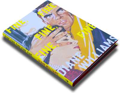
In short, with the world as it is, “fine” is as much a word as anyone should really expect. Ask the “Goon Show” character Eccles to comprehend a situation, and the only possible answer is “fine, fine, fine,” and the appropriate title for Diane Williams’s 2016 collection of very short stories of discombobulating situations is “Fine Fine Fine Fine Fine” – you can’t get any better than that.

06 March 2022

AND I SAID WHAT ABOUT BREAKFAST AT TIFFANY’S? [334]


I have thought about this question every so often, and I will be answering it in my capacity as Leigh Spence, B.A. (Hons) in Film Studies from Solent University, Southampton: what is my favourite film? 


Erm, I don’t really have one, but there are candidates for what may be my favourite film. 


This situation is borne from my taking a critical eye to absolutely everything, both in nature and by training: it was pointed out from the outside that film studies is an arts and humanities subject, and a cinema screen is as much a mirror as a blank canvas. Everything has its virtues, everything has its foibles.


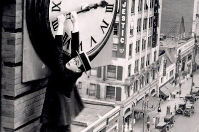
There are films that serve as personal landmarks: “Who Framed Roger Rabbit?” was the first film I saw at a cinema, and the “Back to the Future” trilogy (1985-90) is part of our family, right up to our seeking out the ride when it was still at Universal Studios – the real studio, not the theme park. VHS copies of Hayao Miyazaki’s “Castle in the Sky” (1986) and Disney’s “Fantasia” (1940) were present in my childhood, and I am fortunate to have been exposed to silent comedy from Harold Lloyd, Buster Keaton and Laurel & Hardy from early on, particularly Lloyd dangling from a building in “Safety Last!” (1923), a film I have, of course, now have on Blu-ray.


My go-to-answer for my favourite film is usually Alfred Hitchcock’s “North by Northwest” (1959), having long been a fan of his careful suspense plotting, the shadows of both pictures and character, and his style and humour – I remember a lecturer once stating that, while teaching Hitchcock’s films in a film studies degree is the most obvious thing to do, like he is the Shakespeare of film, the reason why they do teach him is because he is the Shakespeare of film which, having seen “The 39 Steps”, “Rear Window”, “Vertigo” and everything inbetween, I am inclined to agree. Ernest Lehman’s script for “North by Northwest” was deliberately a combination of all of the best Hitchcock motifs to that point, working as a perfect summation of why I like them – the fact that Hitchcock then blew this apart the following year with “Psycho” the following year is another reason for loving the director’s work, but is not as representative of his entire body of work as his previous film.


An easy metric would be for me to list the films I have watched the most times, to find a favourite there. Uniquely for me, I saw Pixar’s “Wall-E” at the cinema more than once, with the Monty Python canon, “Network” (1976), and Terry Gilliam’s “Brazil” (1985) sustaining multiple home viewings. However, films I don’t like – Neil Breen’s “Twisted Pair” (2015) and my personal bĂȘte noire, “Myra Breckinridge” (1969) – have required repeated viewings just to understand what happened, both in front of my eyes and behind the scenes.


It would be very easy for me to rely on lists of best films to formulate an answer, had it not been for the British Film Institute’s journal of record, “Sight and Sound”, producing a decennial “greatest films of all time” list from a poll of hundreds of directors and critics, making for the most definitive, answer for such a subjective question. The 2012 list, asking more industry people than ever, famously had Hitchcock’s lush psycho-drama “Vertigo” (1958) knocking “Citizen Kane” (1941) off the top spot for the first time since 1962. Orson Welles’s film is undeniably the greatest debut anyone has made with a film, and remains one of the best films ever made, but it also proves that you can only decide how good a film is by taking a good twenty years to think about it. The first poll, in 1952, stuck “Citizen Kane” just outside the top dozen films, and placed Vittorio De Sica’s “Bicycle Thieves” at the top, released only four years earlier – the 2012 poll placed it at number 33, below “The Godfather Part II” (1974) and “Taxi Driver” (1976). People asking why no “Star Wars” film is on the list should notice that “2001: A Space Odyssey” (1968) and “Blade Runner” (1982) are there. That said, a new poll is due in 2022, so there is still time.


My most diplomatic answer to why I don’t really have a favourite film is because I have not seen every film. But I know my tastes: I will have had to search it out, it won’t be on a mainstream streaming service, it won’t be a genre film – unless “Hitchcockian suspense” is a genre - and it certainly won’t be “The Sound of Music” (1965), as I have done a good job of avoiding it up to now.

27 February 2022

DON’T KNOW WHAT A SLIDE RULE IS FOR [333]


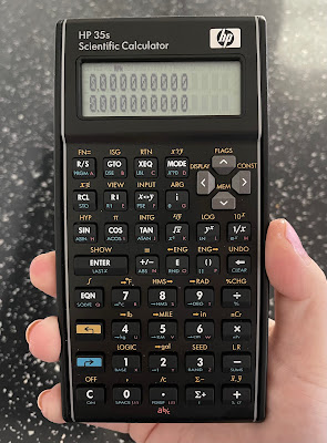
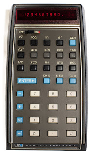
The year 2022 marks fifty years since the introduction of the first pocket scientific calculator, the Hewlett-Packard HP-35. Despite this, I have not seen any evidence that this anniversary is going to be marked in any way, especially as the calculator HP introduced to mark the 35th anniversary in 2007 remains in production to this day, without any changes or updates having been made. The HP 35s could well be the final statement on the matter, as if nothing further can be done.

Having said that, the HP 35s is my favourite calculator to use – I originally said this about the HP-12C financial calculator, in my video about it in 2019 [link], but I hadn’t got my hands on an HP 35s yet. Like the original HP-35, it is ostensibly an engineer’s calculator, including all the expected trigonometric and statistical functions, plus logic and conversions of numerical bases and unit measurements. It is also programmable for any equations you need to need to use frequently, using an intuitive basic language. It is the most you can get a “standard” scientific calculator to do before expecting it to draw a graph and connect to your computer. For me, the HP 35s is solid and dependable, its bowed sides alluding to the original HP design made to fit your pocket more easily, and the keys have a very satisfying click, making it a good stress reliever.


Like the HP-12C, the 35s can use Reverse Polish Notation (RPN) for number entry, which is most easily summarised as entering the number first, then saying what you want to do with it: while you would enter 1 + 2 + 3 = on a standard calculator to get the answer 6, an RPN calculator requires you to type 1 ENTER 2 + 3 +, with no equals button required. More crucially, HP’s RPN calculators use a four-level stack of numbers when calculating, allowing you to combine answers to different calculations more easily using fewer keystrokes – there are also dedicated keys for changing the order of numbers in the stack, depending on what you need. The standard display always shows the first two numbers in the stack, making it much easier to picture everything in order. I found myself becoming so used to this when working from home that I had to buy a second HP 35s for when I returned to the office.


I think this is enough cause for a celebration, but I collect calculators, so of course I would say that. What I think means we may not have this is that HP is not the same company it was in 2007: it had already spun off its analytical instrument arm, including the oscilloscope manufacture on which the company was founded, as Agilent in 1999, and it separated its consumer computer business from its enterprise products and services in 2015. With Hewlett Packard Enterprise also taking the names of the company’s founders with it, the “HP” logo on computers and calculators no longer legally stands for anything, other than the history it used to have. With calculators being HP’s first ever product for the consumer market, it is now listed as “accessories” on the consumer HP’s website, rather than having been hived off with Agilent.


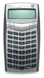
Even then, I am not sure how much involvement HP has with its calculators – their range has been made for them by the Taiwanese company Kinpo Electronics since about 2003, which is also true for Casio and Canon calculators. Up to then, HP’s range had used one standard design, from the cheapest 10B business model to the most advanced 42S scientific calculator, but this was swept aside for an array of bewildering designs for each one: the 35s’s predecessor, the 33s, pushed its keys into a V formation that, to me, is difficult to look at, so a return to the more traditional look based in the 1970s was actually beneficial – another business calculator, the 17bII+ (denoting the second version of an earlier calculator, with more features added), was redesigned to match.


Having heard no announcements or developments so far, it would be a shame not to mark this anniversary in some way. Even if calculator use outside of schools and exams have been replaced by phones and spreadsheets, the initial explosion in their manufacture and use in the 1970s led manufacturers to move to home computers, digital watches and synthesisers. I wouldn’t want this article to be the only acknowledgement of that.

20 February 2022

IT’S NOT THE WAY THAT YOU SAY IT [332]

Mellotron Mark II

Introduced in 1963, the Mellotron is an organ-like musical instrument, its keys instead engaging a tape mechanism to play back ranges of brass, woodwind, string and percussive instruments, making it an analogue forerunner to the sample-based synthesisers that appeared during the 1980s. Instead of its intended sounds being manipulated, recreated or synthesised, they are recordings of the original instruments, and specifically one person’s performance, affected as much by breath and touch – you can hear the air through the flute, and the bows on the violins – as much as the “wow and flutter” of the tape, and the speed of the electric motor. The effect created by that specific combination of factors have made the Mellotron a vital, and slightly eerie-sounding, part of British music for the last sixty years, playing back a sound quality all of its own.

The Mellotron’s sound has become more important than how it works. “Baby Can It Be True”, by The Graham Bond Organization, was the first major song to use one, layering sounds over each other, but Manfred Mann’s 1967 hit “Ha! Ha! Said the Clown” then uses it as the hook, instead of guitar or brass. By this point, The Beatles and The Moody Blues used Mellotrons, including on “Strawberry Fields Forever” and “Nights in White Satin”, later carving a niche in prog rock with King Crimson, Genesis, Pink Floyd and Tangerine Dream. The source of the Mellotron’s sound also means its sounds can be taken too often for the “real” thing, like the cello on Oasis’s “Wonderwall”, and possibly the choir at the end of Coolio’s “Gangsta’s Paradise”, but it sounds too similar to say otherwise. It is also possible to replace the tape, the BBC using an adapted Mellotron to play in sound effects for “Doctor Who” in real time.

Streetly Electronics, the manufacturer of the Mellotron until 1986, was resurrected in 1997 initially to maintain the original version as bands like Radiohead and Oasis continued to use them, even as digital synths by Yamaha, Korg and Roland rendered them obsolete. The sheer number of moving parts in a Mellotron could be affected by humidity, smoke and, least useful for a touring band, movement. However, the possibilities of the Mellotron to a smaller band, and the timbral quality of its sounds, led to more portable versions being introduced into the 1970s.

Mellotron M4000D

The original organ was introduced as an item for the home, with a backing accompaniment available on a second keyboard, and was championed and backed financially by the bandleader Eric Robinson, best known in the UK as presenter of the classical and light music radio show “Melodies for You” on the BBC Light Programme, along with the TV magician David Nixon. Among the first adopters of the Mellotron were people as disparate as Peter Sellers, Scientology founder L. Ron Hubbard, while also providing the only fact I knew off the top of my head about Princess Margaret.

Most notably, the sound of a Mellotron is most often mistaken for that of a Chamberlin, but only because the former is a legally distinguishable version of the latter. Harry Chamberlin designed and perfected his patents from 1949 to 1956, and counted Bobby Darin and Elvis Presley as early customers – but after a legal wrangling caused by a Chamberlin salesman disappearing to the UK and setting up production with a British manufacturer of tape heads, which became Streetly Electronics, Chamberlin and Mellotron continued to sell independently from each other, and not in their home countries. 

Therefore, American acts like The Beach Boys, Edgar Winter, Three Dog Night and Stevie Wonder had access to Chamberlins, and UK acts had Mellotrons. While David Bowie did use a Mellotron on “Space Oddity”, his later “Berlin trilogy” of albums, recorded in Germany, Switzerland and New York, used Chamberlins. Adding to the confusion, the Mellotron’s “3 Violins” sound, used prominently in “Nights in White Satin”, was the one sound licensed for it from Chamberlin.

I want a Mellotron but, due to space and lack of mechanical knowhow, it would have to be one of the modern digital versions currently being manufactured by the original company, although they are expensive: even a rack-mounted version for the studio, where you have to add your own keyboard, costs over a thousand pounds. Fortunately, because Harry Chamberlin sold his company’s rights to them in 1981, all digital Mellotrons effectively come with a free Chamberlin, to layer sounds on top of each other. Arturia sells a downloadable Mellotron sound pack for use via MIDI and a computer, but that is much less special than playing on the real thing.

What would I want to do with a Mellotron? Play on the nostalgia created by the sounds it makes? Layer those sounds together to recreate that eerie quality employed by The Moody Blues? Create something that sounds like nothing else? Yes please.

Mellotron M4000D Micro


13 February 2022

BREAK IT TO ME GENTLY NOW [331]


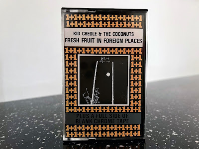
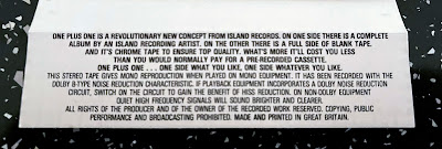
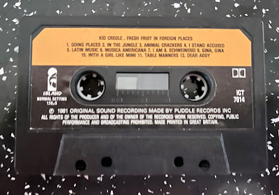
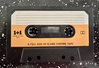
A while ago, I bought a cassette tape in a second-hand shop. It wasn’t for the album on side A, which was “Fresh Fruit in Foreign Places” by Kid Creole & The Coconuts – their most played songs, “Annie I’m Not Your Daddy” and “Stool Pigeon”, are on their following album “Tropical Gangsters” - but more about why side B of the tape was deliberately left blank.

In 1981, Island Records began a series of album releases on cassette titled “1+1”. The inlay card on my album describes it as a “revolutionary new concept… On one side there is a complete album by an Island recording artist. On the other there is a full side of blank tape. And it’s chrome tape to ensure top quality. What’s more it’ll cost you less than you would normally pay for a pre-recorded cassette. One plus one… one side what you like, one side whatever you like.” After a year, the “1+1” pattern on the packaging was minimised to a single logo at the bottom of the front cover of the cassette, which otherwise matched the regular release of the album, and would instead feature the title album in full on each side, giving you the option to record over one side. This series was discontinued in 1983, but continued in the United States by Mango Records, Island’s ska and reggae label.


This would have been particularly attractive at the time to people who made copies of their vinyl albums for home use, or on their recently-acquired Sony Walkman, as the forty-minute duration of the average LP meant two of them could fit onto a C90 cassette. The attraction of buying an album on higher-quality tape stock, and adding another of your own to take advantage of the same tape, will have made “1+1” a sensible option at the record store. 

However, with the marketing blurb mentioning that its cost would be lower than usually expected, I originally thought “1+1” was a novel way of packaging album re-releases. But 1981 was the year “Fresh Fruit in Foreign Places” was first released, and the “1+1” version was simultaneously released alongside the standard cassette format which, in being able to use both sides of the tape, used half the amount of tape. Meanwhile, chrome tape didn’t cost much more to buy than standard ferric tape, but its use as a selling point is more interesting today.


In 2017, I wrote that many of the advances in cassette technology, from types of tape used to Dolby noise reduction, are no longer available to new adopters of the format [link]. Buy a new blank cassette, and it will only be standard ferric tape, otherwise known as IEC Type I, which was established once new formulations of tape were created by manufacturers like BASF, that turned Philips’s original Compact Cassette from a medium for dictation into a higher fidelity format suitable for music. However, Type II chrome, Type III “ferro-chrome” and Type IV “metal” tapes, using different compounds to increase dynamic range and fidelity, haven’t been made for some time, although you now have the option of paying premium prices for the “new old stock” that remains...


...provided your cassette recorder can make use of the different tape formats. With the “Tanishin” China-manufactured cassette mechanism being effectively the last remaining cassette mechanism still being manufactured, and the only new cassette recorder I can find that still currently manufactured to record to chrome tapes, while also accounting for the maximum output levels, bias levels and time constants of different tape types, turns out to be the professional-grade Tascam 202MKVII and its TEAC-branded consumer version, costing from £400 to £600. In short, making serious use of cassettes as a recording medium in the way it used to be requires you to invest in old equipment that can take advantage of the advantages chrome tape could offer, and probably old tapes as well.


Side B of my copy of “Fresh Fruit in Foreign Places” is still blank after forty years and, unless someone buys me the Tascam unit, that is how it will have to stay.


06 February 2022

GREEN IS THE COLOUR OF HER KIND [330]


For all the planning, research and energy I may put into an article or video, I never usually give much thought to how it looks on screen, other than it should be legible. Since 2018, this has taken the form of black text on a mint green background, topped with a pink logo, and I probably did not give these choices more thought than the time it took to whip up the logo using Adobe Photoshop. 

That said, I have no reason to change them. Green and pink are a strong combination that has come to work as a signal or brand for me and my work from the moment they are seen, either on the canvas of a website, or when reduced to a smudge of colour on a YouTube video thumbnail.

My site began in 2016, with a functional white text on a black background – a style that marked the absence of style. By December that year, black had been swapped for what is meant to be International Klein Blue (RGB hex triplet code #002FA7), an ultramarine blue formulated to be more blue than blue, also my favourite colour – a simple choice, but better than nothing.

Apart from blue being the colour of a clear horizon, its being my favourite colour is much like 26 being my favourite number: there is really no reason for such a thing to exist, although it may have arrived as a result of appearing in a number of places at the same time in November 1993 – I think the BBC held their annual Children in Need appeal night on the 26th of that month.

Charlestowne Mall
 

By April 2018, I had arrived at the tagline “nostalgia culture crisis”, and this produced a need to apply branding to support it while looking for something that could be more identified as mine than just the colour blue. The original choice was going to be navy blue text on a peach background, inspired by a carrier bag from the clothes store Next, but what worked on plastic failed on a screen. I changed the peach to a light pink (#f6cac9), and went for mint green (#a3fdd7) based on videos I have seen of dead US shopping malls that were designed in the 1980s and 1990s, particularly the Charlestowne Mall in St. Charles, Illinois, currently due for demolition. I then also realised these were the same colours used on the classic vaporwave album “Floral Shoppe” by Vektroid, using the name Macintosh Plus, so I was on the right track. The pink colour was darkened a bit in May 2021 (#ffb5b2) for legibility, once I decided I should make more use of it as branding in videos.


Does writing about this mean I now have to keep to the scheme of green on pink? It’s more an indication that you can establish something without really thinking about it, and that thinking “if it ain’t broke, don’t fix it”, requires you to properly acknowledge it as a thing first.