
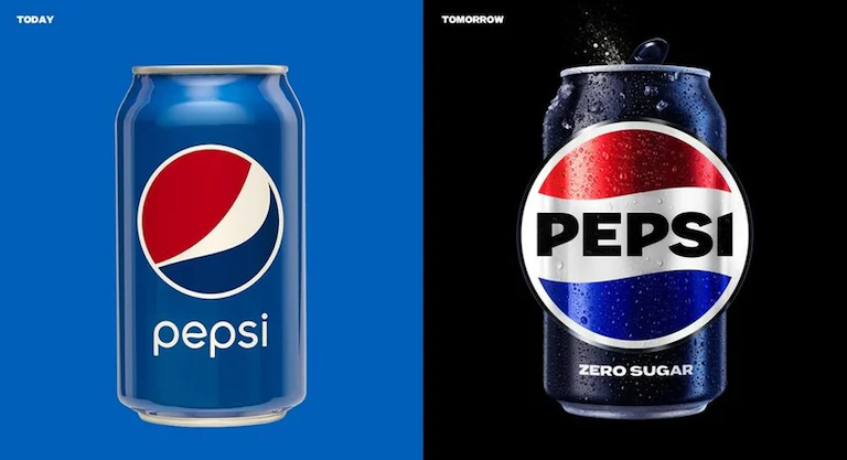
Marking its 125th anniversary in 2023, despite having first gone on sale as “Brad’s Drink” in 1893, Pepsi unveiled its latest rebrand in North America on 28th March, rolling out to the rest of the world in 2024. Currently a red and blue circle bisected by a white line with “pepsi” placed under it, the new logo returns the name in bold capitals to the newly wavy line, termed by them as a “pulse”, in what is essentially a refresh of the branding used from the 1960s to the 1990s.
Pepsi’s Chief Marketing Officer, Todd Kaplan, said in PepsiCo’s press release that “This new visual system brings out the best of the Pepsi brand's rich heritage, while taking a giant leap forward to set it up for success in an increasingly digital world.” Not unlike the BBC’s brand refresh from 2021 [which I discussed here], the press release accepts their brand needs to work beyond the static logo featured on the products themselves: “the revitalized and distinct design introduces movement and animation into the visual system, unlocking more flexibility for Pepsi to move between physical and digital spaces, from retail shelves to the metaverse.”

However, the sentence that made me react irrationally was: “The logo and visual identity thoughtfully borrows equity from its 125-year history and incorporates modern elements to create a look that is unapologetically current and undeniably Pepsi.” My initial thought was, “Borrows equity”? Surely it would have been easier to admit “our older logo is more recognisable, and our customers are more nostalgic for it, so we are introducing a new version of it”? And doesn’t “equity” mean the value of something minus its liabilities, so Pepsi are removing elements of their branding that aren’t working? Does this explain why the Pepsi brand isn’t as timeless as that of Coca-Cola, despite how many “Coke” wordmarks they have used over time?
I now know that “brand equity” is a more specific term, relating to the social value of a brand-name, measuring its worth as a financial asset, as a product among other similar items, and public awareness. Reinforcing brand awareness not only involves removing elements that no longer work, but questioning whether what does still works as effectively as it did upon introduction, introducing new elements while maintaining consistency. The BBC logo was changed because it was required to be more flexible on screen; the cultural goodwill towards Volkswagen engendered by their Type 2 camper van helped it pass the “Dieselgate” scandal with the new, nostalgic ID. Buzz electric vehicle; the Co-Op Group reintroducing the original version of their “cloverleaf” logo in 2016, a much stronger brand than had been used in the previous twenty years [which I also talked about here].
In the knowledge of the “cola wars” of the 1980s, the chief objective is to delay changing the product for as long as possible. Coca-Cola famously blinked in 1985, using the “New Coke” controversy to reintroduce the original recipe under the new brand “Coca-Cola Classic”. Likewise, Pepsi was reformulated in the 1920s, after it had been bought out of bankruptcy. For me, Pepsi will remain the cola sold when the restaurant doesn’t serve Coke, but I am well aware of it.
No comments:
Post a Comment