

When I last created a CV, I knew I had to use the correct font. I chose Futura, a precursor to Gill Sans, which is clear and easy to read, especially when any human resources person may scan it for only a few seconds before making a decision. If I chose the wrong font, any split second of confusion in the reader could have threatened my future career prospects.
So, when I come across forms at work that use COMIC SANS, that a company has asked us to fill in, and which could be used in a court of law, you do question the decisions made by both the designer, and by those that said, “yes, that looks OK.” The company concerned does not use these anymore, so they must have realised what the forms look like.
Comic Sans exists to look child-like, but its misuse has made it look childish. Designed for Microsoft Bob, a 1994 program to make navigating screens easier for novice computer users, it was intended to solve the problem of having a cartoon dog having speech bubbles that used Times New Roman, a font designed for use in "The Times" newspaper from 1932 to 1972. However, the font’s designer, Microsoft’s Vincent Connare, did not have the font completed in time for Bob, but it was included with Windows 95.

To me, the main problem with Comic Sans is its deliberate aping of someone’s handwriting, in particular the kind of handwriting you expect your child to grow out of when they are taught how to join the letters up. Therefore, when an adult uses it, you doubt any serious intent in the words you are given, and you are less likely to take in their meaning. Its position as a default font on Microsoft Word makes it too easy a choice, especially when few people are likely to look for a font that fits what they want to say. When the inevitable consequences of this appear, you will eventually read the message, but not after you have rolled your eyes first.
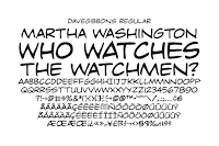
The irksome nature of the font’s name doesn’t help either. Few comic books are made for children these days, and the most popular graphic novels of the last thirty years carry the phrase “Suggested for Mature Readers” on the back cover. “Watchmen” and “Batman: The Dark Knight Returns” are the two books that, when collected into square-bound books, gained the medium the respect that has grown into blockbuster film franchises.

However, “Watchmen” and “Dark Knight” inspired Comic Sans, through the work of Dave Gibbons and John Costanza respectively, and by being found on Vincent Connare’s bookshelf. Gibbons, who drew and lettered every page of “Watchmen,” described Comic Sans as, “…a real mess. I think it's a particularly ugly letter form.” I don’t think the fact you can buy a Dave Gibbons font has anything to do with his opinion, but having your name even mentioned alongside Comic Sans can’t be desirable.
For the record, Vincent Connare went on to design Trebuchet MS in 1996, which is a much easier font to look at.
No comments:
Post a Comment