
Sometimes, you only notice a trend when it has already fully established itself, leaving you to trail back to where it might have begun. My latest such realisation came in, well, the alcoholic drinks section of a local supermarket, one which still separates out the non-alcoholic versions of well-known brands into their own, comparatively tiny section.
I had been looking for Guinness 0.0, which is basically the standard draught Guinness with the alcohol filtrated out at the end of the production process, which has recently been reintroduced after a contamination issue led to its withdrawal in October 2020 after only its first two weeks on sale. I remember it tasted pretty much exactly like normal Guinness, if a little lighter, with notes of coffee – here’s hoping that wasn’t what was wrong with it.
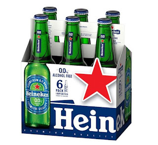
The design of Guinness 0.0 cans is pretty close to those of the standard brand, except for stating “0.0” in large blue lettering, and blue bands on the top and bottom of the cans. The supermarket did not have it, but with the other non-alcoholic brands grouped together, I realised that similar design choices had been made on the packaging of other beer brands like Heineken, Beck’s (named "Beck's Blue"), Moretti and San Miguel, but also on Kopparberg cider, Freixenet sparkling wine, and Gordon’s and Tanqueray gin.
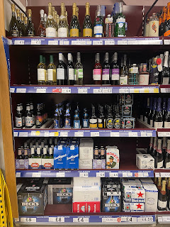 |
| The shelves that inspired this article |
While not a hard and fast rule – Budweiser Zero removes the red from the standard design to leave it in monochrome, and Carlsberg 0.0% outright replaces its green colour with blue – the use of blue highlights on existing branding, to emphasise the taste identified with the brand over the removal of a major element and selling point of that brand, is something that must have slowly sprouted over the last year, as brands latch on to a growing taste and trend.
I rarely drink alcohol as both a preference and a rule, so the opportunity to avoid it altogether will make having a Guinness even more enjoyable, while I wait for Pimm’s to follow suit. Therefore, another interpretation of this use of blue is to indicate safety, that this drink you would only have in certain acceptable circumstances is safe to drink anywhere, at any time, without having to think about it. My reason for thinking this is intentional is having seen Heineken 0.0 on sale in a shop that otherwise did not sell alcohol, which was a high street branch of the newsagent-stationers-bookshop WH Smith – thinking about it further, the blue accents on the Heineken can made it fit in with the soft drinks stocked next to it.
Having said all this, I live in a country where the colour blue on food and drink packaging is more associated with a conspiracy theory that Walkers Crisps changed the bags for their cheese and onion flavour from green to blue, never acknowledging they changed it, when in fact they have always used blue, despite the majority of other brands use green.
Always read the label.
No comments:
Post a Comment