

For all the planning, research and energy I may put into an article or video, I never usually give much thought to how it looks on screen, other than it should be legible. Since 2018, this has taken the form of black text on a mint green background, topped with a pink logo, and I probably did not give these choices more thought than the time it took to whip up the logo using Adobe Photoshop.
That said, I have no reason to change them. Green and pink are a strong combination that has come to work as a signal or brand for me and my work from the moment they are seen, either on the canvas of a website, or when reduced to a smudge of colour on a YouTube video thumbnail.
My site began in 2016, with a functional white text on a black background – a style that marked the absence of style. By December that year, black had been swapped for what is meant to be International Klein Blue (RGB hex triplet code #002FA7), an ultramarine blue formulated to be more blue than blue, also my favourite colour – a simple choice, but better than nothing.
Apart from blue being the colour of a clear horizon, its being my favourite colour is much like 26 being my favourite number: there is really no reason for such a thing to exist, although it may have arrived as a result of appearing in a number of places at the same time in November 1993 – I think the BBC held their annual Children in Need appeal night on the 26th of that month.
Charlestowne Mall

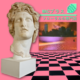
By April 2018, I had arrived at the tagline “nostalgia culture crisis”, and this produced a need to apply branding to support it while looking for something that could be more identified as mine than just the colour blue. The original choice was going to be navy blue text on a peach background, inspired by a carrier bag from the clothes store Next, but what worked on plastic failed on a screen. I changed the peach to a light pink (#f6cac9), and went for mint green (#a3fdd7) based on videos I have seen of dead US shopping malls that were designed in the 1980s and 1990s, particularly the Charlestowne Mall in St. Charles, Illinois, currently due for demolition. I then also realised these were the same colours used on the classic vaporwave album “Floral Shoppe” by Vektroid, using the name Macintosh Plus, so I was on the right track. The pink colour was darkened a bit in May 2021 (#ffb5b2) for legibility, once I decided I should make more use of it as branding in videos.
Does writing about this mean I now have to keep to the scheme of green on pink? It’s more an indication that you can establish something without really thinking about it, and that thinking “if it ain’t broke, don’t fix it”, requires you to properly acknowledge it as a thing first.
No comments:
Post a Comment