Showing posts with label the dark knight returns. Show all posts

28 April 2019

NOW THE WORLD IS READY FOR YOU [167]


My local cinema multiplex is showing “Avengers: Endgame” thirty-six times today. Quite rightly, the reviews for the film, in its opening weekend, have remarked on the extraordinary achievement that has been the Marvel Cinematic Universe, and how it ties up the eleven years of connected storylines that unfolded and weaved through large numbers of films and TV series, coming together for event storylines, and characters appearing in each other’s films.
I remember first hearing, in 2005, that Marvel Entertainment had secured a credit facility with Merrill Lynch to start making its own films, intending from the start to make a series of films that would come together, and I just thought, “they’re doing what now?” However, it has not been enough for me to invest the time in watching all these series, as while their characters and storylines were being introduced to the wider public, I had already been catching up on some of them for years.
The first superhero comic book I ever bought was “Robin,” issue 96, dated January 2002, which guest-starred the Blue Beetle. I had no idea what to expect – I didn’t yet know that this was the third Robin so far, and the second Blue Beetle, and I had no idea that “Oracle,” running information checks behind the scenes, used to be the original Batgirl. I didn’t know it was set after a particular crossover storyline, and it didn’t matter. It told a pretty good action-based story, and showed me that superhero stories can be told well, and provided a lesson in how you can arrange time on a printed page. I later picked up the great examples of superhero stories, like “Batman: The Dark Knight Returns” and “Watchmen,” and I have built up quite a collection of books in the years since.

So, here is my problem: why do I need to see a comic book film, when I read comic books? I felt this especially when “X-Men: Days of Future Past” was released in 2014, having already read the original comic, first printed back in 1981. Earlier, “Watchmen” and “V for Vendetta” sought to reproduce the look of the comic as exactly as it could, just as Channel 4’s version of Raymond Briggs’ “The Snowman” had directly used the original picture book as its storyboard. By then, comics using a more “decompressed” storytelling style, like “The Authority,” and Marvel’s Ultimate line of books, were providing a more cinematic and realistic style than before – “The Ultimates,” retelling the Avengers for the Ultimate line, presages the cinematic Avengers in its style, if not the storyline.
I do wonder if comic books could eventually be supplanted by comic book films. Marvel and DC are both owned by major film companies – Marvel has been owned by Disney since 2009, while Warner Bros. realised that year that they had downed DC Comics since 1967, and restructured it as a division of a new company, DC Entertainment, to take better advantage of the stories and characters that had been under their noses for so long. Comic books are essentially the Research & Development section for a film company, and will later serve to provide the tie-in books for their films. All the while, comic book films are the mass market version of a niche industry: “Avengers: Endgame” will be watched by tens of millions of people, but the latest issue of an “Avengers” comic will be bought by tens of thousands, from a specialist comic book shop. It almost doesn’t matter if those readers know what stories will make the films, because those readers number so few.

03 December 2016

TAKE THAT LOOK OFF YOUR FACE [30]


When I last created a CV, I knew I had to use the correct font. I chose Futura, a precursor to Gill Sans, which is clear and easy to read, especially when any human resources person may scan it for only a few seconds before making a decision. If I chose the wrong font, any split second of confusion in the reader could have threatened my future career prospects.
So, when I come across forms at work that use COMIC SANS, that a company has asked us to fill in, and which could be used in a court of law, you do question the decisions made by both the designer, and by those that said, “yes, that looks OK.” The company concerned does not use these anymore, so they must have realised what the forms look like.
Comic Sans exists to look child-like, but its misuse has made it look childish. Designed for Microsoft Bob, a 1994 program to make navigating screens easier for novice computer users, it was intended to solve the problem of having a cartoon dog having speech bubbles that used Times New Roman, a font designed for use in "The Times" newspaper from 1932 to 1972. However, the font’s designer, Microsoft’s Vincent Connare, did not have the font completed in time for Bob, but it was included with Windows 95.


To me, the main problem with Comic Sans is its deliberate aping of someone’s handwriting, in particular the kind of handwriting you expect your child to grow out of when they are taught how to join the letters up. Therefore, when an adult uses it, you doubt any serious intent in the words you are given, and you are less likely to take in their meaning. Its position as a default font on Microsoft Word makes it too easy a choice, especially when few people are likely to look for a font that fits what they want to say. When the inevitable consequences of this appear, you will eventually read the message, but not after you have rolled your eyes first.
The irksome nature of the font’s name doesn’t help either. Few comic books are made for children these days, and the most popular graphic novels of the last thirty years carry the phrase “Suggested for Mature Readers” on the back cover. “Watchmen” and “Batman: The Dark Knight Returns” are the two books that, when collected into square-bound books, gained the medium the respect that has grown into blockbuster film franchises.

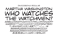
However, “Watchmen” and “Dark Knight” inspired Comic Sans, through the work of Dave Gibbons and John Costanza respectively, and by being found on Vincent Connare’s bookshelf. Gibbons, who drew and lettered every page of “Watchmen,” described Comic Sans as, “…a real mess. I think it's a particularly ugly letter form.” I don’t think the fact you can buy a Dave Gibbons font has anything to do with his opinion, but having your name even mentioned alongside Comic Sans can’t be desirable.
For the record, Vincent Connare went on to design Trebuchet MS in 1996, which is a much easier font to look at.