Showing posts with label Cadbury. Show all posts

23 February 2025

ONE MORE CUP OF COFFEE [489]

"freeze-dried"

A good coffee will not need milk or sugar, as far as I am concerned – at least, that is my conclusion from only just starting to drink coffee for the first time in my life.

Watching other people contend with and compromise in drinking coffee kept me safely with soft drinks up to now, my sweet tooth being happily satisfied, mostly by The Coca-Cola Company.

But tastes change with age, as does your body – I felt mine becoming less impressed by fizzy drinks, and so a solution had to be found.

I rarely tried accustoming myself to hot drinks. Soft drinks have uniformity of taste, but they both cost and weigh more to carry home from a shop, because they need to be pre-prepared and ready to drink. Hot drinks take time to prepare and perfect.

That may be obvious, but I avoided hot drinks for this reason. I prefer just to add hot water and be done with it. Instant drinking chocolate, usually by Cadbury, was the hot drink I had the most before now, but even then, only occasionally, getting bored of forcing Dairy Milk into me. Tea has always been the opposite, too weak for my tastes no matter how long I steep the bag, although a peppermint infusion is much preferable for me to standard black or white tea.

Modifying the taste of your tea or coffee by adding milk, sugar or whatever else led me to think that changing the tea or coffee itself would be more appropriate – like I have done with soft drinks up to now, having a satisfying taste that can stand on its own was what I wanted.

So why coffee, and why coffee now? My family started watching “Twin Peaks” just before Christmas 2024, a very welcome, and endlessly fascinating, alternative to what TV schedules had planned in the festive period. In the character of Special Agent Dale Cooper, the show’s creators David Lynch and Mark Frost, with actor Kyle MacLachlan, created a character who, among all his fastidiousness and intuitive methods, had a love of coffee so great it sold the concept to me. A stronger, more full-bodied taste was what I was looking for, and on the one occasion someone at work asked me how I liked it, I said without hesitation, “black as midnight on a moonless night”.

I first decided to sample the coffee at work one day, not having realised tea and coffee, and milk and sugar, were being supplied in the break rooms, having never needed to look before. However, the three types of instant coffee on offer – “smooth”, “decaf” and “rich”, all apparently from Kenco – were terrible to me. The “smooth” and “decaf” granules smelled burnt, and the “rich” coffee I made was too bitter for more than an initial sip.

The coffee I have arrived at was what we had at home, recommended by my sister: Percol smooth Colombian coffee – “roast 3”, apparently. One teaspoon produces a perfectly nice cup of coffee to me, a sense of warmth and taste without the bitterness, and without all the fuss. No Americano, flat white, long black or other type of complication, and no snobbishness or crema spoons – just a Platonic ideal of a cup of coffee.

The only addition I need is an insulated mug to keep it warm.

12 November 2023

THAT’S THE WAY THE MONEY GOES [422]

A last one.

I decided to write about Caramac, “The Caramel Flavour Bar”, the demise of which has been announced by its manufacturer Nestlé, because some headlines kept referring to it as a chocolate bar. Its recipe used treacle instead of cocoa, its lack of egg or gelatine making it vegetarian, and instead of the whole milk used by Cadbury’s in Dairy Milk bars, Caramac used skimmed milk.

I am also using the past tense because the news led to the near-complete disappearance of Caramac by people acting upon nostalgia in the shops, when declining sales in the present day prompted Nestlé’s decision, efficiently clearing shelves for other products they wish to sell. The simultaneous withdrawal of the Animal Bar, a chocolate bar aimed at children with pictures of animals on them, and the closure of a factory near Newcastle, were reported less often.


Unlike Coca-Cola’s rebranding of Lilt as a Fanta flavour, decried in the pages of “The Spectator” and incorrectly reported as the drink being withdrawn, this really is the end of a product, unless you buy the ingredients and make it yourself. My family has already been deprived by KP of their Brannigans crisps, my private joke being that their potent beef and mustard flavour, not reused on any of their brands, was decommissioned and put beyond use. Like Caramac, I only found Brannigans in discount stores and the occasional newsagent ahead of their withdrawal – perhaps I should have seen it coming, so fans of KP’s Roysters T-bone flavour crisps should stock up, to keep sales up, as petitions speak less loudly than cash.

Caramac was introduced in 1959 by Mackintosh’s, a maker of toffee that involved caramel in all its most famous brands, such as Quality Street, Rolo and Toffee Crisp. Merging in 1969 with Rowntree’s, manufacturers of Kit Kat, Smarties, Aero, After Eight, Black Magic, Polo mints, Fruit Pastilles, Fruit Gums, Yorkie and Lion bars, Nestlé took over the combined Rowntree Mackintosh in 1988 – chocolate products were branded under Nestlé, with Rowntree’s retained for the rest. I found all these products in my local supermarket, still being too established and commonplace for nostalgia to have taken form, except for how much larger tins of Quality Street used to be.

Nestlé themselves invented white chocolate with the Milkybar in 1936, and the caramel-infused Milkybar Gold variant is perhaps more sustainable for them than the separate brand of Caramac. However, like Caramac, the Australian and New Zealand versions of Milkybar don’t use cocoa butter, so adding treacle to those may get them back where they started. Any desire of mine for Caramac to be brought back wouldn’t be worth the effort, and if I did want a confectionery to be brought back, it would be Rowntree’s Cabana, a chocolate bar containing caramel, cherries and coconut – I’ve never had one, but I like the sound of it.


24 October 2021

YOU’RE STILL THE ONE [316]

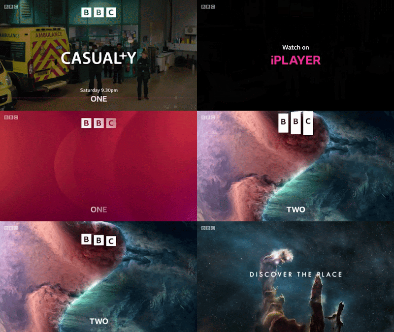
Back in 2017, I wrote about BBC One replacing its channel idents with the “Oneness” series of group portraits, photographed by the artist Martin Parr [link]. I ended that article by saying: “…getting audiences to programmes do not rely on individual channels so much, unless you count the BBC iPlayer or Netflix as a ‘channel.’ For the BBC, Martin Parr’s new idents may be more important for the ’BBC’ on screen, rather than for the ‘One’.”

On Wednesday 20th October, the BBC unveiled new branding that placed their restyled logo at the top of screens, programme trailers and poster advertising, and their channel names in smaller letters at the bottom, underlining the inevitability of the move – all programme trailers end with “available on iPlayer,” placed prominently in the middle of the screen, just as “iPlayer” and “Sounds” replaced the “TV” and “Radio” categories on BBC Online. Long gone are the days of simple radio-like announcements over slides of upcoming shows. Moreover, the way the new logo is used highlights, at a fundamental level, the change in how we watch television over the last twenty-four years.

I have always changed my website’s logo and branding when it was needed, as proved by my 300th article showing five logos over five years [link], as I zeroed in on the most effective way of presenting myself and my work. Likewise, the BBC’s logo, a variation of three letters in three boxes since it was first introduced in 1958, has been modified as its uses have changed, from identifying a broadcaster to supporting the quality of British programmes sold worldwide, to being a mark of reputation to sell tie-in merchandise, to being a sigil for a British national identity portrayed through cultural soft power. 

As much as some people search for the opportunity to complain about taxpayers’ money being perceived to have been wasted on a logo change that is still superficially similar to the previous version, you have make changes when your current branding is found to have stopped working effectively. As stated by the BBC’s Chief Customer Officer, Kerris Bright [link], “Our research tells us that audiences think some of our services look old fashioned and out of date. They want a modern BBC that is easier to use and navigate to find the content they love and enjoy.” 

If people in its own country are saying that, then perhaps it was being said elsewhere. The latest BBC logo was introduced in April 2021 on an online streaming service aimed at North America, BBC Select, and on the Australian TV channel BBC Kids, six months before the UK saw it on screen. Because these are subscription services, their audiences are also, indirectly, paying for the new logo. Meanwhile, the latest Cadbury logo, using thinner lines and closer to the company founder’s original signature, was first seen on chocolate bars sold in Australia. 

A big feature of the BBC’s new branding, and one that has been introduced gradually for a couple of years, before reaching the logo, is the font. “Reith,” in its sans serif form, may not immediately be too different from the previous use of Gill Sans to the casual user, but the one-off cost of the BBC buying its own font, to use it as much as it wants, contrasts with the yearly fees to use Gill Sans, Helvetica, Futura and other fonts over the years. I could not find how much the BBC pays to use fonts, but I could also not find out how much Ikea saved in 2009 by switching their shops and catalogues from using Futura to Microsoft’s cheaper font Verdana.


The previous BBC logo was introduced in 1997. The logo that version replaced was deemed not to work when made smaller on screen – the lines under the blocks, and the spaces in the letter B, began to disappear. Its replacement was simplified, easier to reproduce and was more legible on screen.


What has changed since then is the screen. In 1997, people were still watching cathode-ray tube (CRT) televisions, beaming a raster pattern of electrons onto a fluorescent screen. LCD and LED televisions did become commonplace until 2006, when regular HD television broadcasts began in the UK. In 1997, the BBC still played their idents for their channels from laserdisc, with servers not being used until widescreen broadcasts began in 1998. They still only had two channels to worry about – the BBC News Channel began in November 1997, followed by BBC Choice in 1998. Aside from all this, watching television from a non-television screen only properly began when the BBC iPlayer download service began in 2005, only becoming a streaming platform in 2007, the same year Netflix began their own service – the flood of mobile, tablet and other connected devices began from there.


What made me realise this was using the BBC News app in beta mode. I knew about the new logo from the reports of BBC Select introducing it, finding that an upcoming update to the News app will use it. In using it, I found that the logo, placed at the top of my phone’s screen, placed its blocks further apart so they can animate more clearly: swiping down to refresh the page would stretch the blocks before reverting to their correct shape, and they would shrink to lines as I moved down the page, maintaining their presence as a constant reminder. 


I thought this animation was something cute at the time, because it is something you could do on your phone, but I didn’t think it would happen on television. With the blocks making the Channel 4 logo having been broken up and thrown about since it began in 1982, and with a new ident on ITV seemingly every week as part of an artist initiative, it is now time for the BBC to stop being defined by three static, immovable blocks. 


Now, they rarely ever sit: they move in, they fall into place, they move up, down, in and out. Perhaps this could have been done fifty years ago, but when BBC One and Two had idents that were live feeds of clockwork models, it wouldn’t have been practical. It certainly does not feel like the logo of a corporation that is approaching its hundredth anniversary in 2022, but that is entirely the point: this will be the last BBC logo made for a regular television screen, if not for a linear television channel. Next time: holograms, probably.


There is a lot to be said for the triviality of a broadcaster changing its logo, as I have proved, but because of the unique way it is funded, the BBC belongs to everyone, and it represents us all to the rest of the world. I want it to look its best.

17 September 2018

THERE’S A GHOST IN MY HOUSE [127]


Trying to take a complex philosophical concept, that I am only just beginning to understand, and trying to apply it to chocolate, to make it easier and more palatable, may well be the most literal possible example of biting off more than I can chew. However, with long-gone brands, and their tastes, still on the tips of many tongues since childhood, there may no be easier place to start.
What am I talking about? A word that has come to mind a lot recently has been “hauntology,” which was coined in 1993 by the French philosopher Jacques Derrida. It is a play on “ontology,” the philosophical study of being, of existence and reality, of how things can be said to exist – the French “ontologie” and “hauntologie” sound identical when spoken. The idea that existence can be haunted comes from Derrida, in his book “Spectres of Marx,” ruminating over how Communism can be said to have failed, with the Soviet Union having been dissolved in 1991, despite Karl Marx and Friedrich Engels opening “The Communist Manifesto” with the idea of Communism being a “spectre... haunting Europe.” If that is the case, the idea of Communism, if it is a ghost, couldn’t be dead – and if it appears in the present, it cannot be said to be of the past either.
I already feel lost, and yet that may be the point, because hauntology essentially replaces the notions of ontology, that there must be something that, well, “is,” and replaces that with something which is neither present or absent, relying on language in order to describe any of it – Derrida was already known for his work on the deconstruction of language in texts, so hauntology was seen as an extension of this work.

How do you apply this theory to chocolate, then? Consider the way chocolate is often talked about: chocolate doesn’t taste as good as it used to be, chocolate bars have become smaller, and we wonder why our favourite bars have never been brought back. The notion of chocolate, as it exists today, is literally haunted, for many people, by the notion that there is a perfect definition of chocolate that either did exist, or may have never existed, forever out of reach, but without a way of moving forward into the future to create something entirely new, you must reach back into the past to recreate something, or create a pastiche – nostalgia leads the way.

This was where I thought Cadbury was heading when their new “Darkmilk” bars were announced. When I first heard of the possibility of eating a dark milk chocolate bar – a darker kind of Dairy Milk, or a smoother-tasting Bournville – I thought, oh, they are trying the Gambit bars again. The Gambit only lasted for a few years in the 1980s, but its literal gambit was blending Dairy Milk and Bournville together, giving you all of both, rather than the best of both. From the taste tests I conducted with family and friends, Cadbury appear to have created something that some people may not have tasted before. In Australia, where Darkmilk first launched, it is also available with chips of dried raspberry – that would be the real game-changer for me.